Hello, my name is Jonathan Miskolczy. I am a former Bachelor of Arts student at the FHNW HGK in Basel, Switzerland. I have studied visual communication with deeper focus on typography.
Coffee and Cigarettes
Book Design
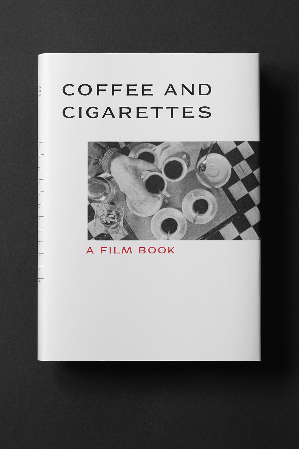
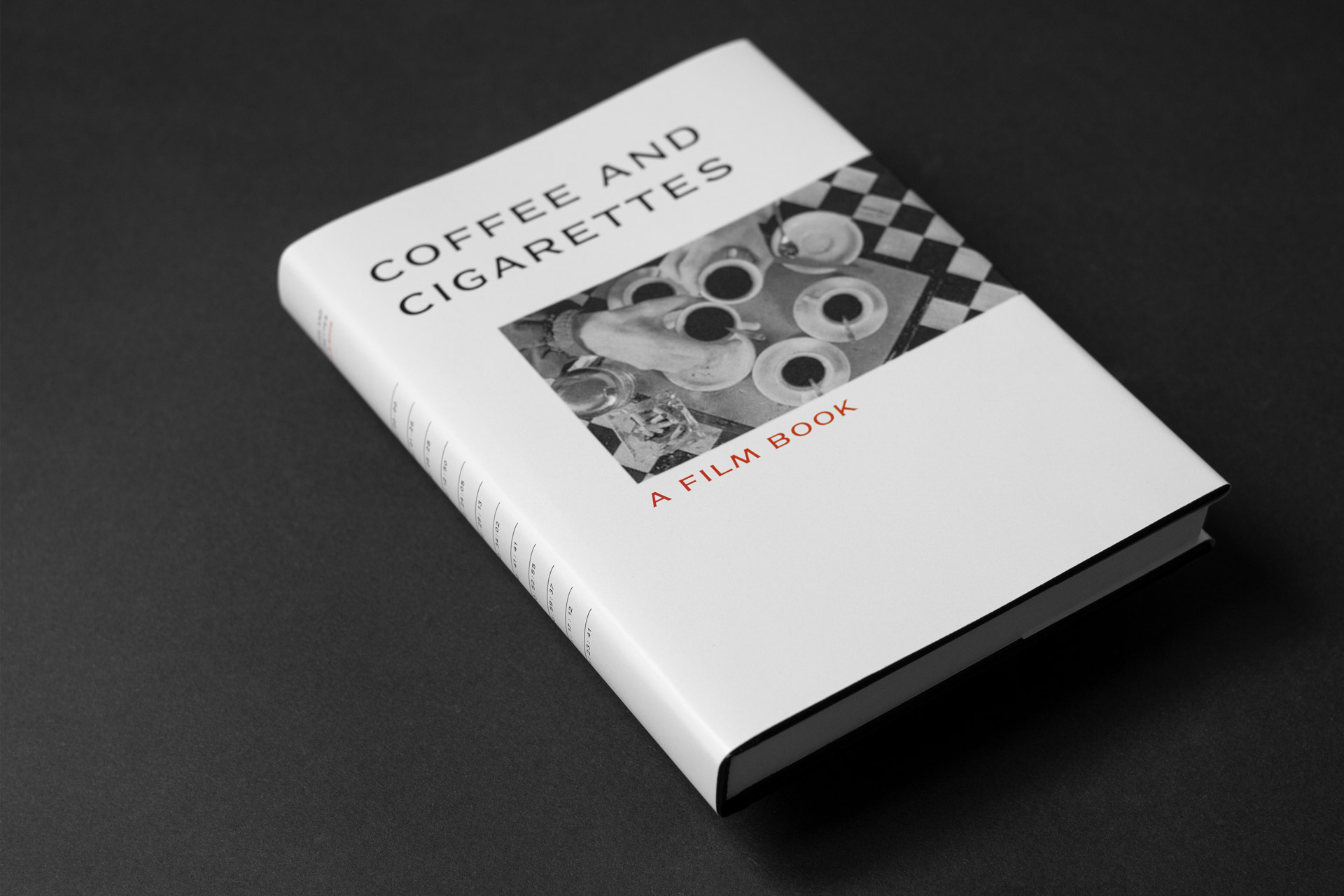
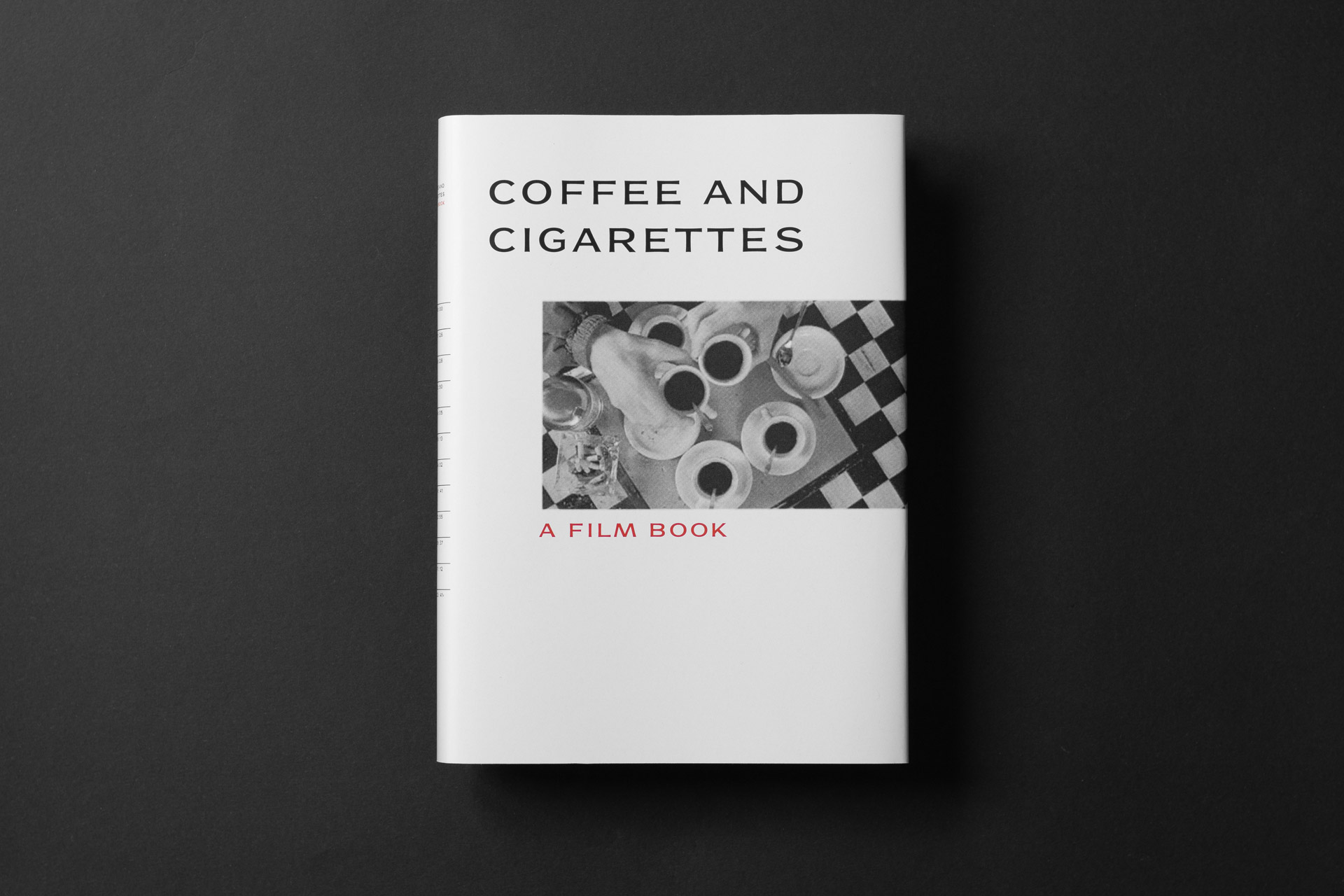
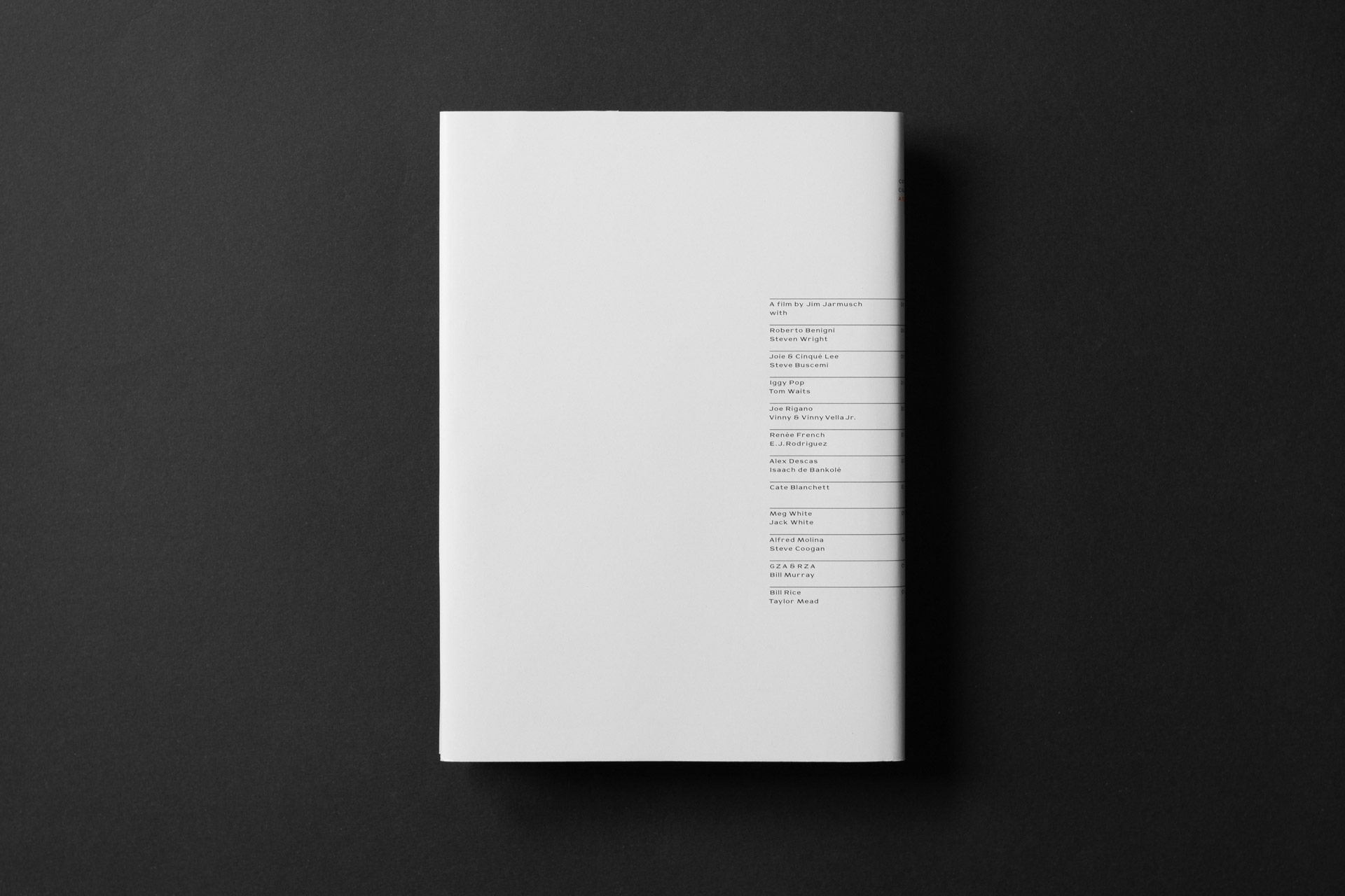
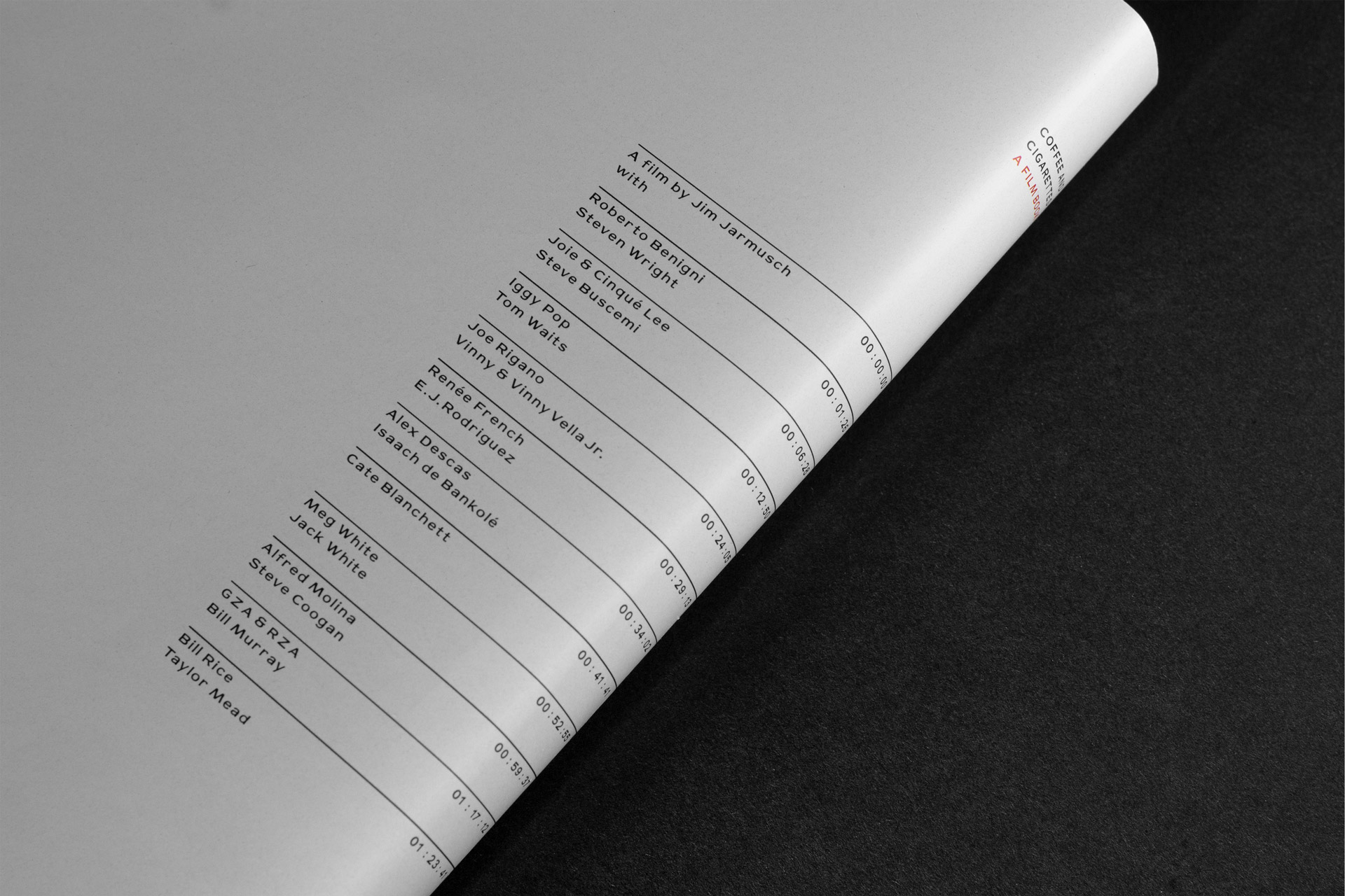
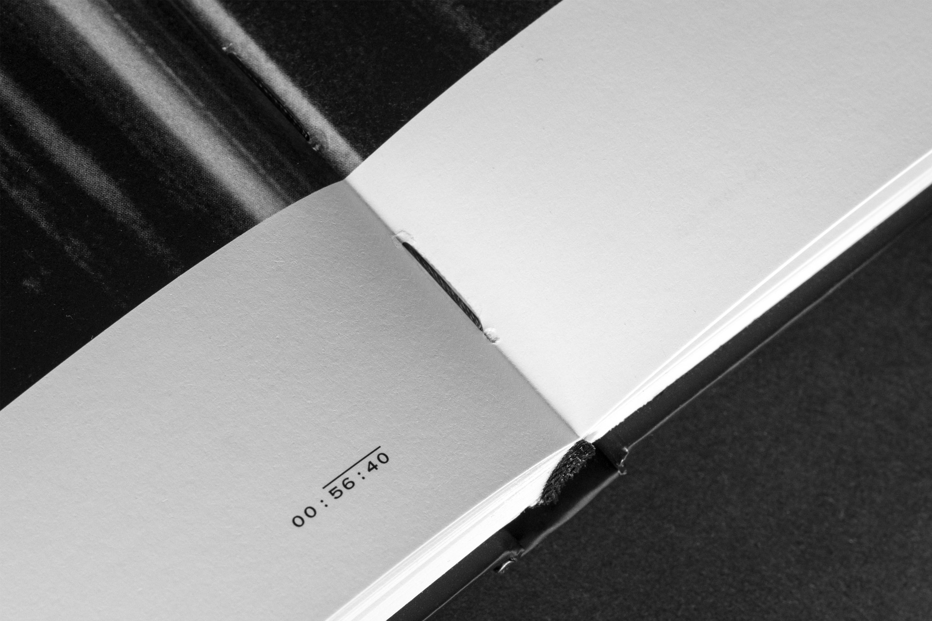
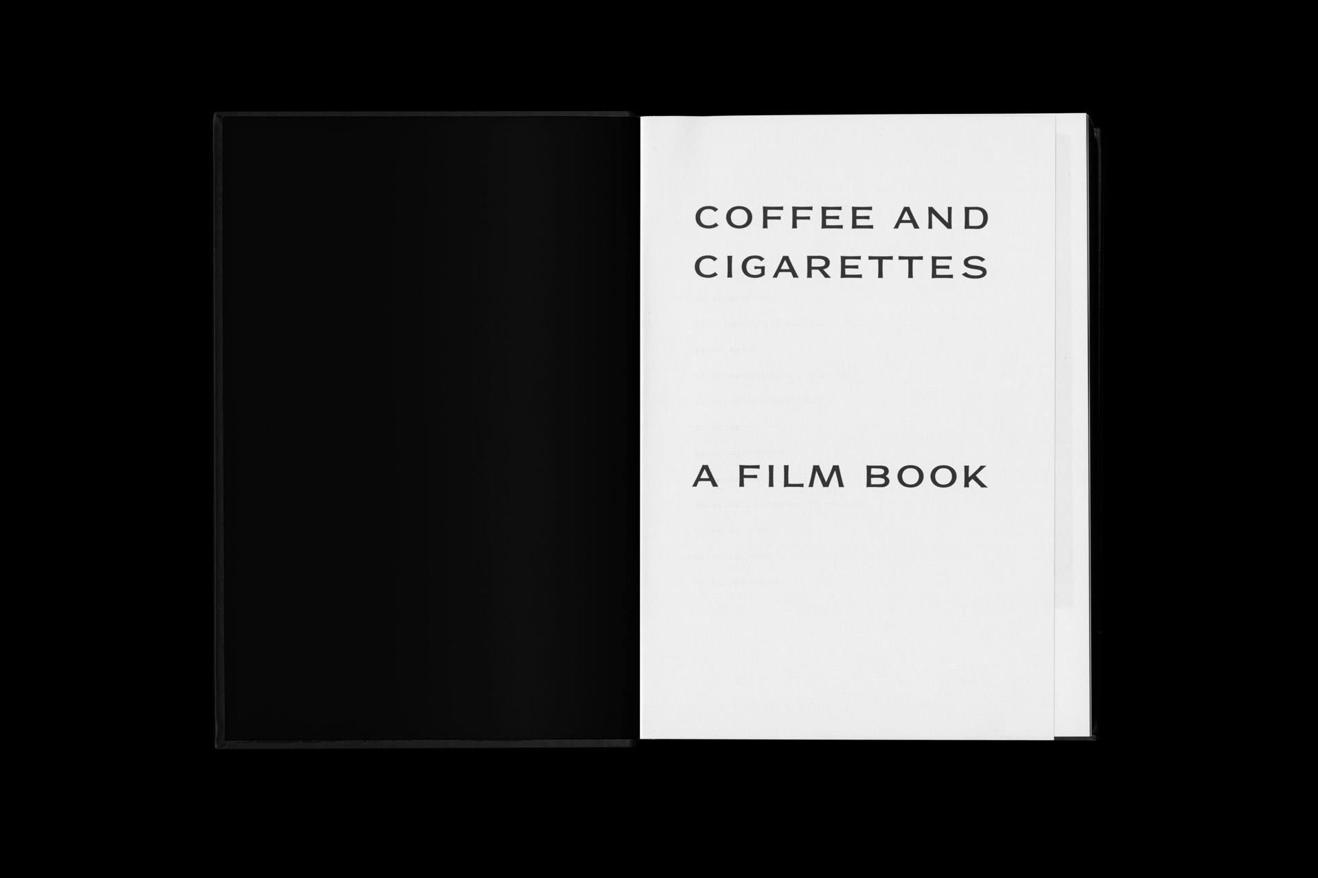
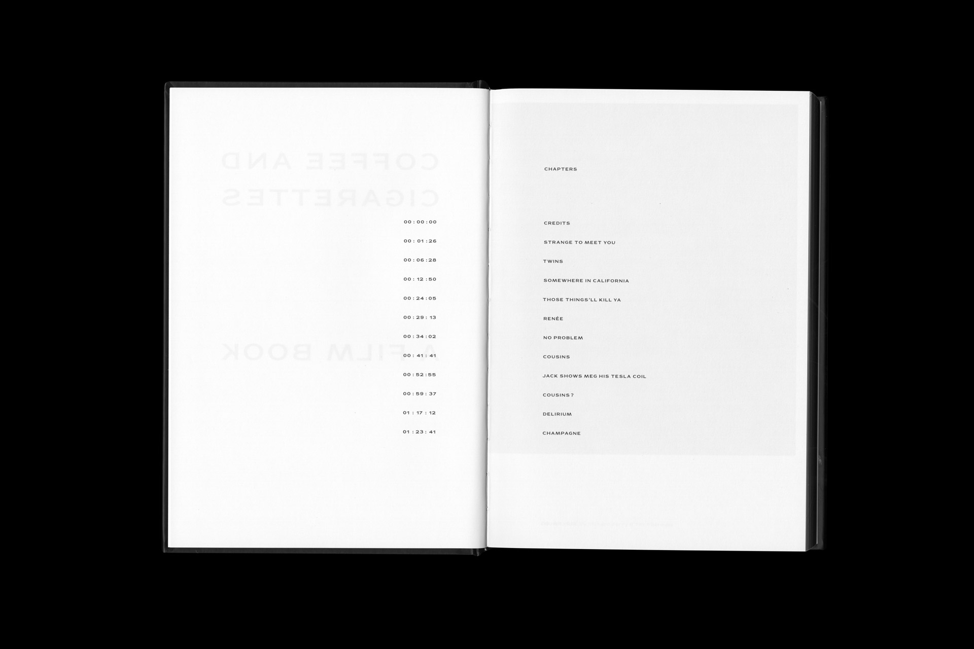
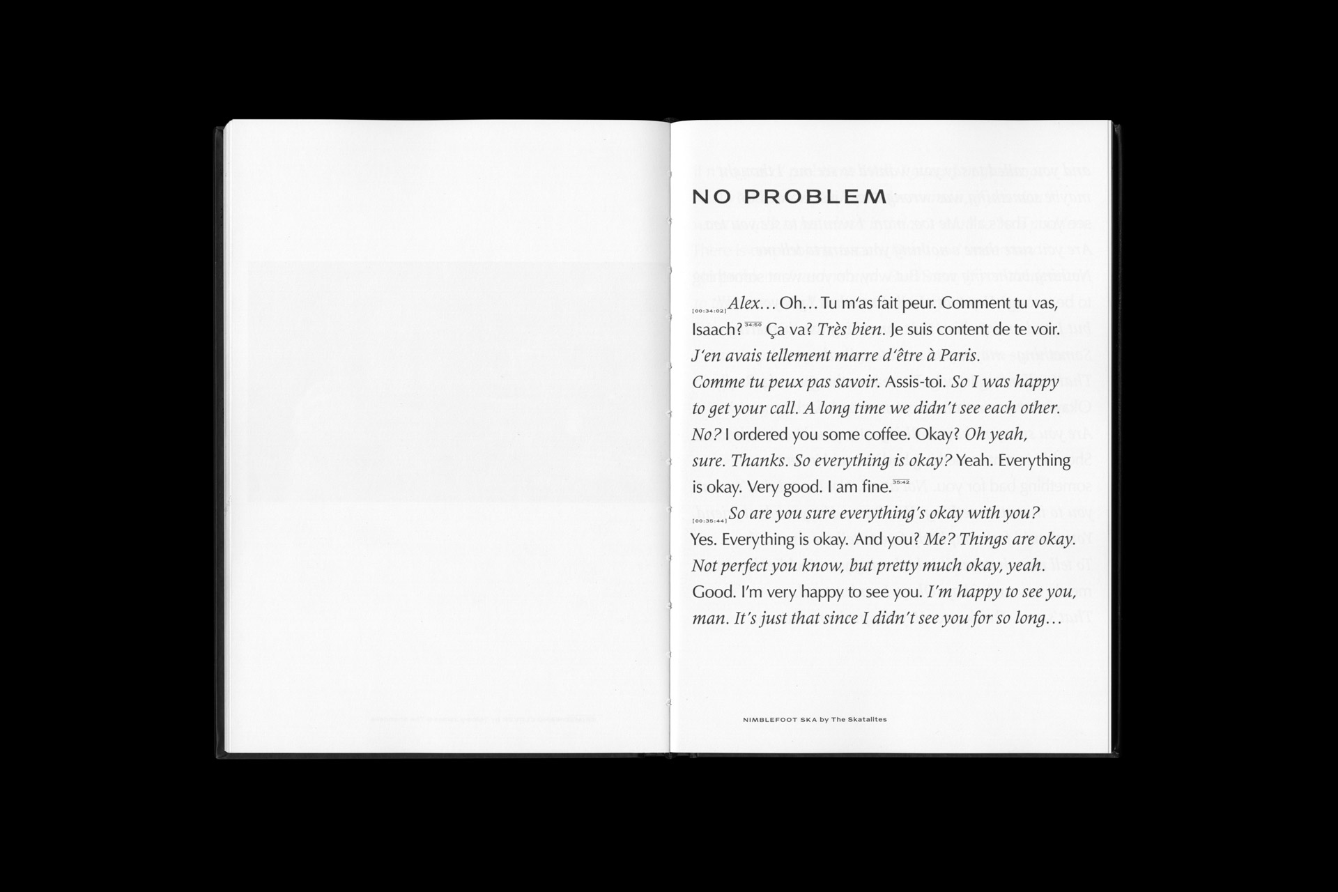
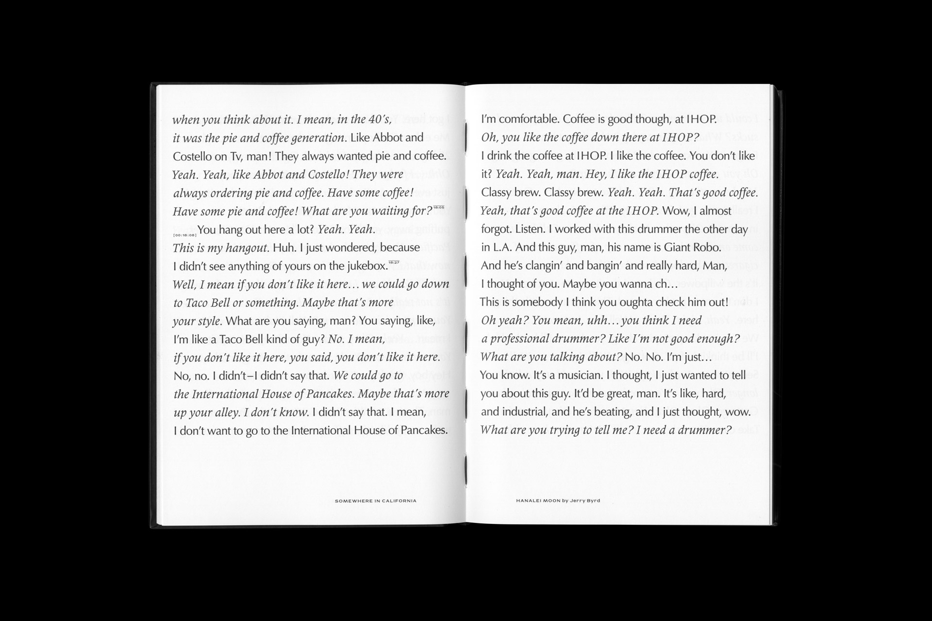
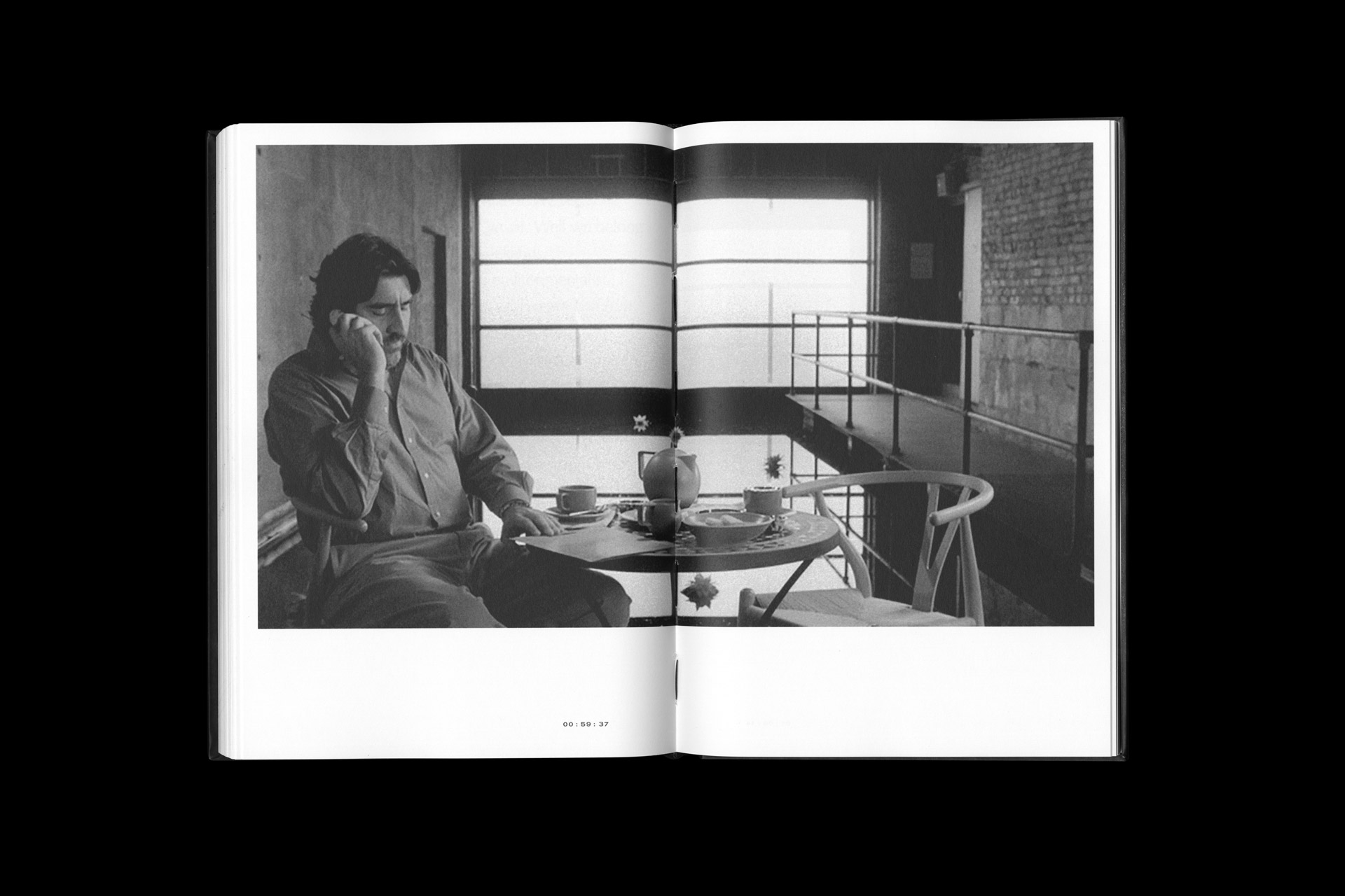
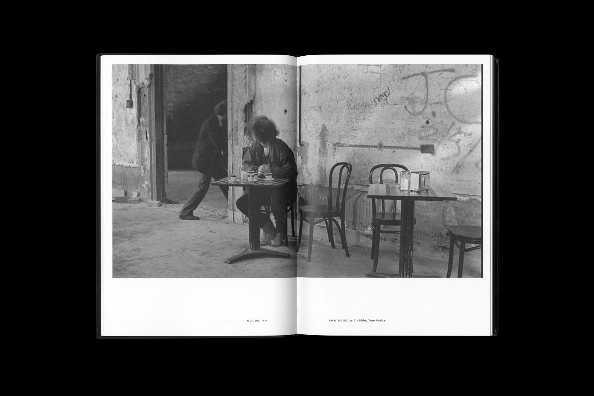
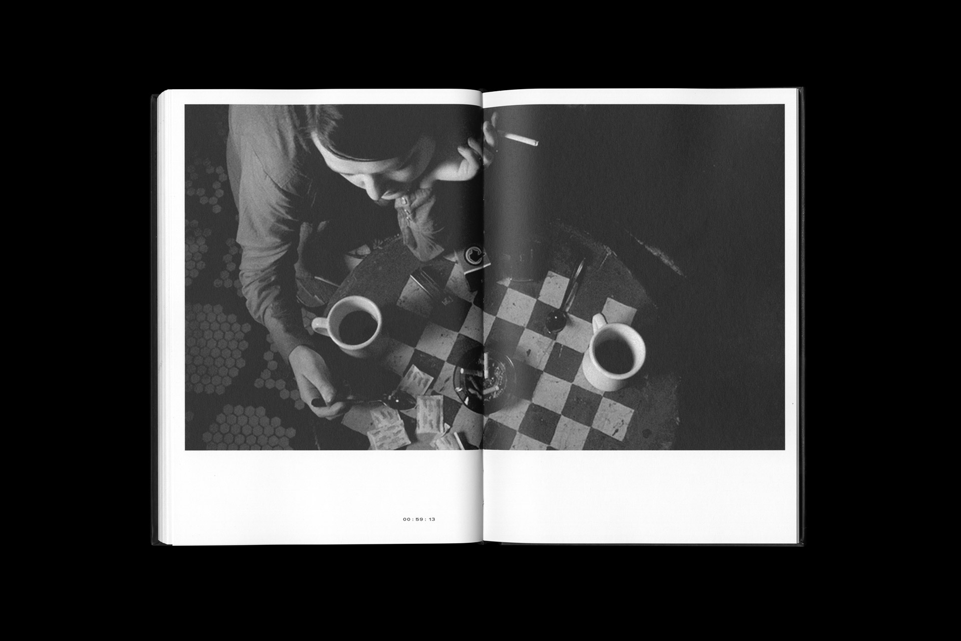
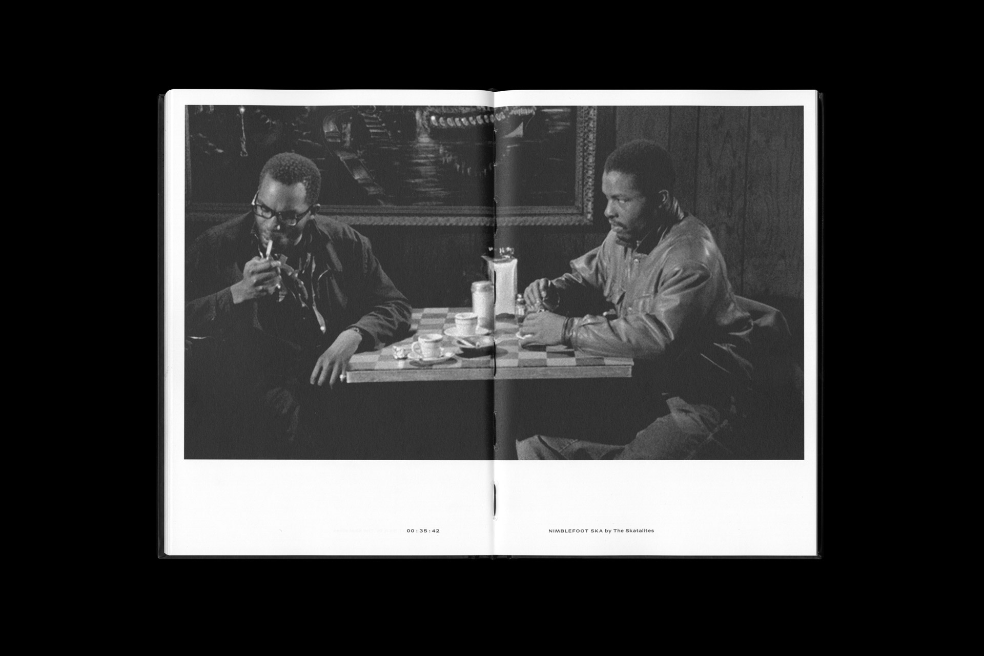
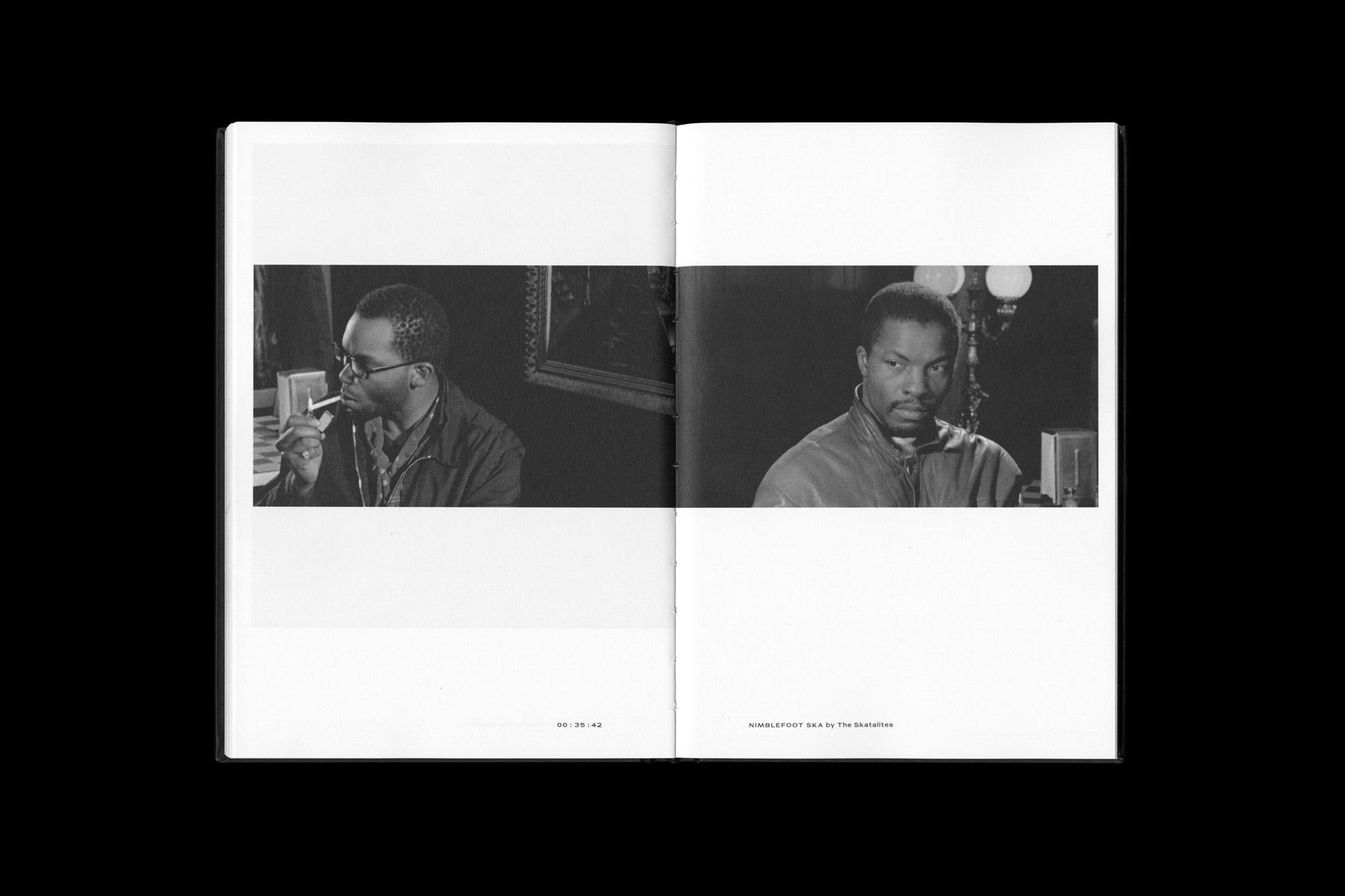
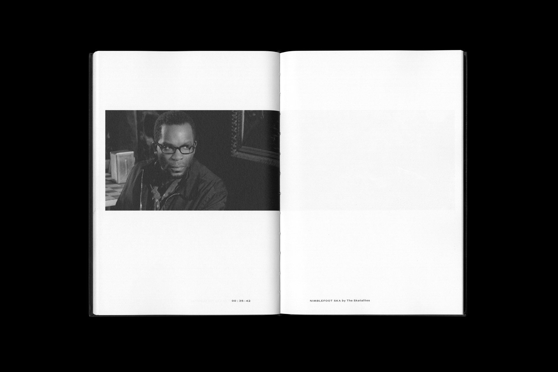
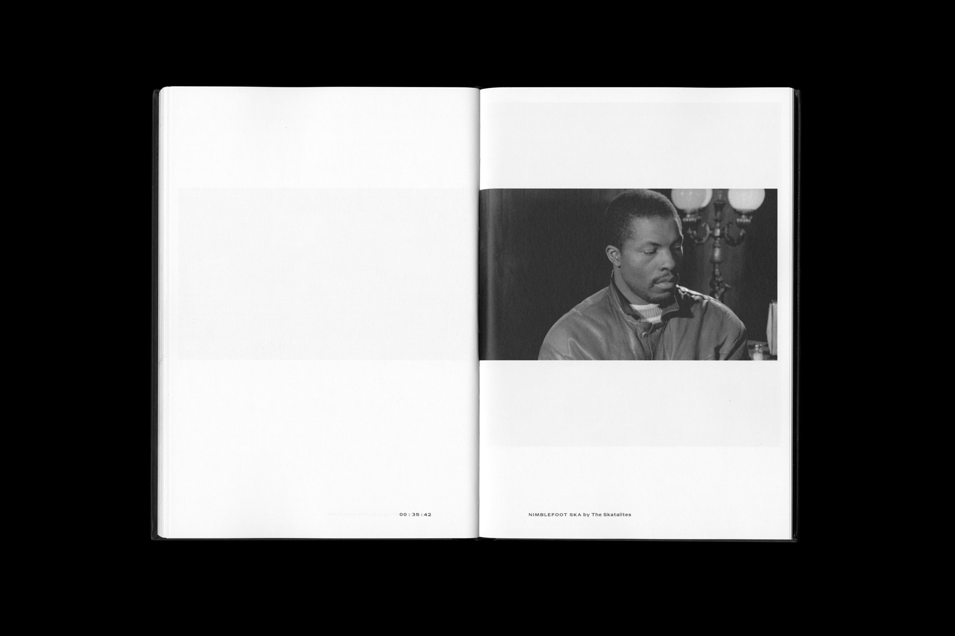
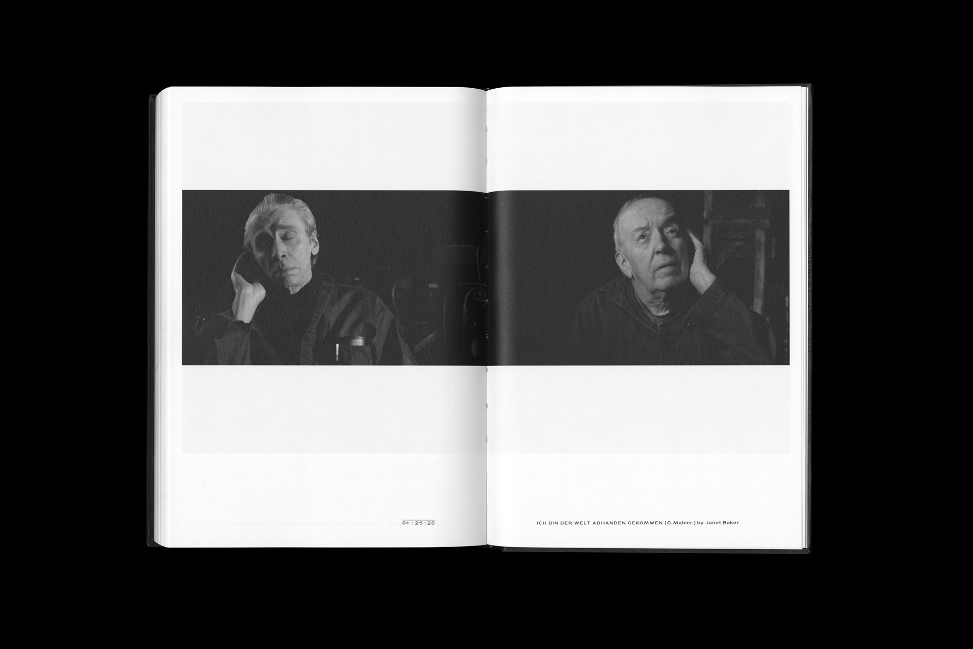
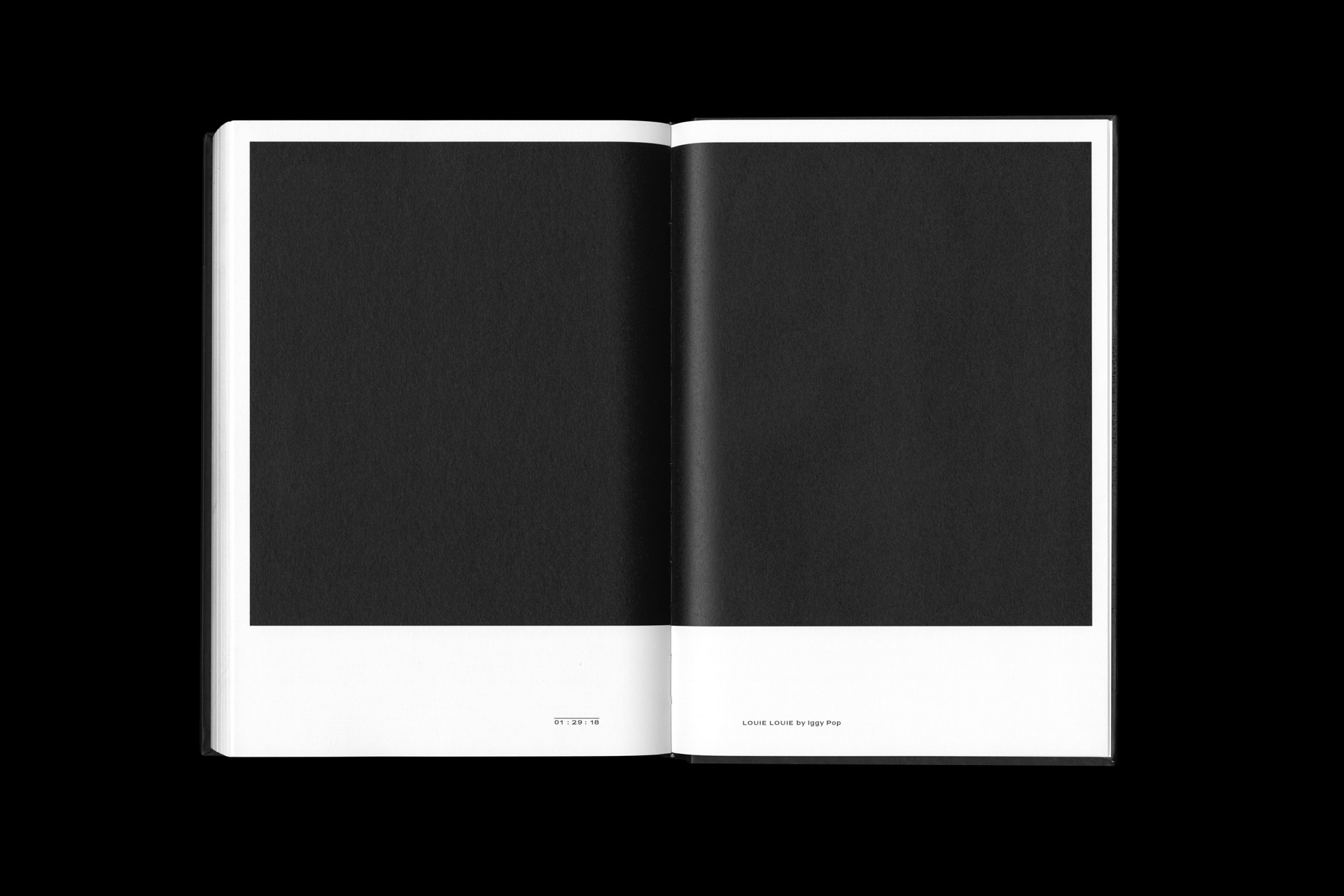
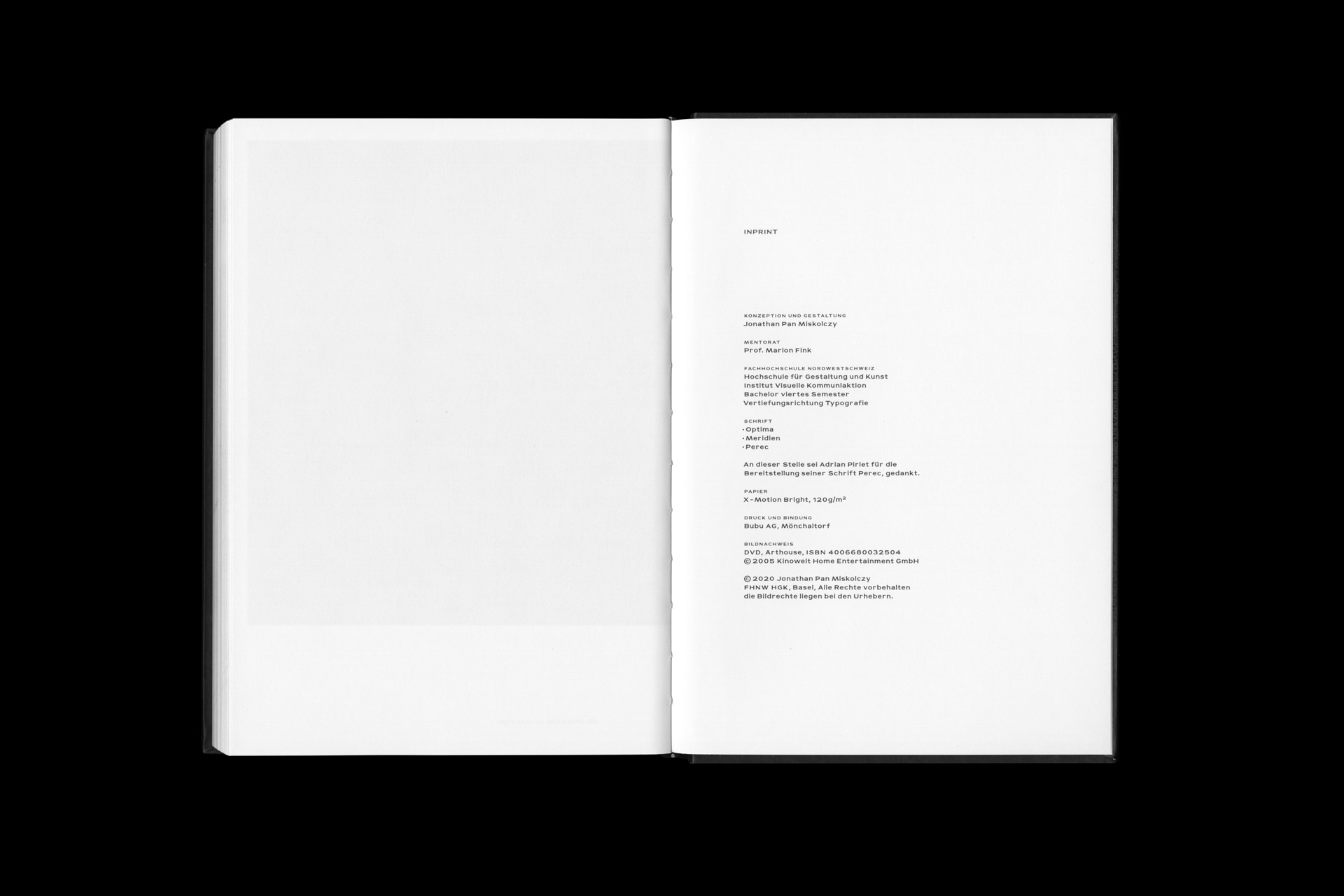
In the movie ‹Coffee and Cigarettes› by Jim Jarmusch ‹dialogue› takes up an important role. I created a book based on the movie in which the script and scenes of the movie come together in a dialogue. In spoken dialogues the text takes the lead, in silent moments the image does. Exact time references of the scenes serve the reader to navigate between text and visual world.


Color Combo
Design Tool
For years, ‹A Dictionary of Color Combinations› by Wada Sanzō (1883–1967) has served as a source of inspiration in my design process. The book presents selected color combinations as square color fields placed side by side, which I enjoy browsing through. The question was: How can these combinations be seamlessly integrated, experimented with, and tested in modern design processes?
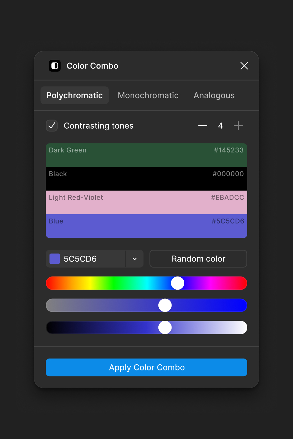
To answer that, I began developing a tool, building on Wada Sanzō's color harmonies. It's evolved to let you generate color combos from any primary color using different harmony rules: polychromatic (complementary, triadic, square), monochromatic, and analogous. You can try it out on Figma or in the browser on GitHub Pages.


Decisive Moments in History
Book Design
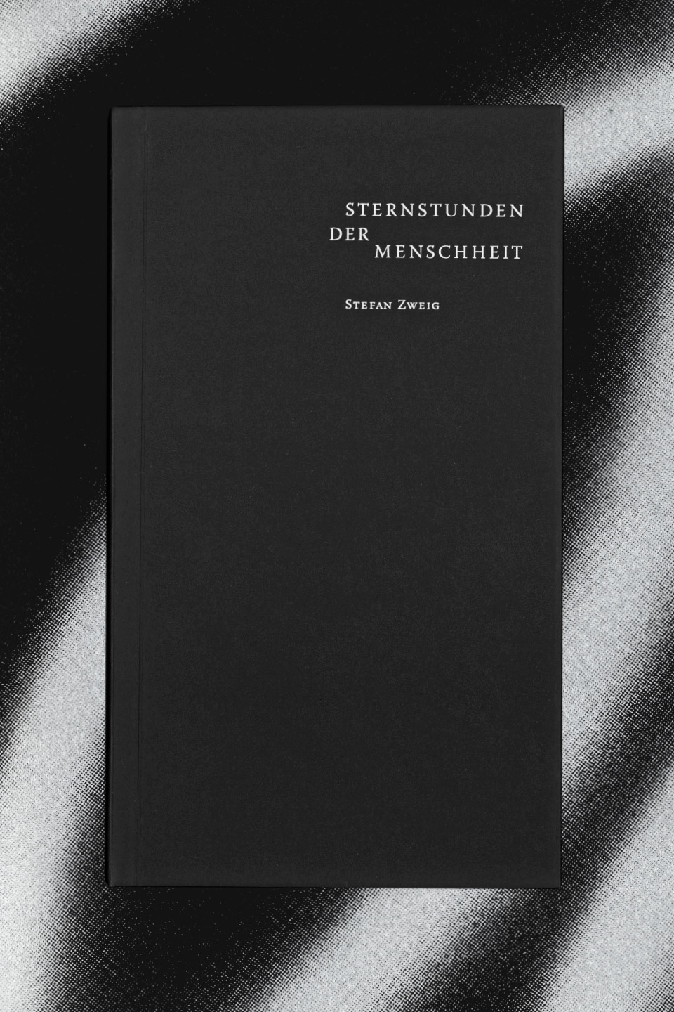
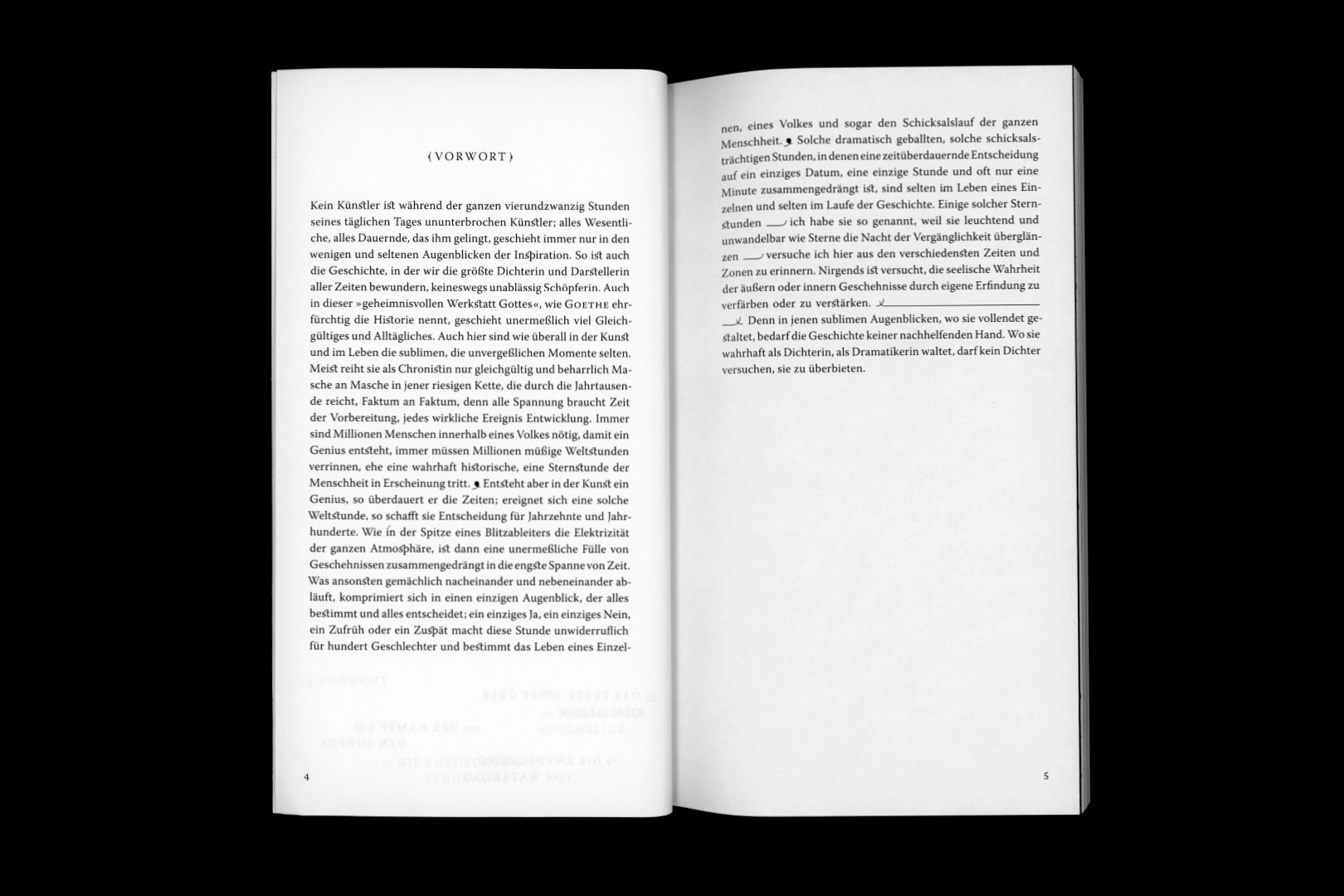
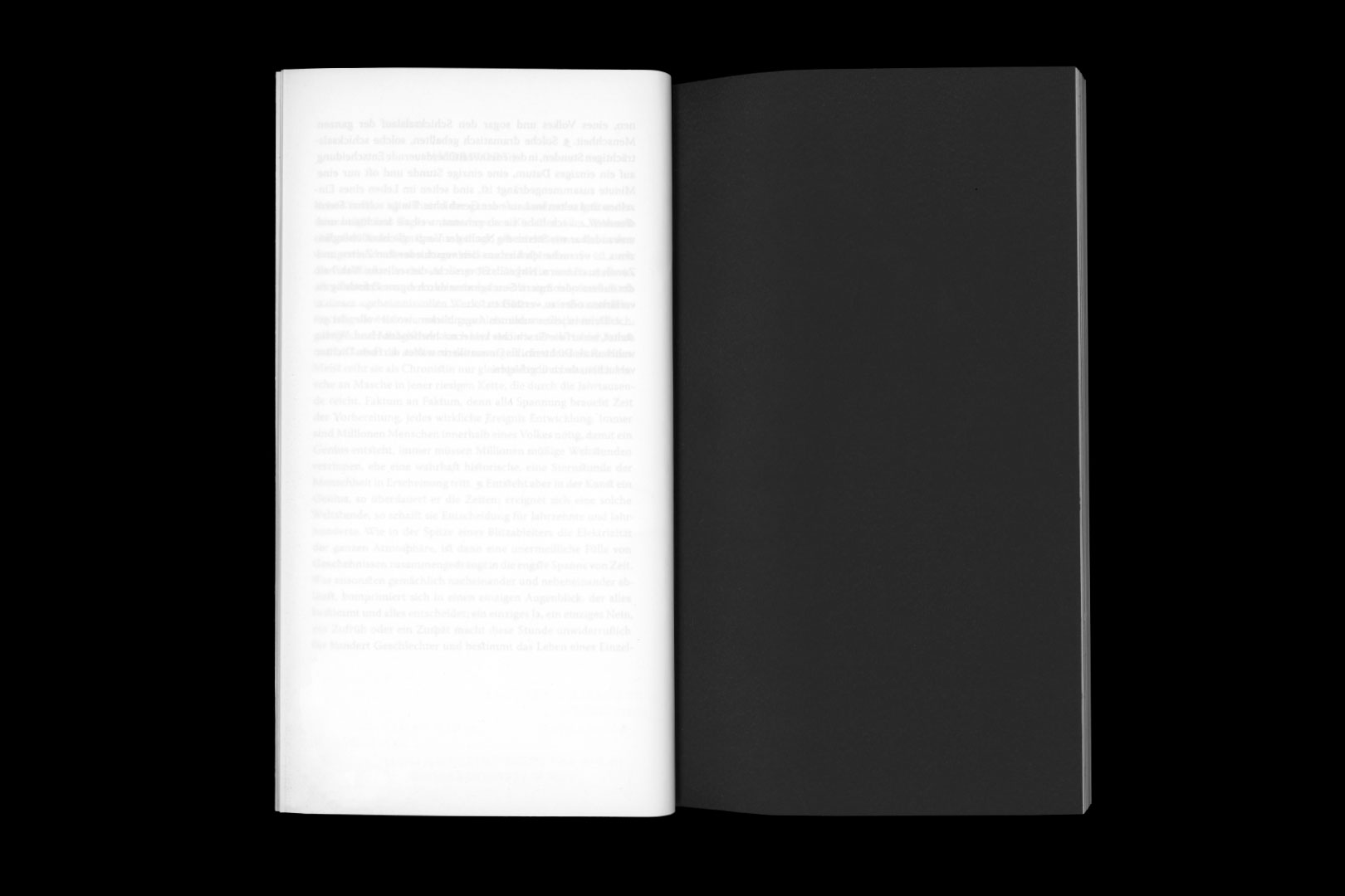
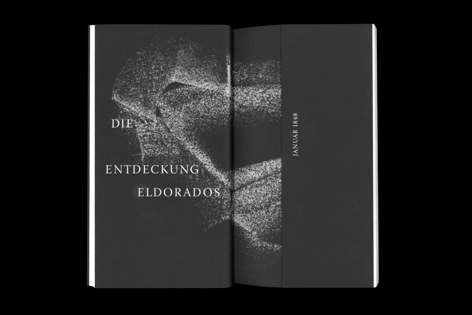
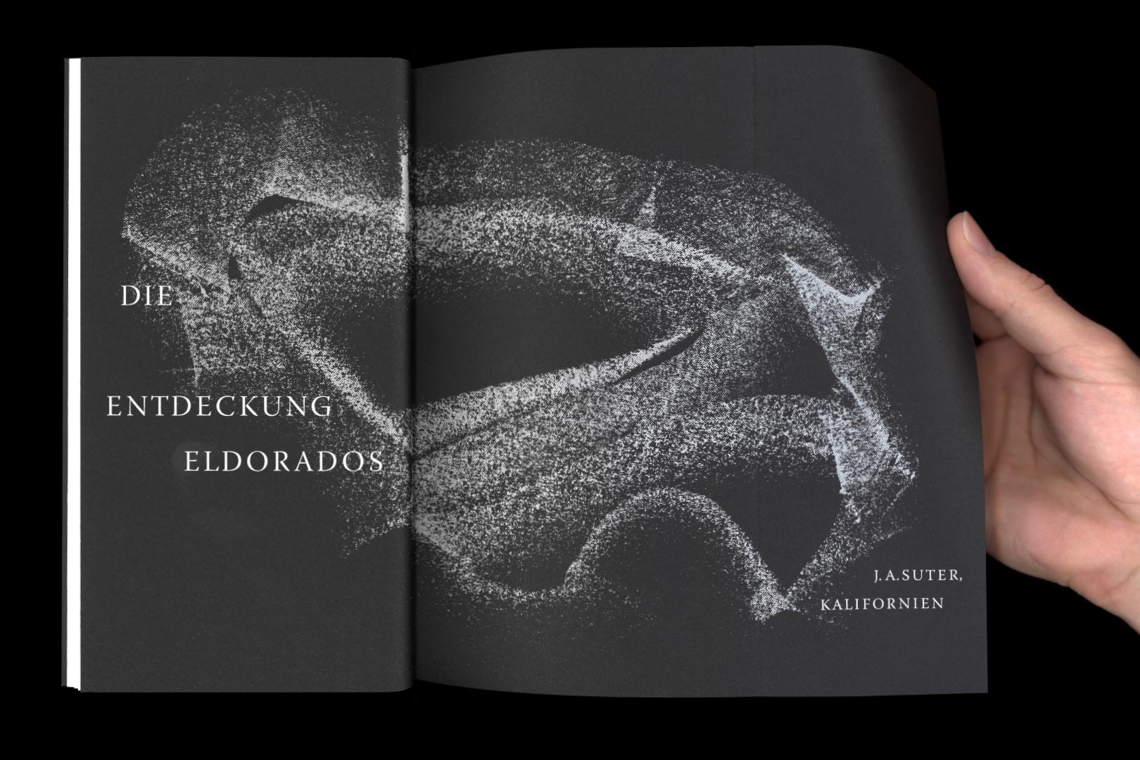
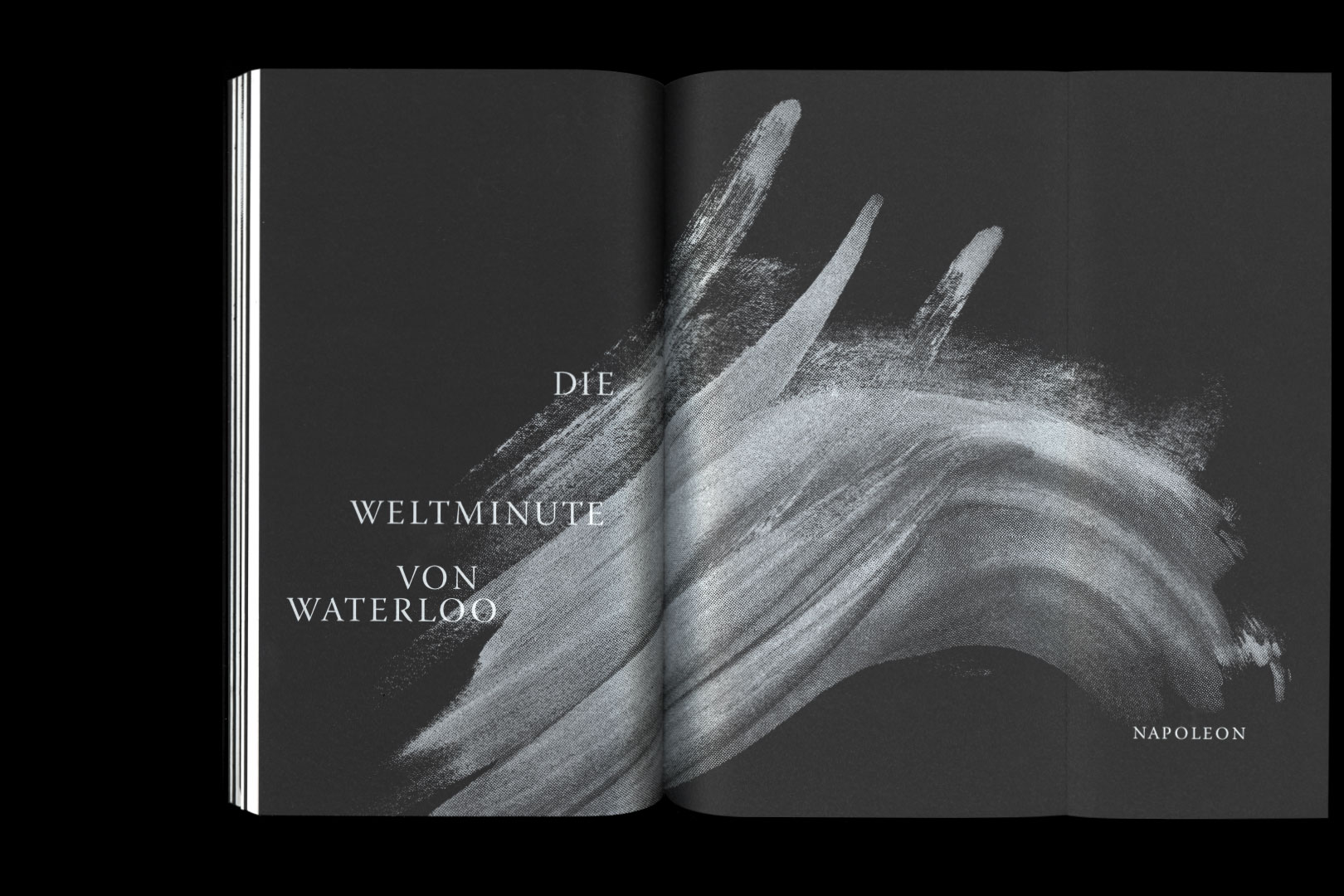
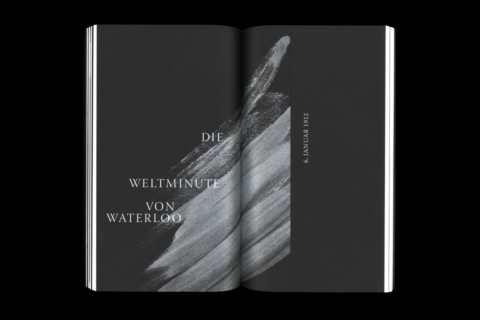
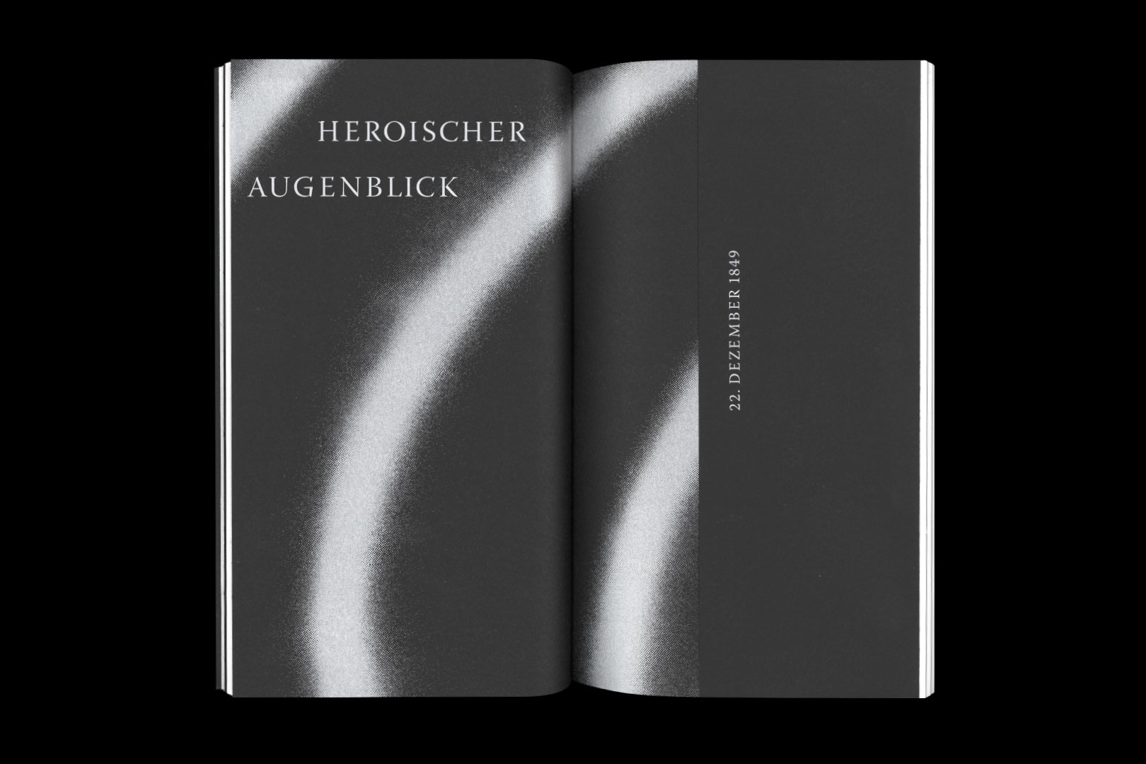
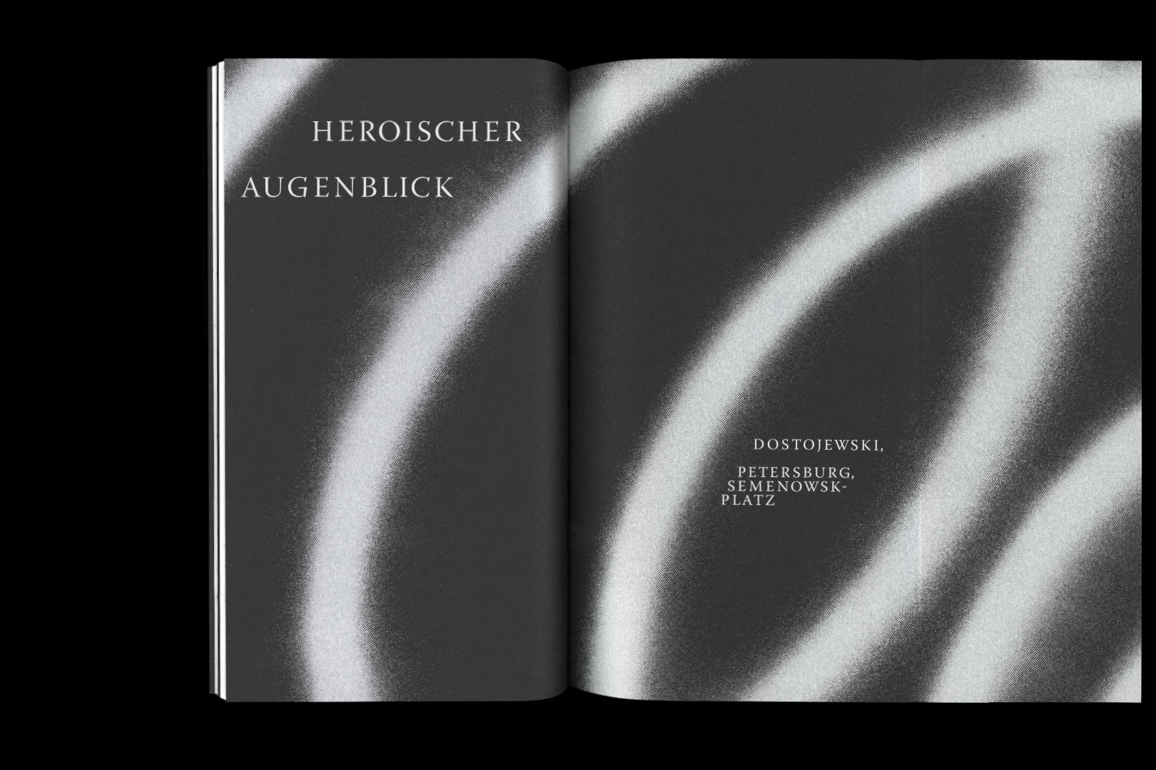
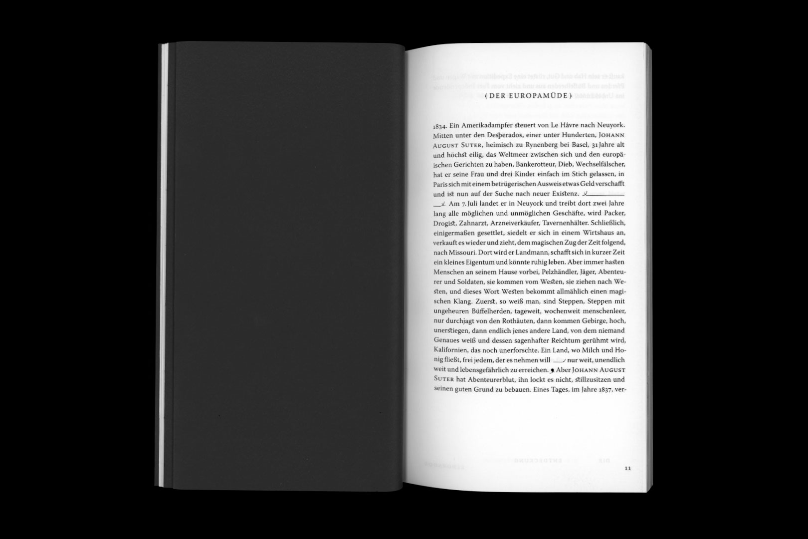
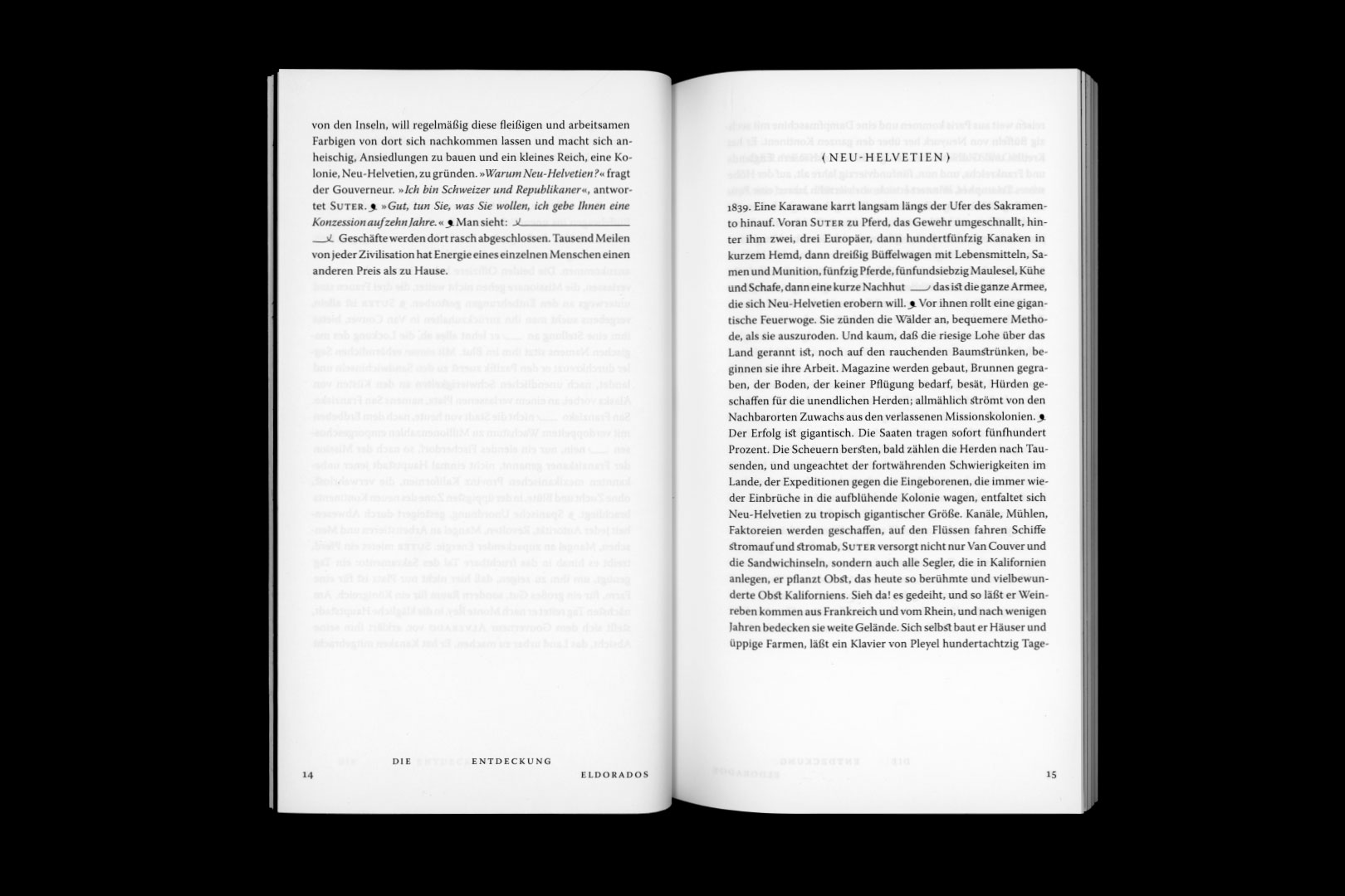
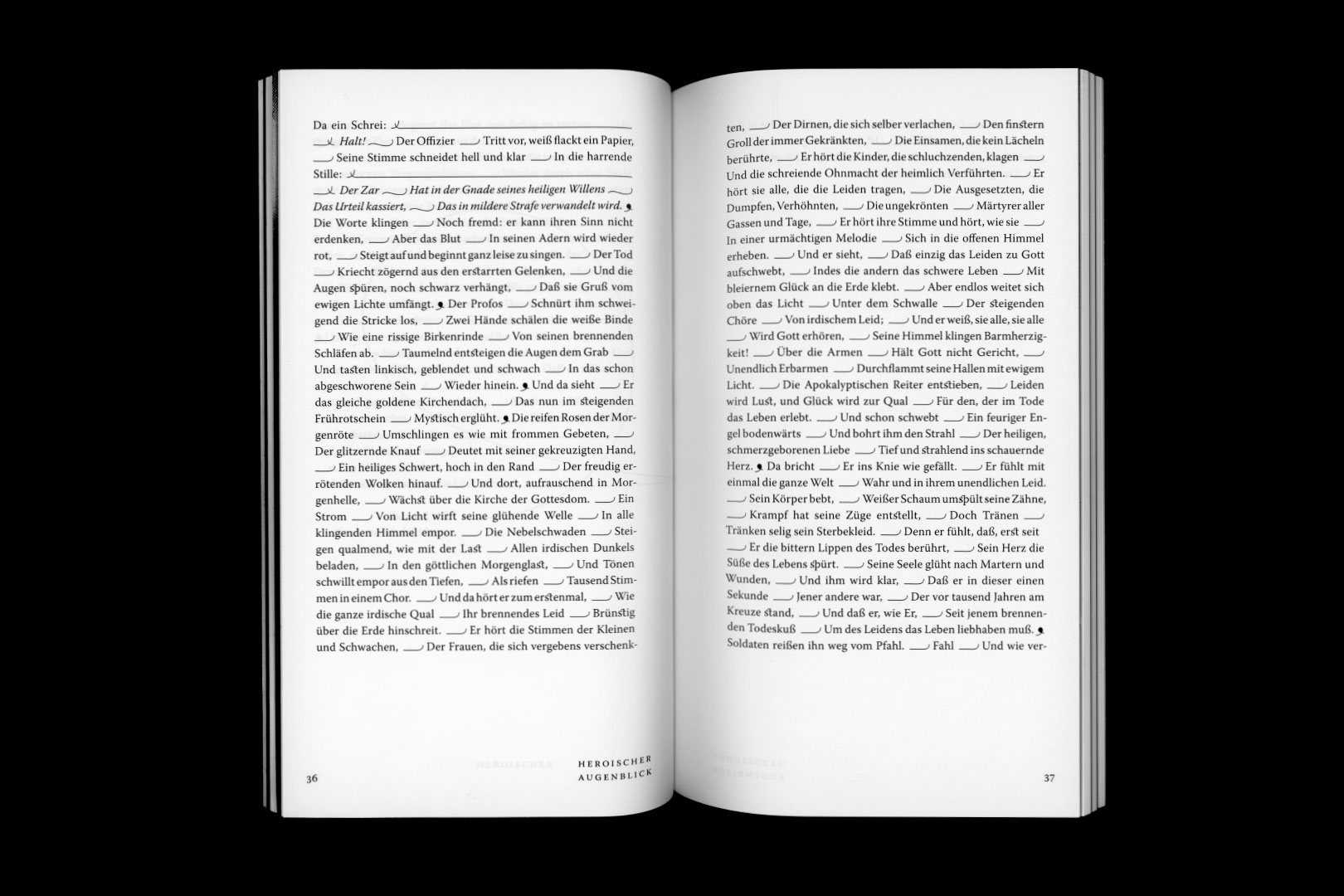
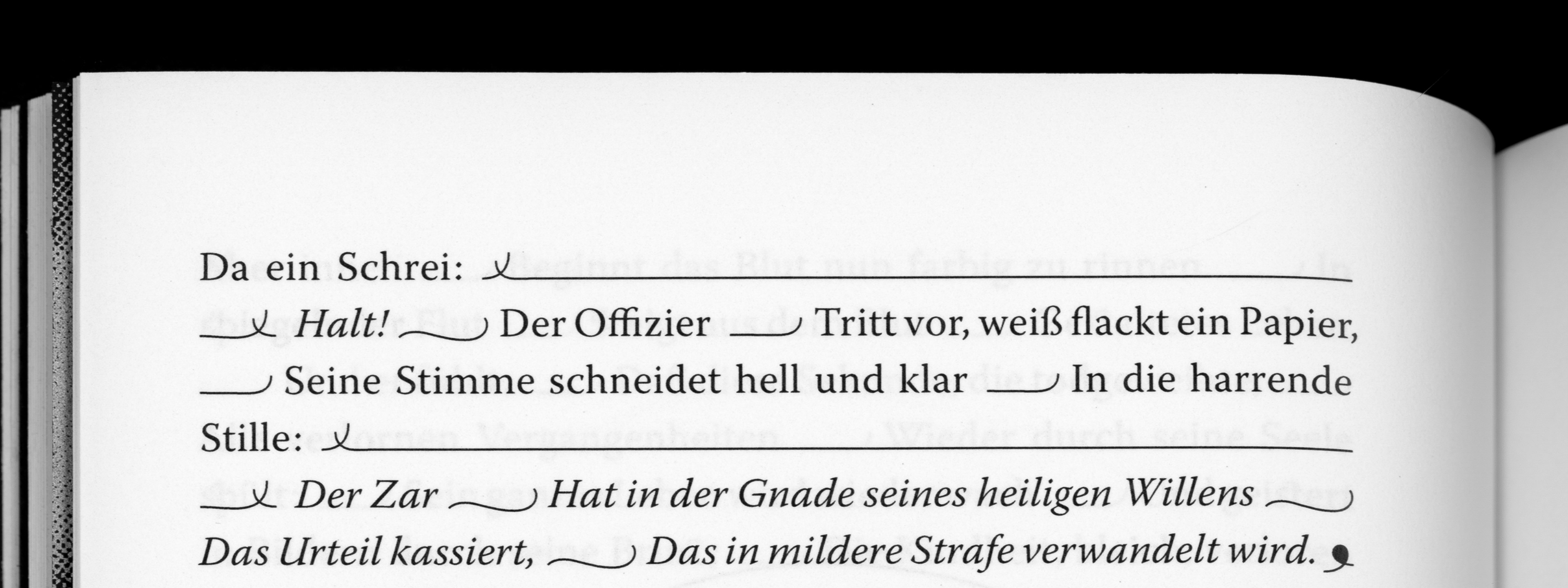
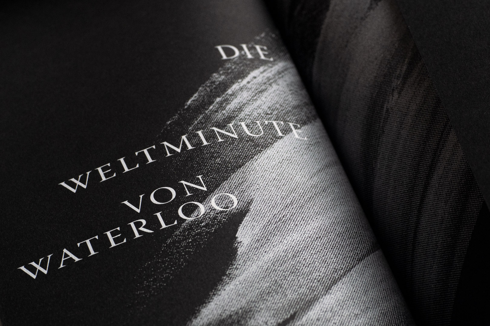
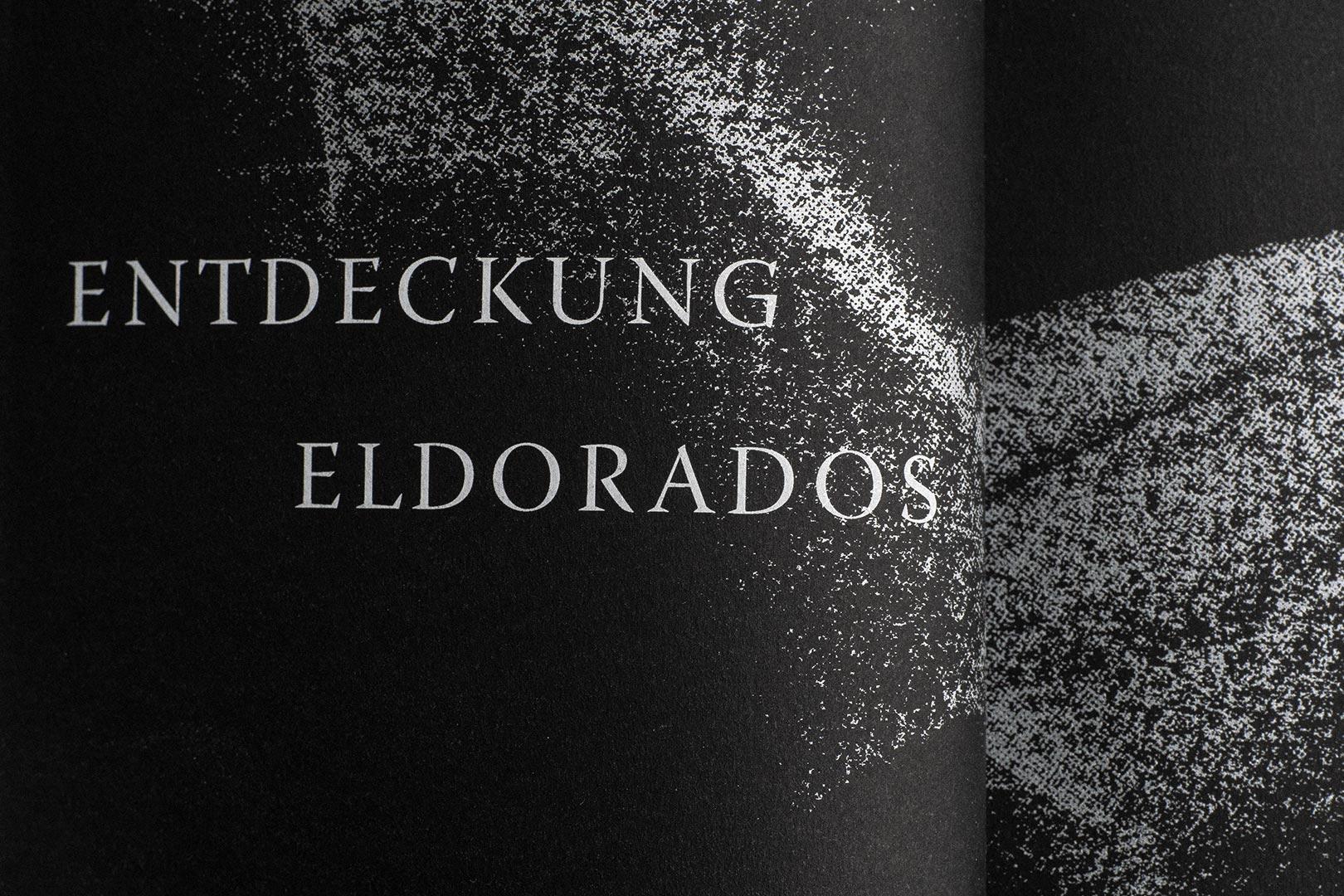
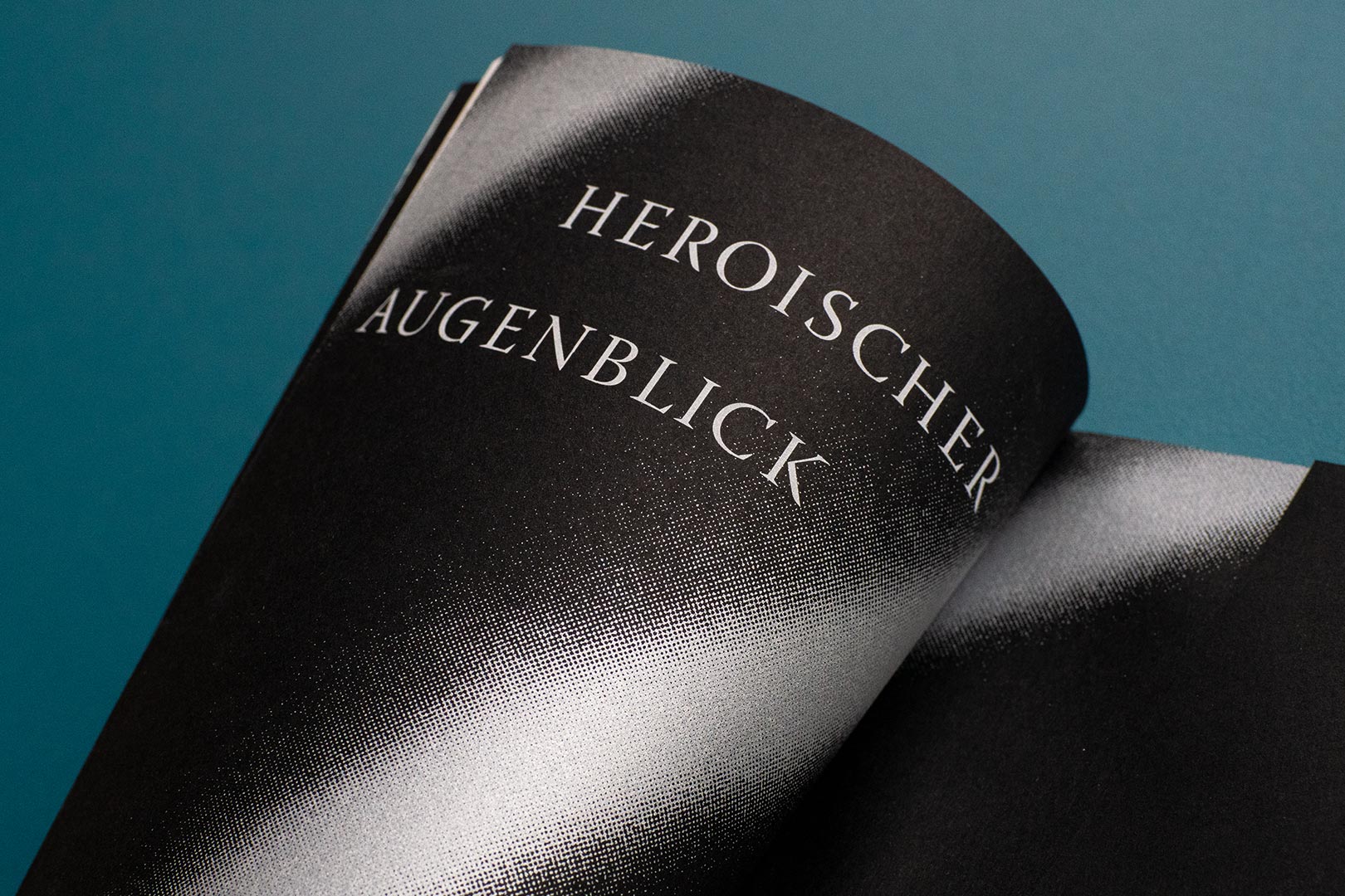
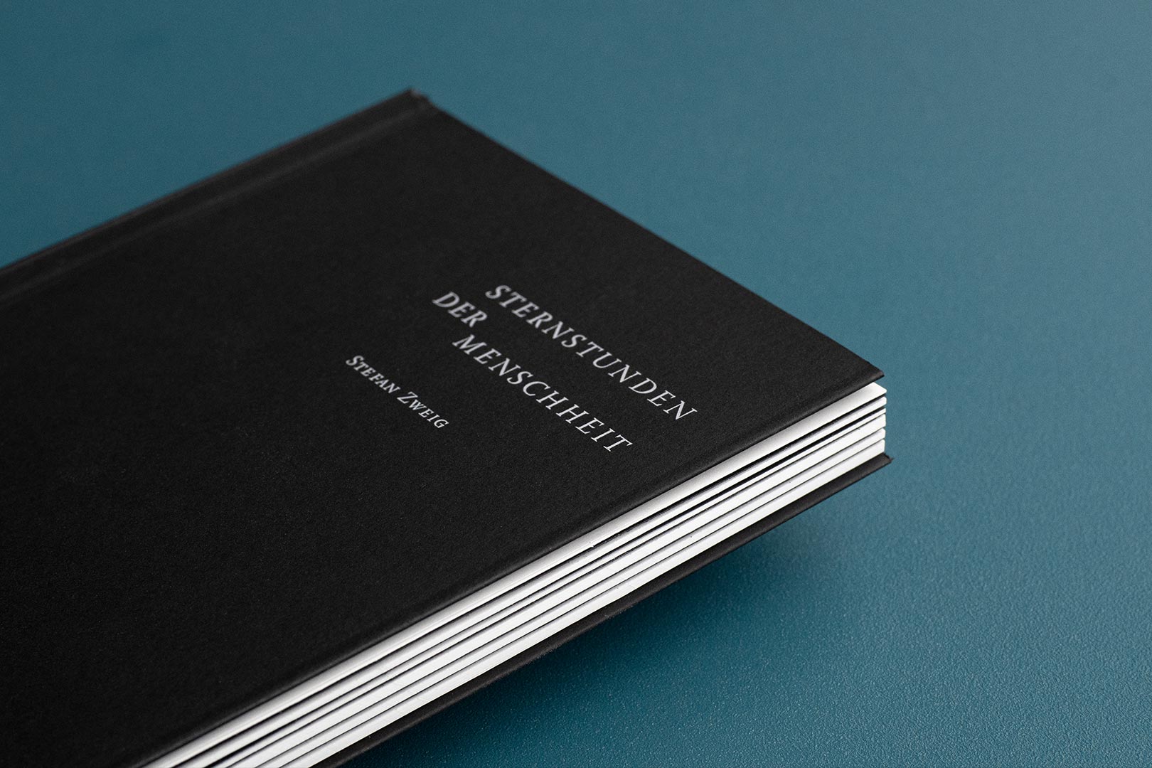
Within my typographical book design lessons, I tried to grapple with five of fourteen short stories of the book ‹Decisive Moments in History› written by Stefan Zweig. His metaphorical and playful way of writing fascinated me a lot while reading. I was thinking that in order to connect his unique style of writing with my design, I would have to inhibit the reader from consuming the text too rapidly and therefore inspire the reader to contemplate and linger.
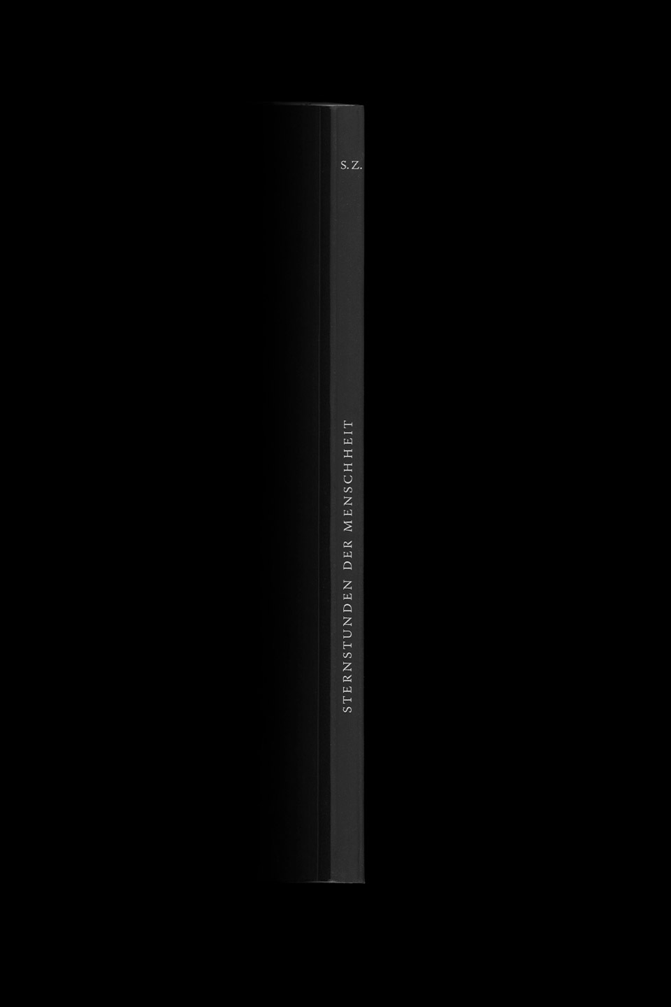
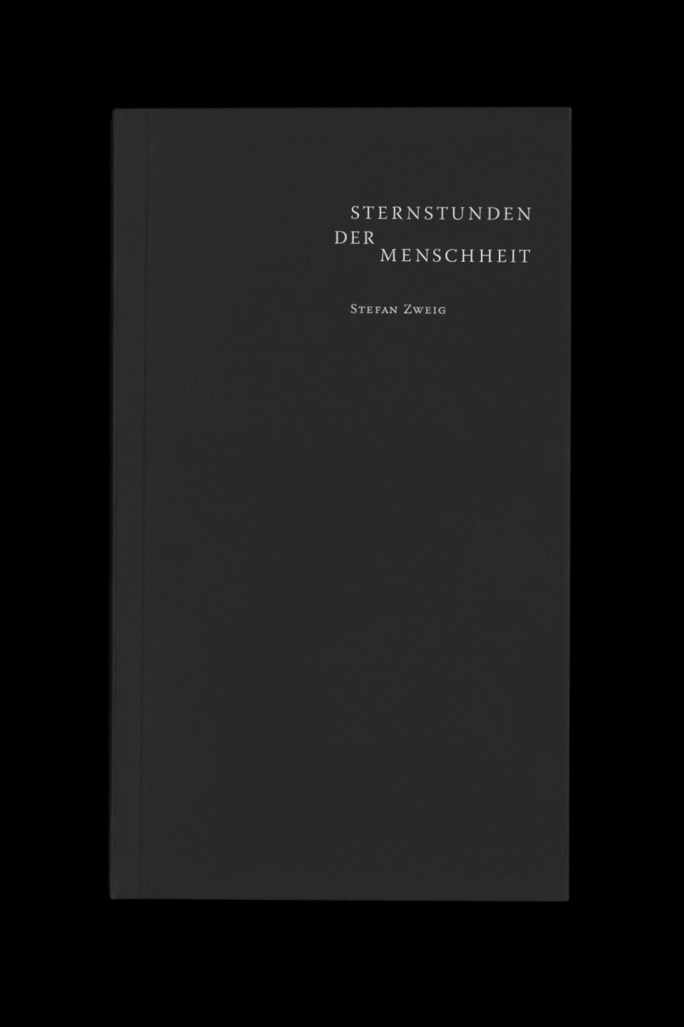
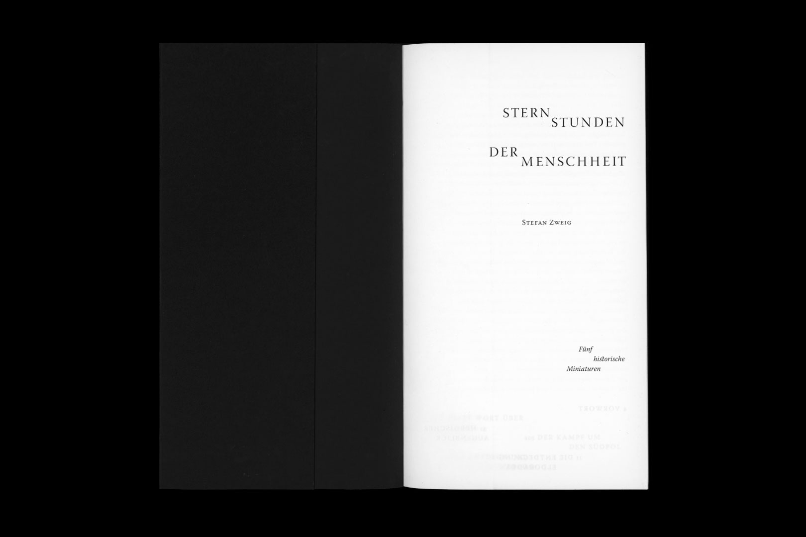
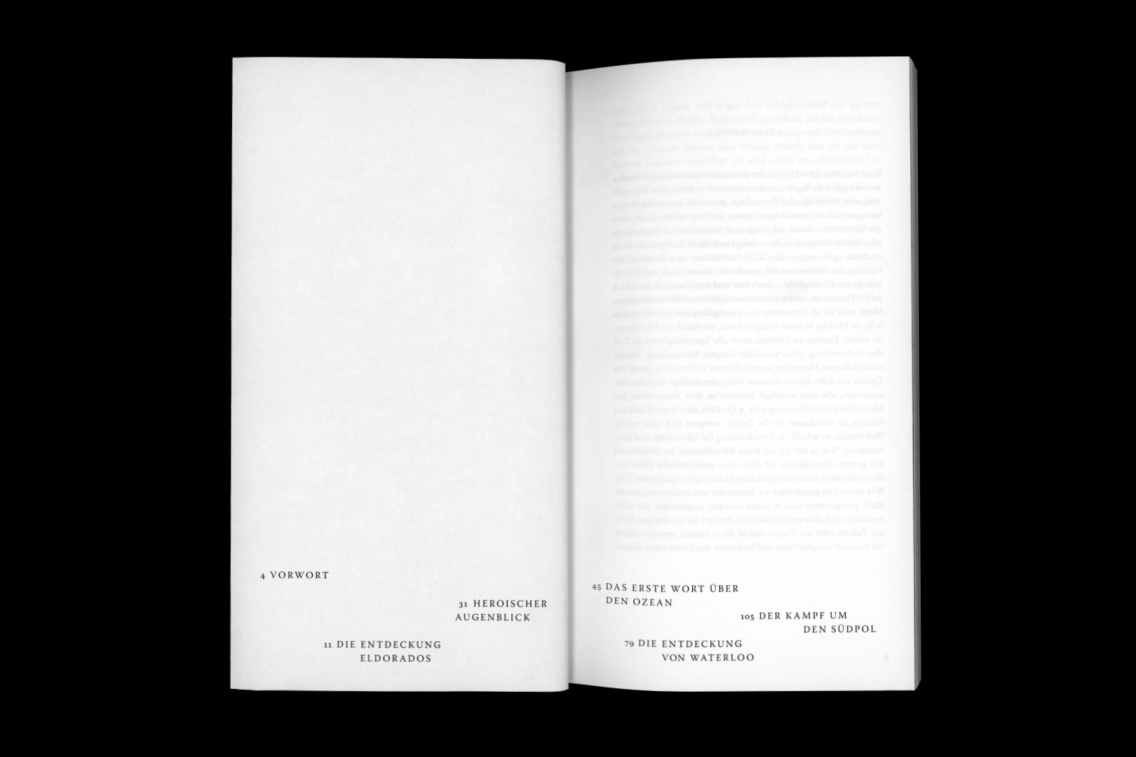
DornSans
Type Design
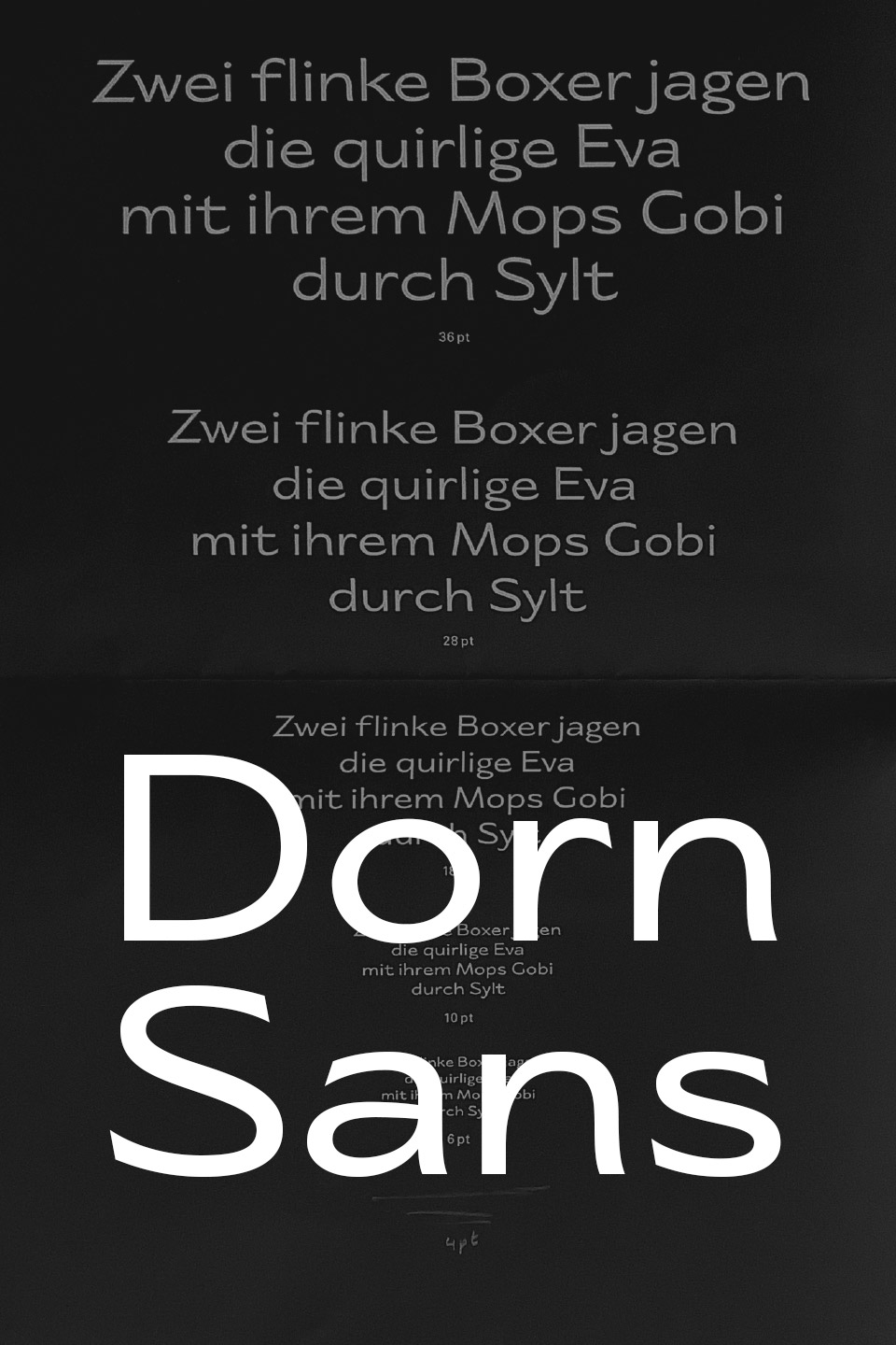
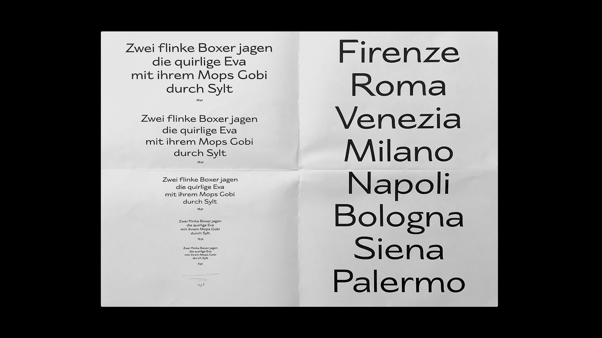
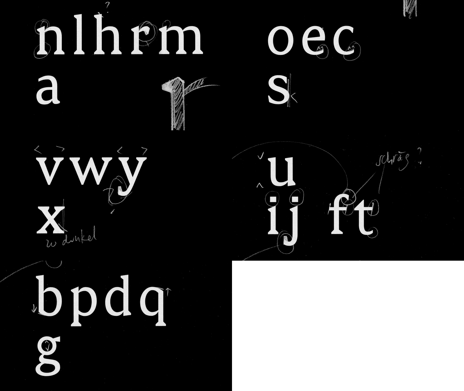
The Display Typeface, ‹Dorn Sans›, is inspired by handwriting with a pen on paper, swiftly written with a slightly angled holding of the pen. This way of writing makes the Typeface appear wide and dynamic. The curvy ends of the letters are slanted and have sharp spikes like thorns. Furthermore, the counters of the letters (e.g. bpdq) are asymmetrical and teardrop-shaped and therefore appear floral. Professor Philipp Stamm as my mentor supervised this typographical project.




Families of Circles
Motion Design
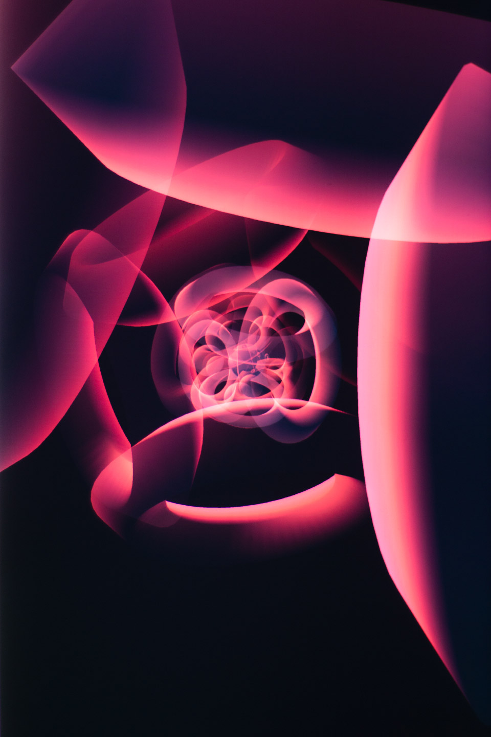
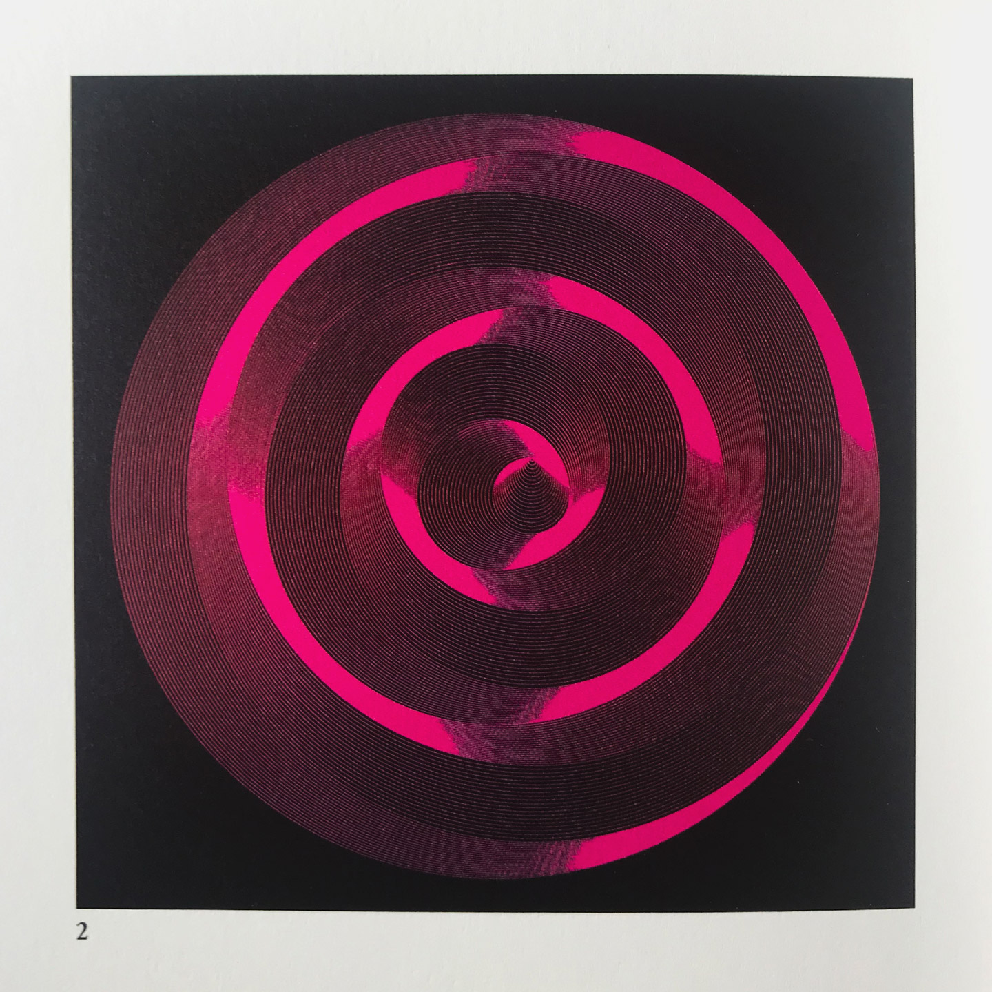
Based on the computer-generated artwork ‹Families of Circles I› by Aron Warszawski in 1972, I have developed an audio visualization. The visualization was programmed in Javascript and the library p5.js. In the process of recreation, the desire to capture movement and return to the static image emerged. Therefore I decided to photograph my screen with long exposure time.











Fox Paw
Design System
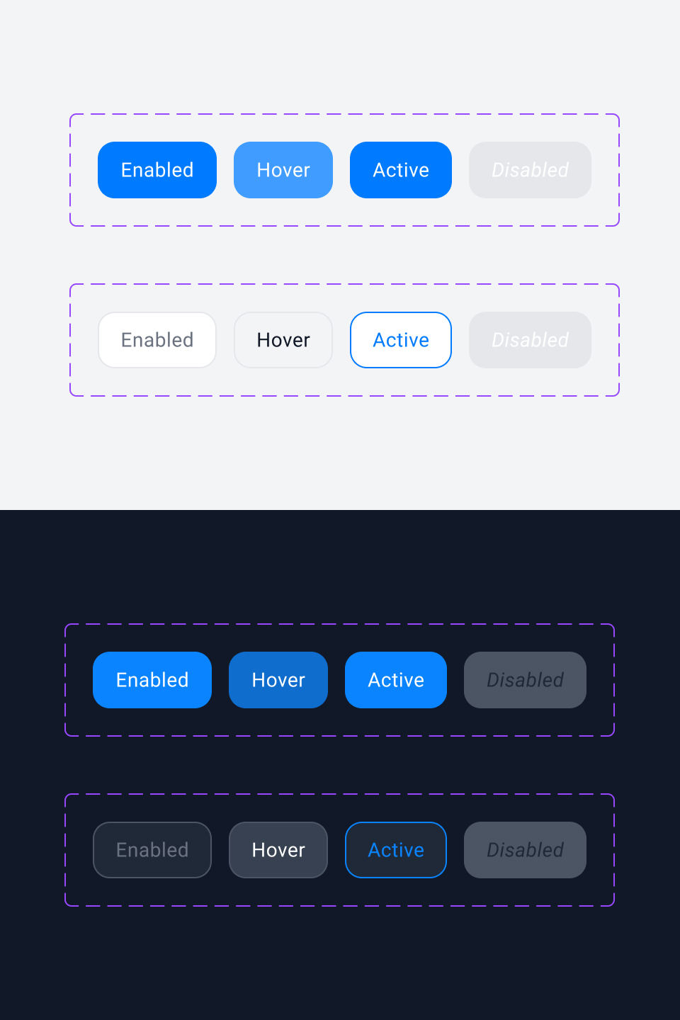
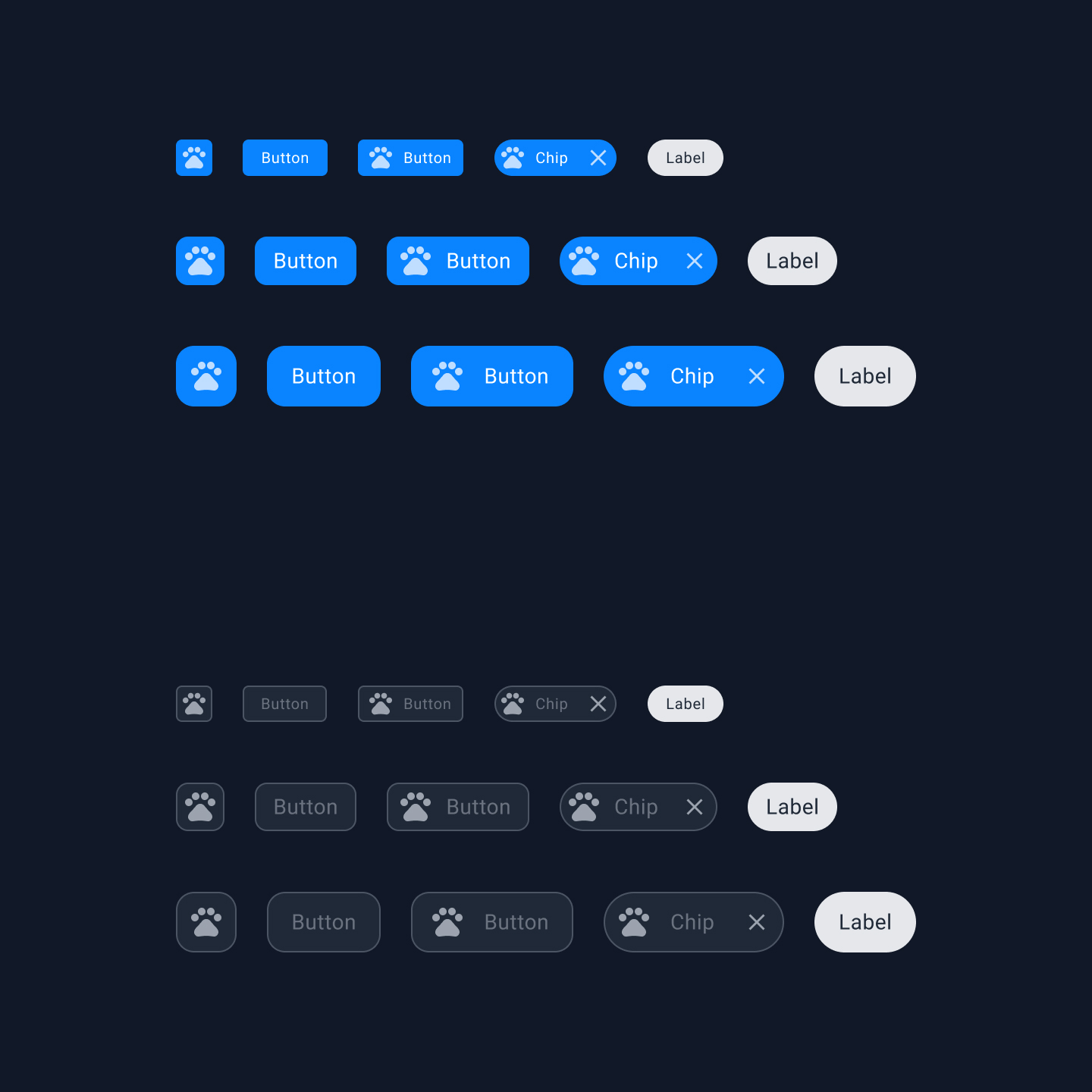
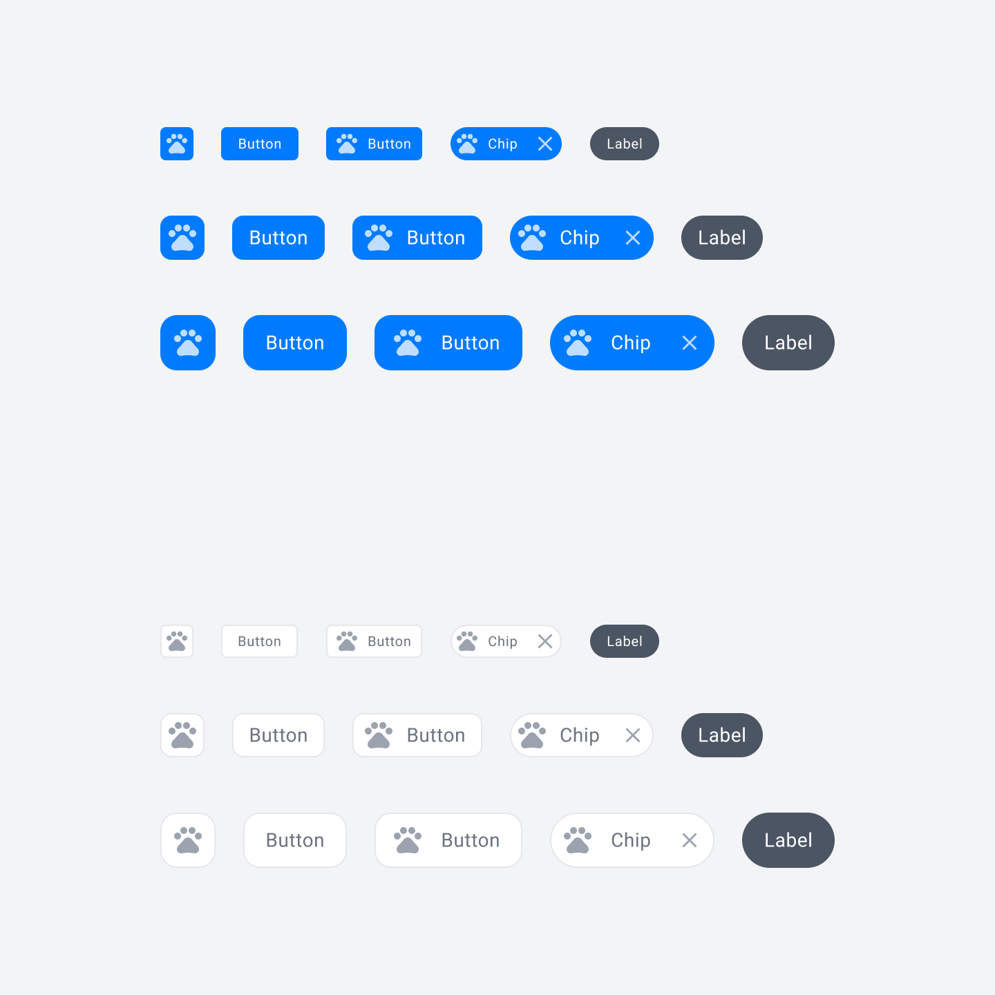
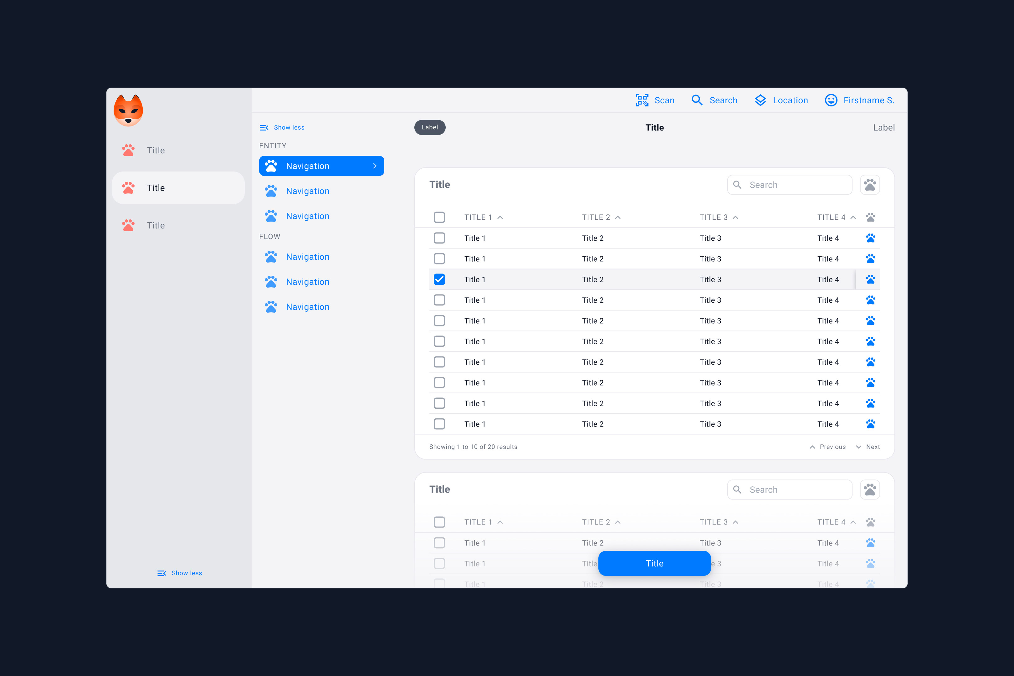
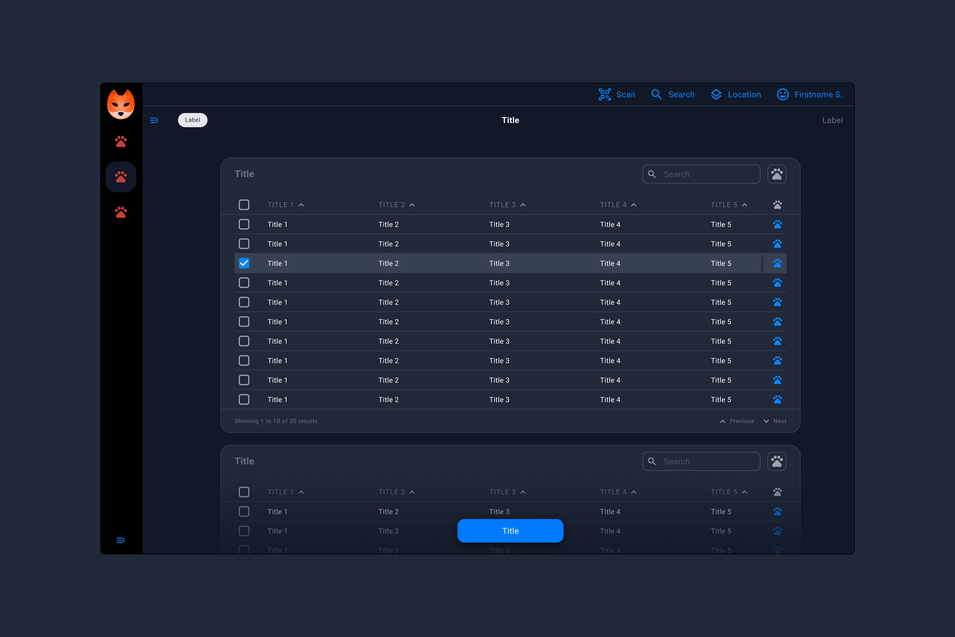
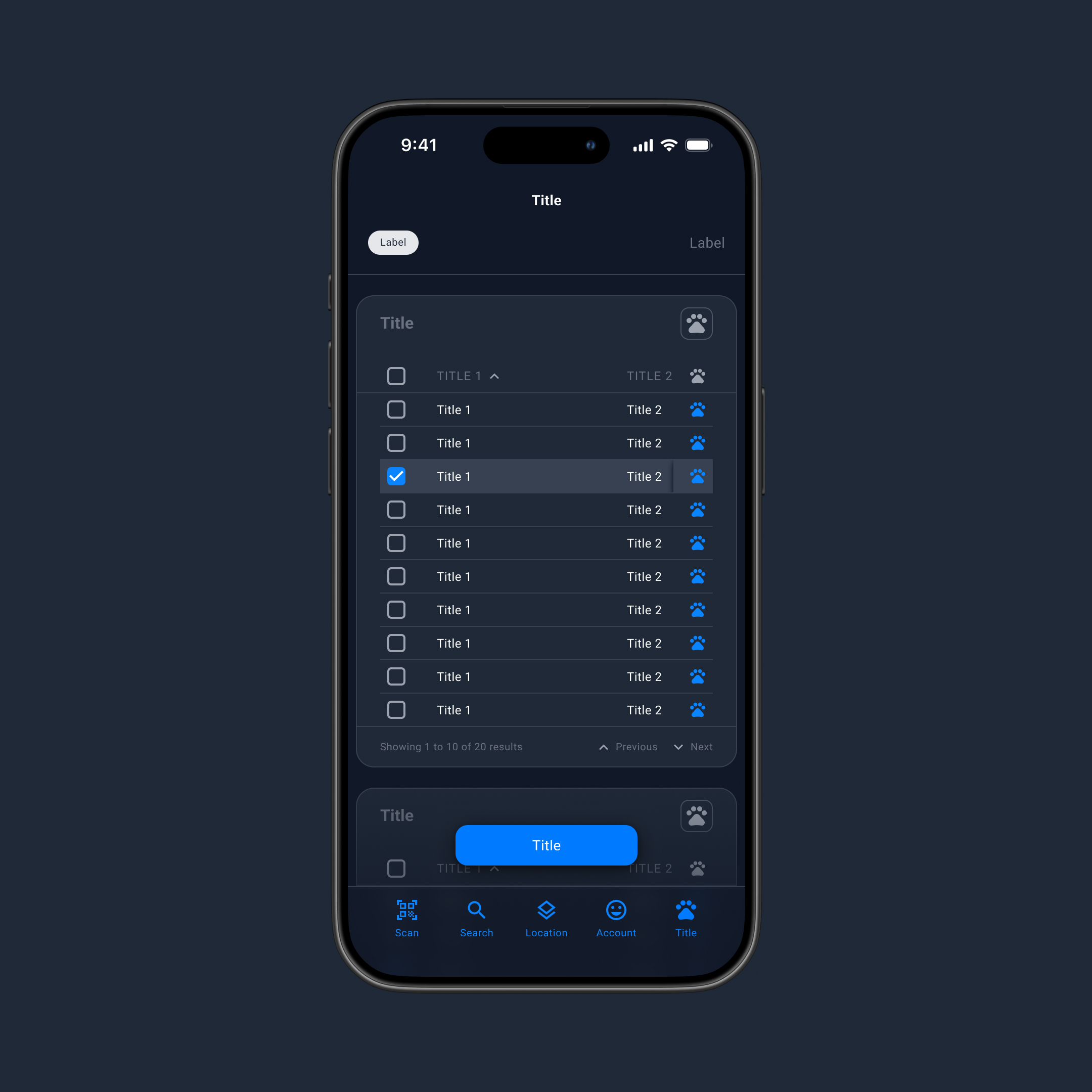
Paw is Revendo’s first design system for their own digital products, like the inventory management software called Fox. The design system Paw consists of components, interfaces and prototypes, which come in light and dark mode. You can open the design resources in Figma.



Justified text on the web
Type Design
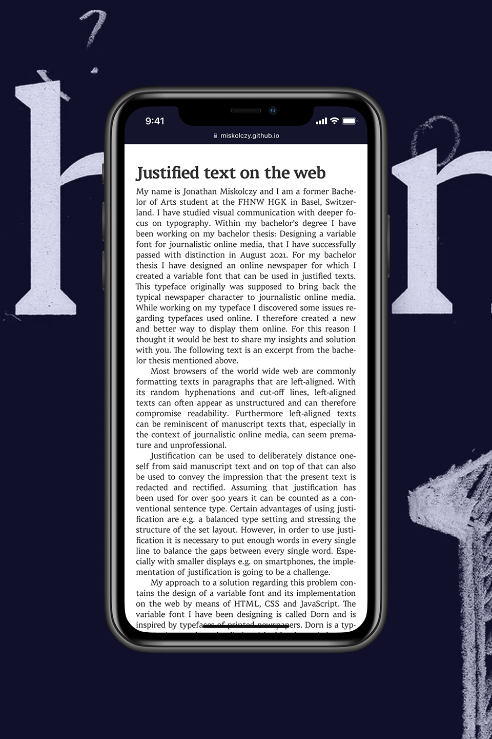
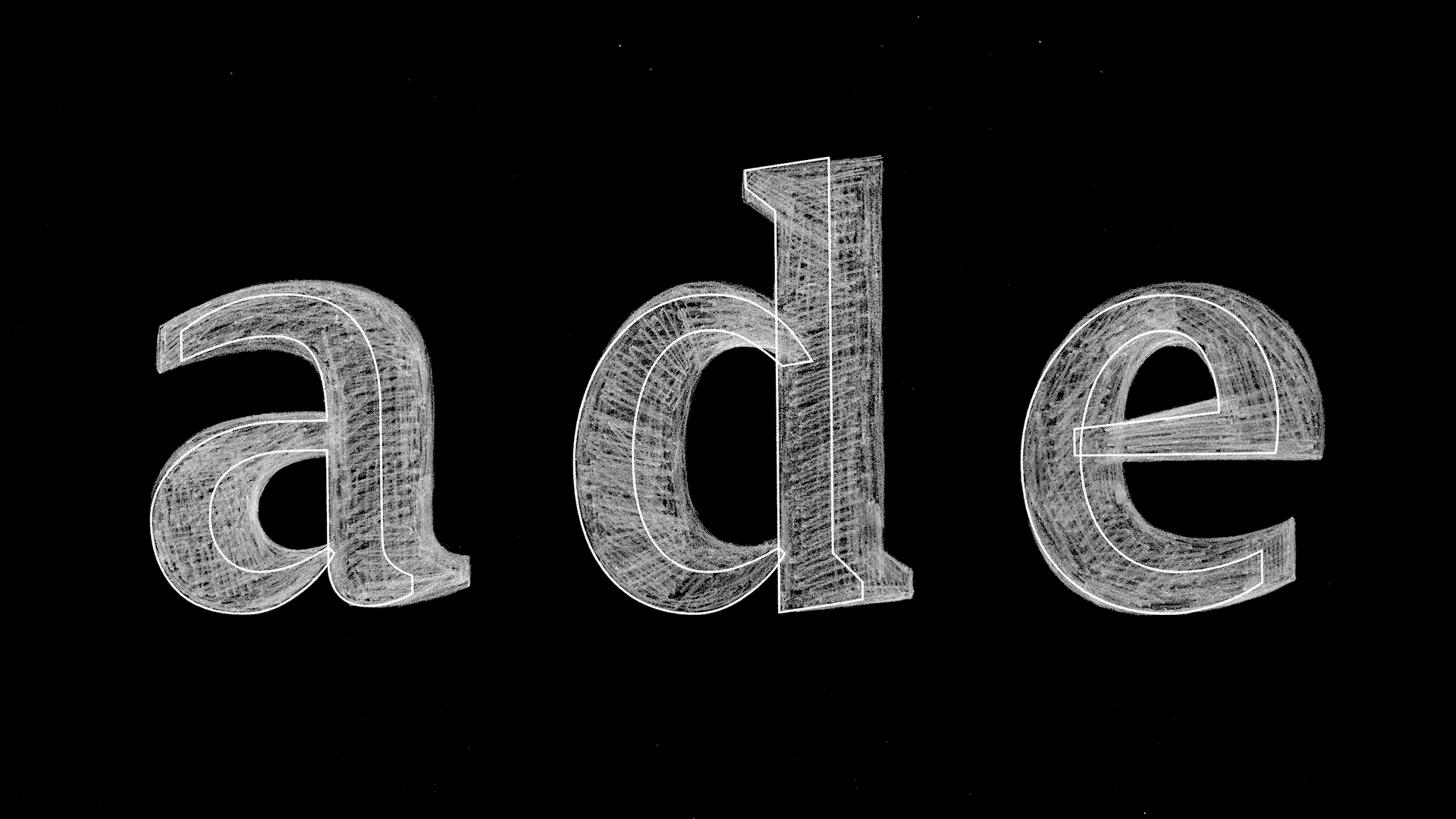
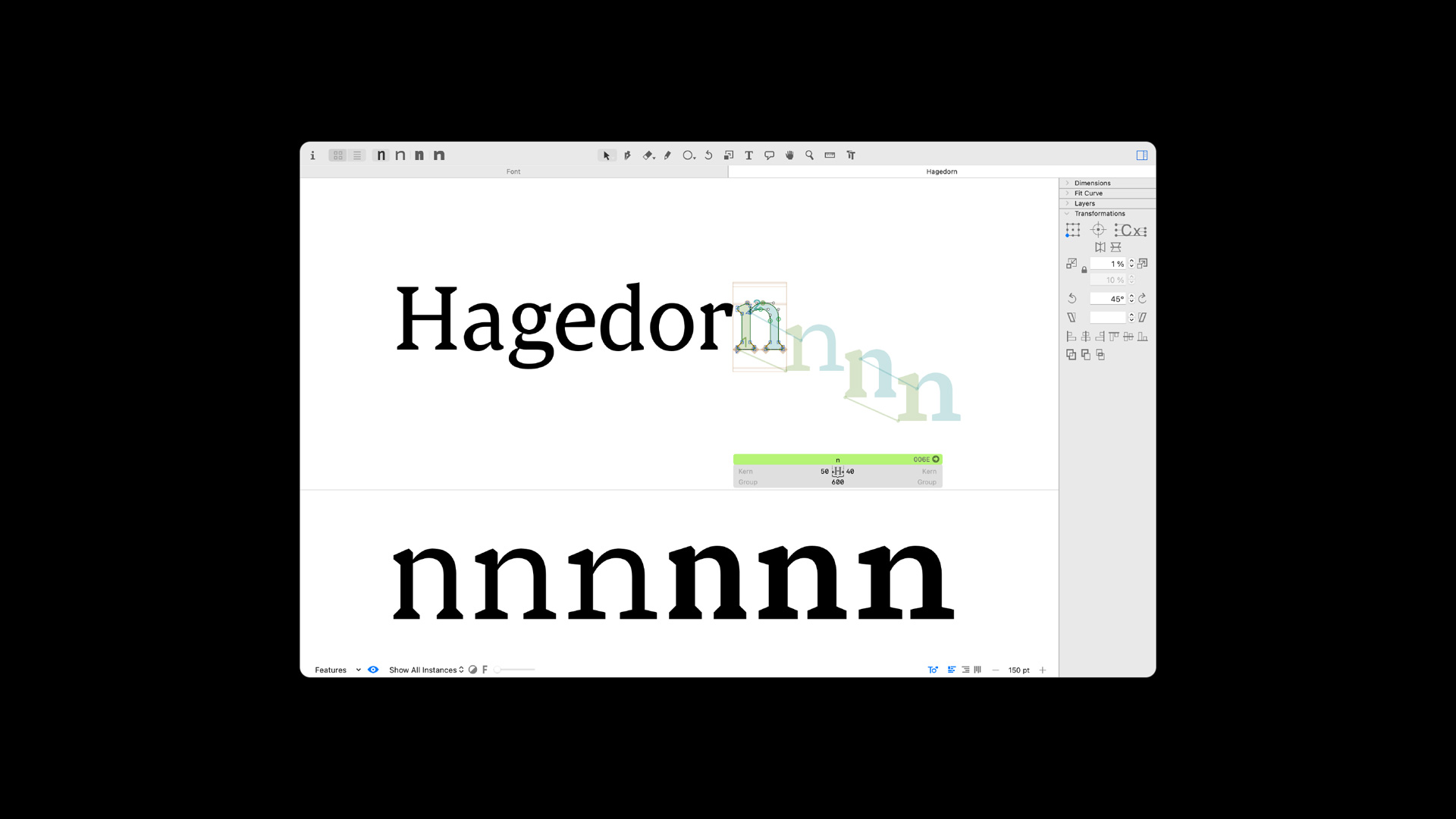
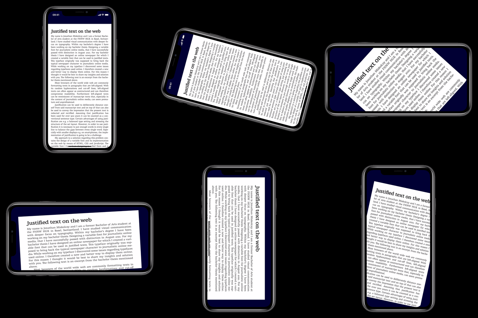
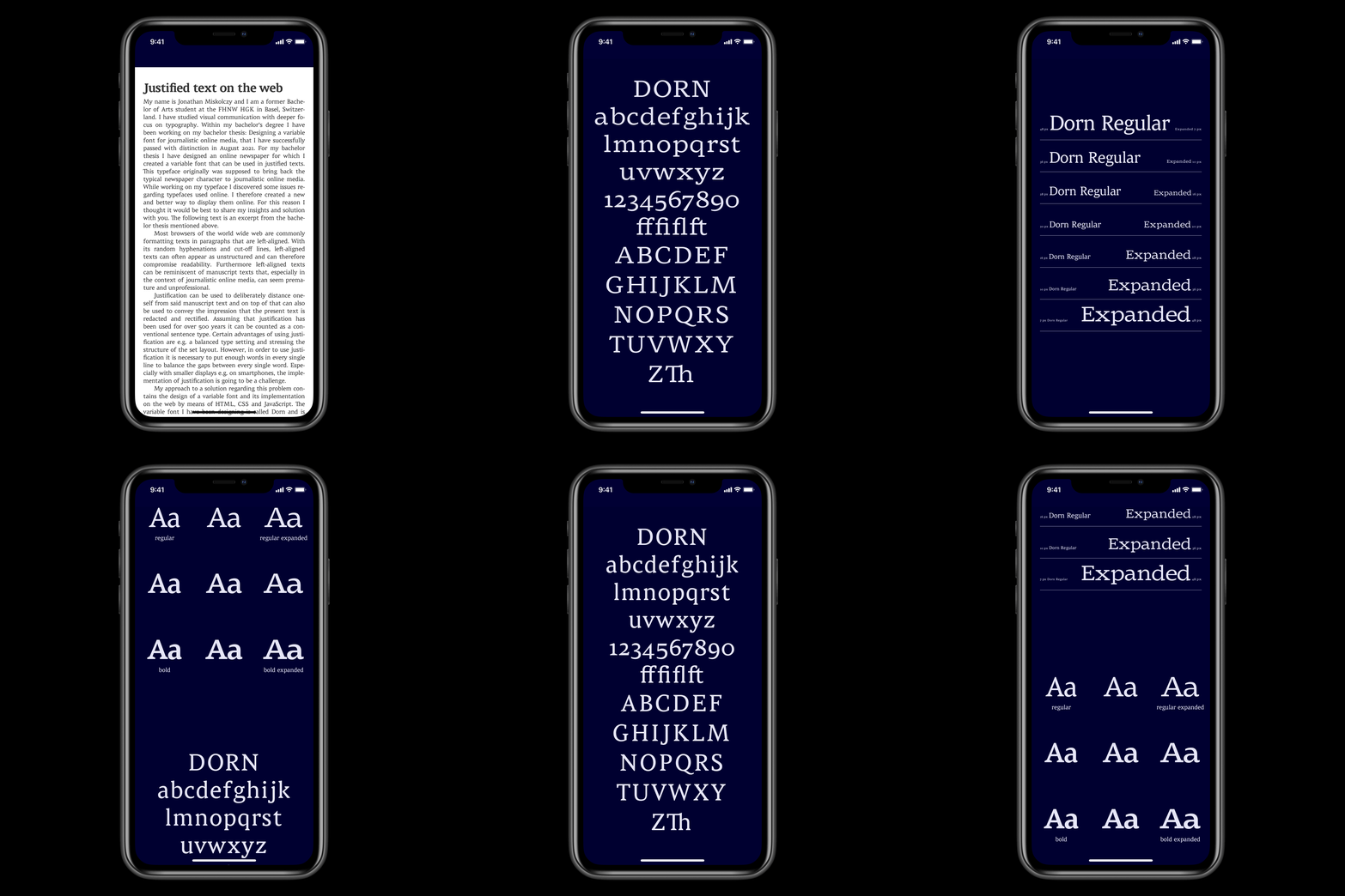
For my Bachelor Thesis I have designed an online newspaper for which I created a variable font that can be used in justified texts. This typeface originally was supposed to bring back the typical newspaper character to journalistic online media. While working on my typeface, I discovered general issues regarding typefaces used online. I therefore created a new and better way to display them online. You can read more about it on Medium.
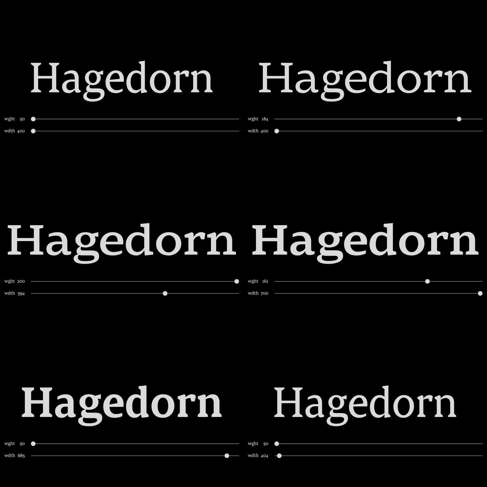
The variable font I have been designing is called Dorn and is inspired by typefaces of printed newspapers. Dorn is a typical Antiqua and can be distinguished by dynamic buoyancy. My typeface Dorn was designed to be read on a computer screen comfortably. In order to enable legibility, Dorn had to be designed with a small line contrast, emphasised serifs and a greater x-height. This variable font also contains two design axis therefore the width and boldness of the letters can be adjusted smoothly to the size of the screen of the device used. Professor Philipp Stamm supervised the practical approach of my bachelor thesis as my personal mentor. You can see the type specimen on GitHub Pages.
One for all
Packaging Design
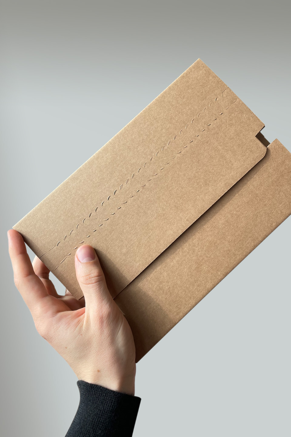
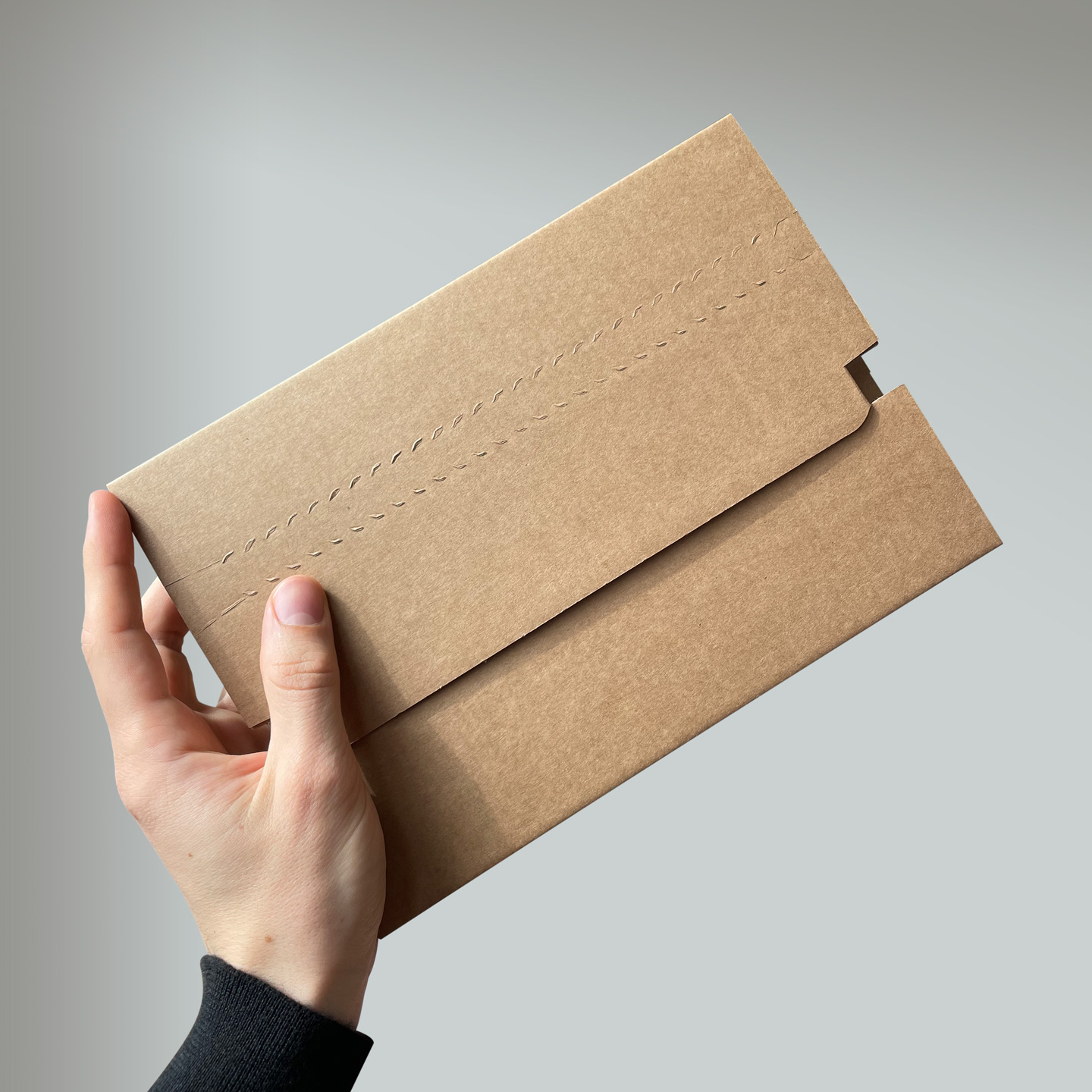
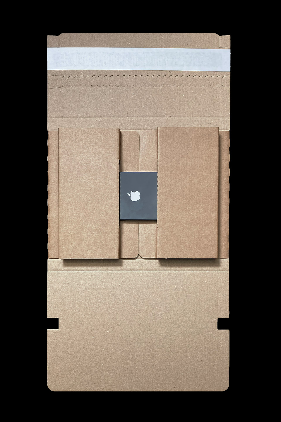
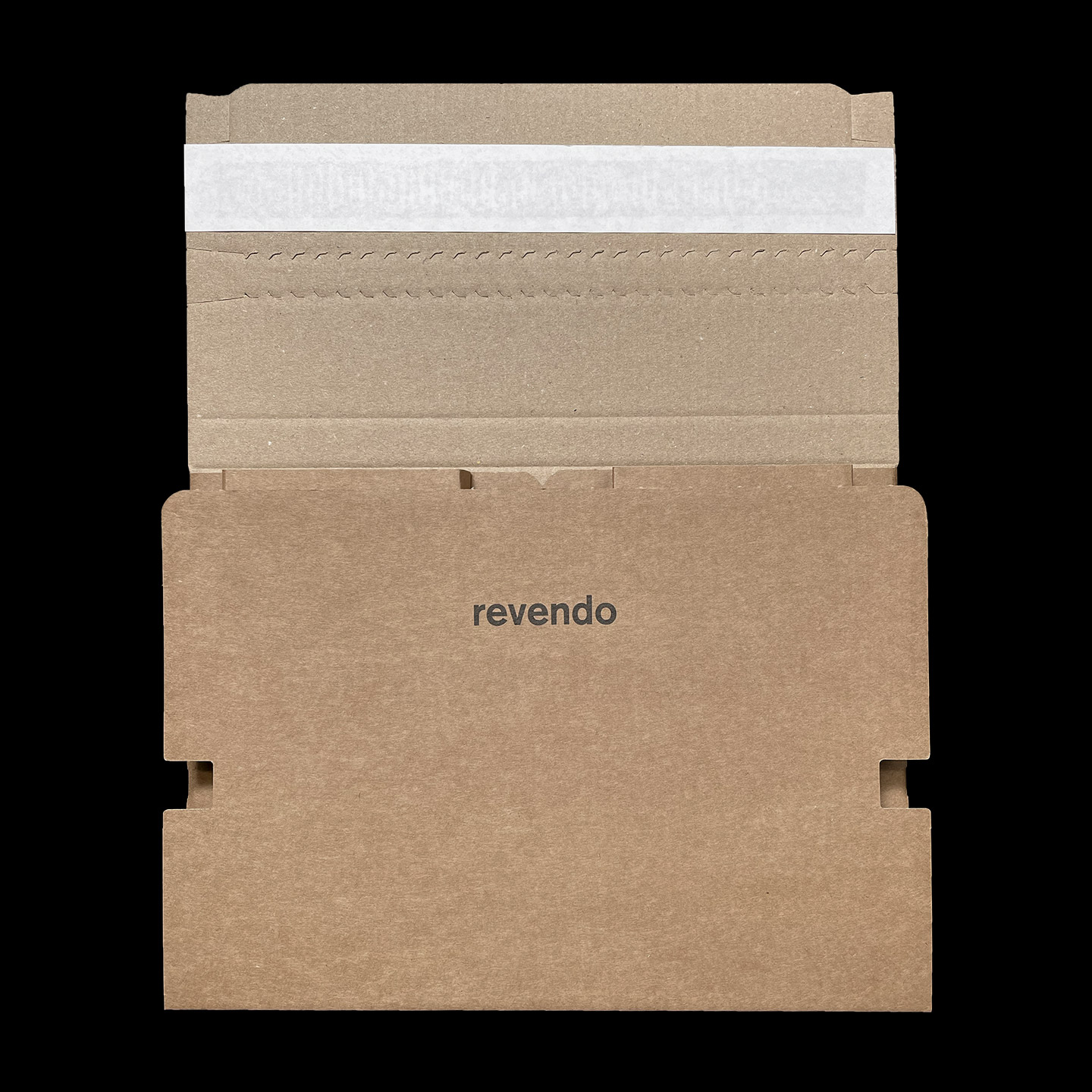
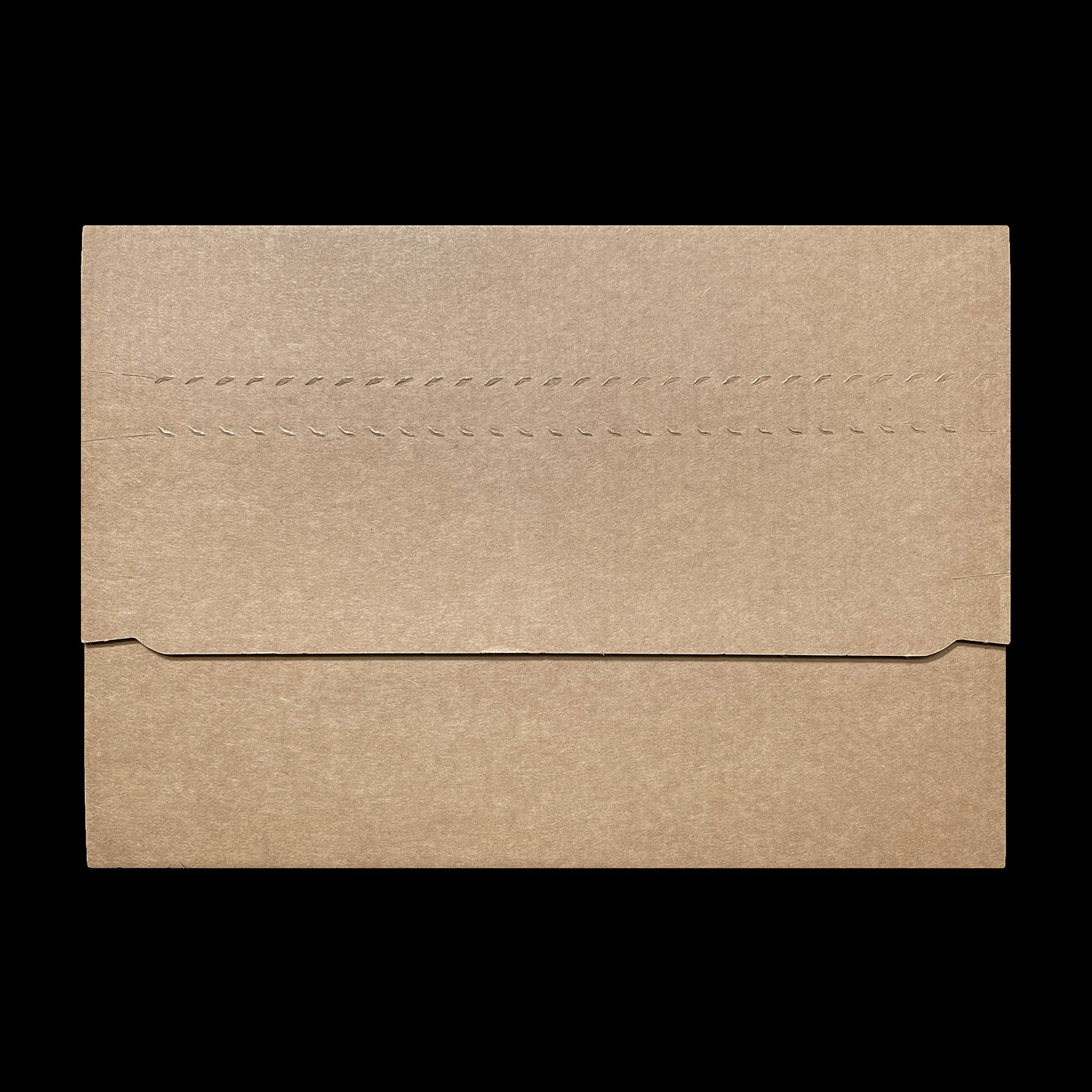
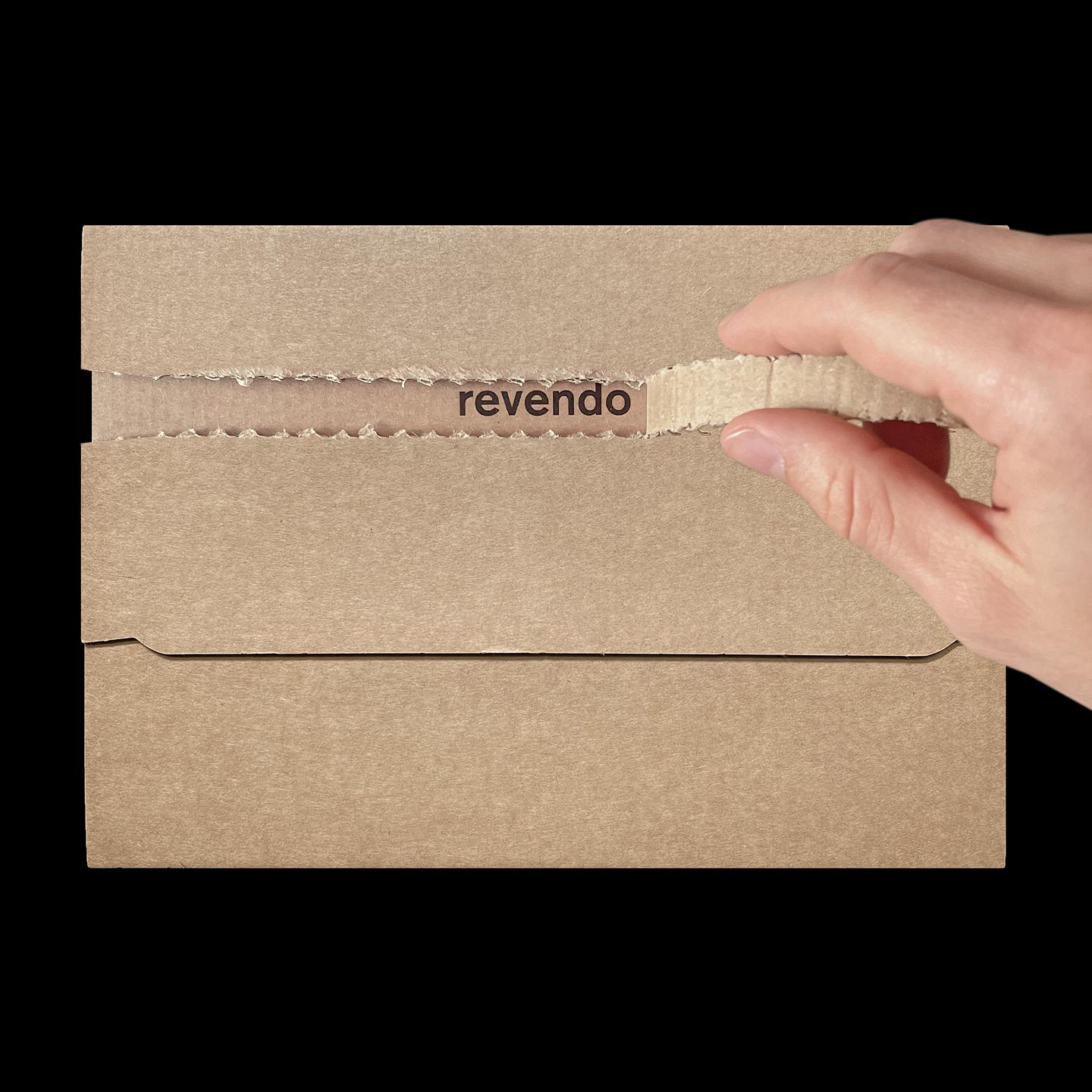
In collaboration with Fischer Papier AG, Revendo has developed a universal packaging for all current smartphones that are sold. With the new packaging design, Revendo strives to lower shipping costs, reduce unused space and improve handling-processes for employees as well as unboxing-experiences for customers.

Reego
Logo Design
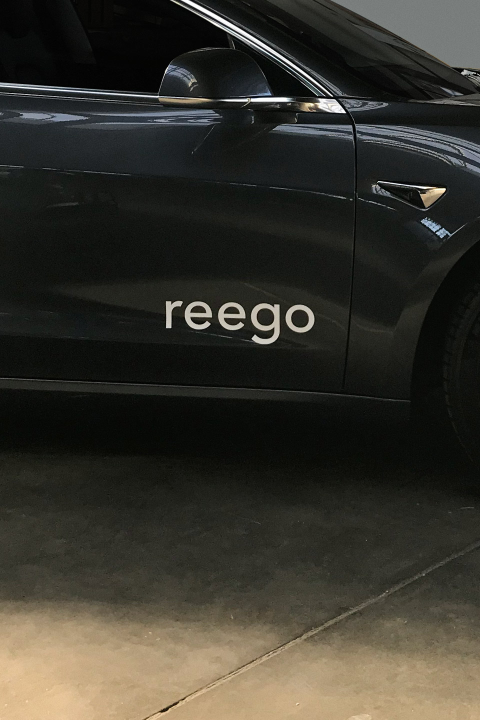
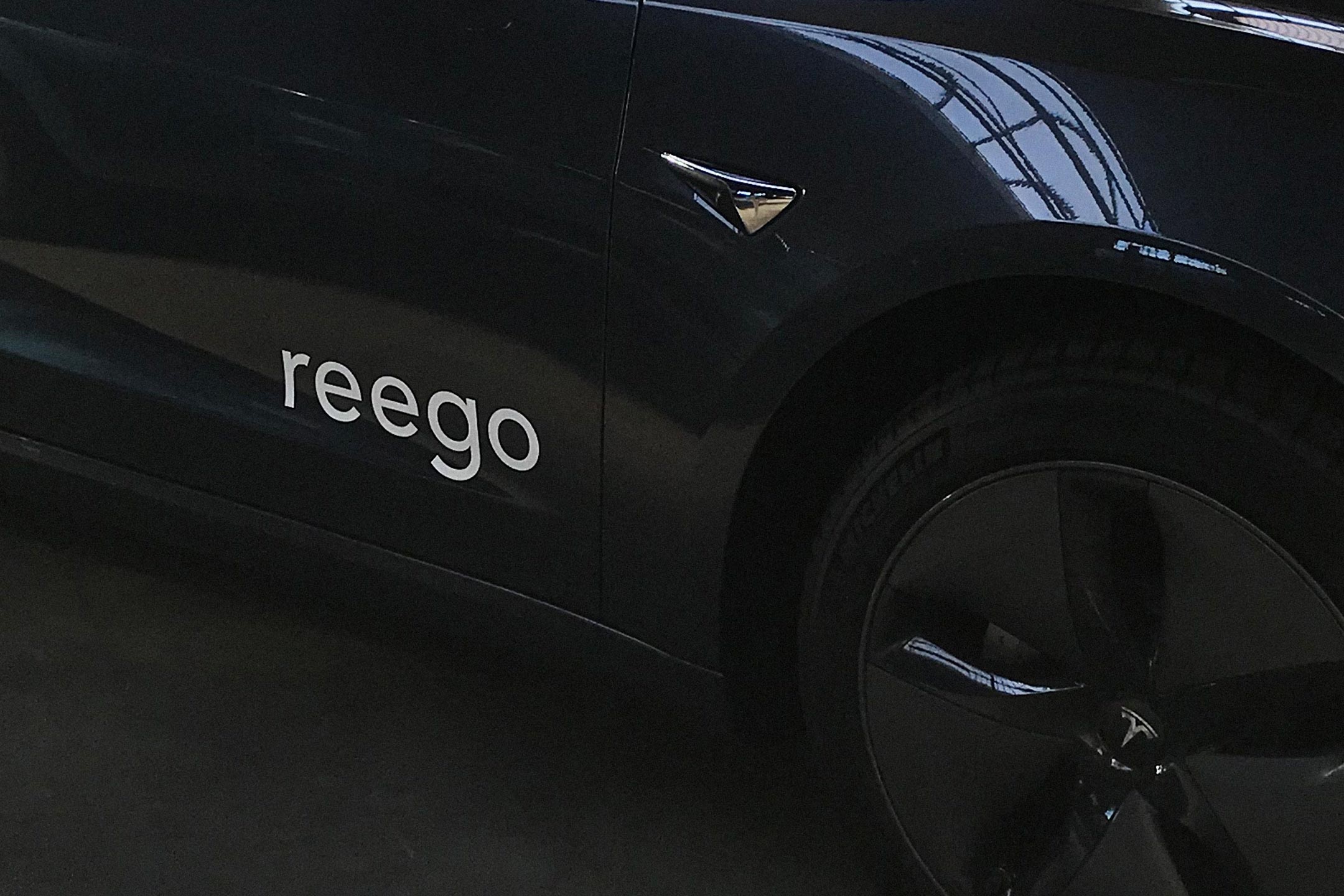
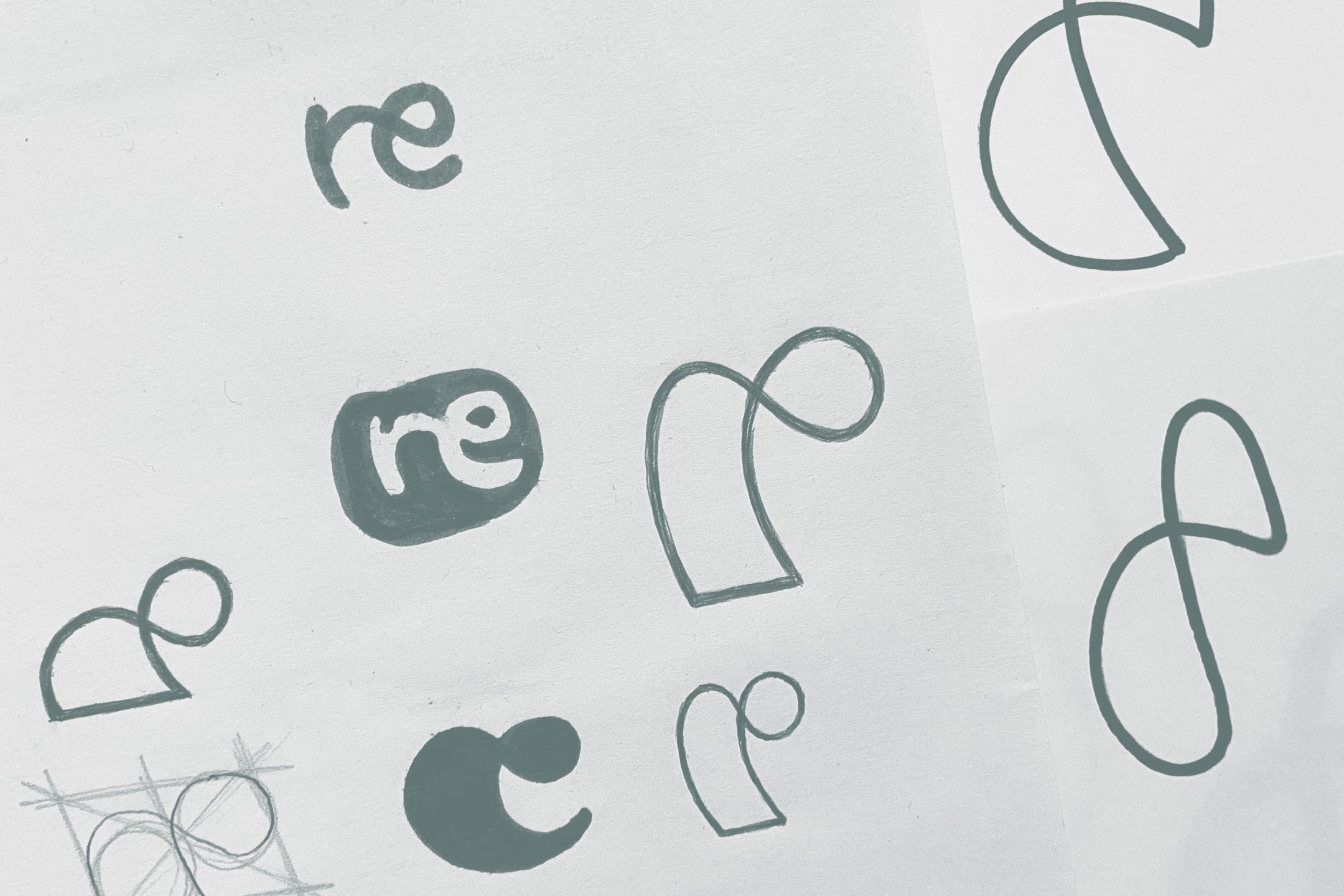
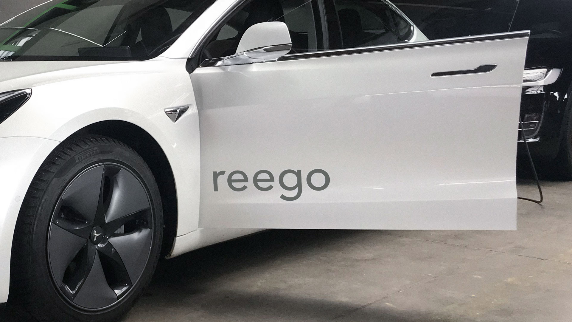
At the formation of the start-up Reego I was commissioned to develop a logo. Reego is a vehicle dealership that offers to rent, sell and purchase electric cars. In a briefing with Reego we settled on attributes like ‹revolutionary› and ‹dynamic› and focused heavily on the functionality of the logo itself. Complementary to the logo, I was asked to design an additional app-icon and a colour scheme for the app.




Refugium
Exhibition
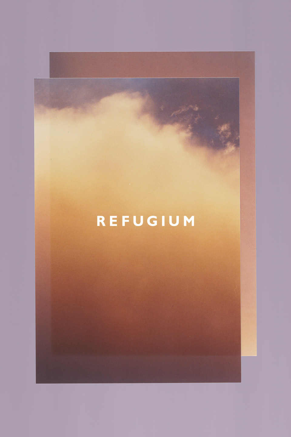
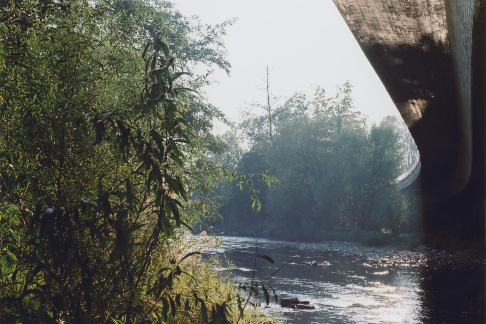
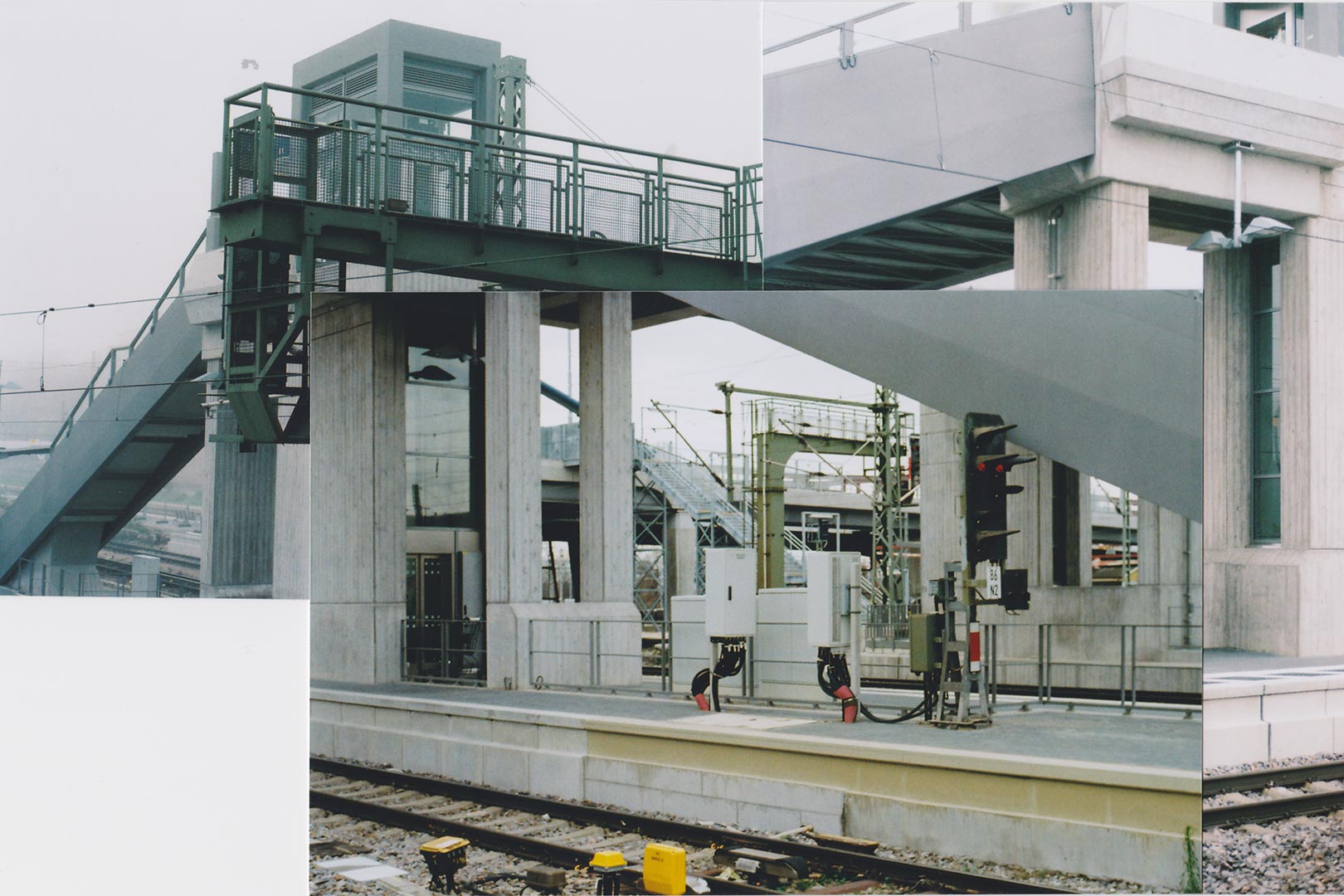
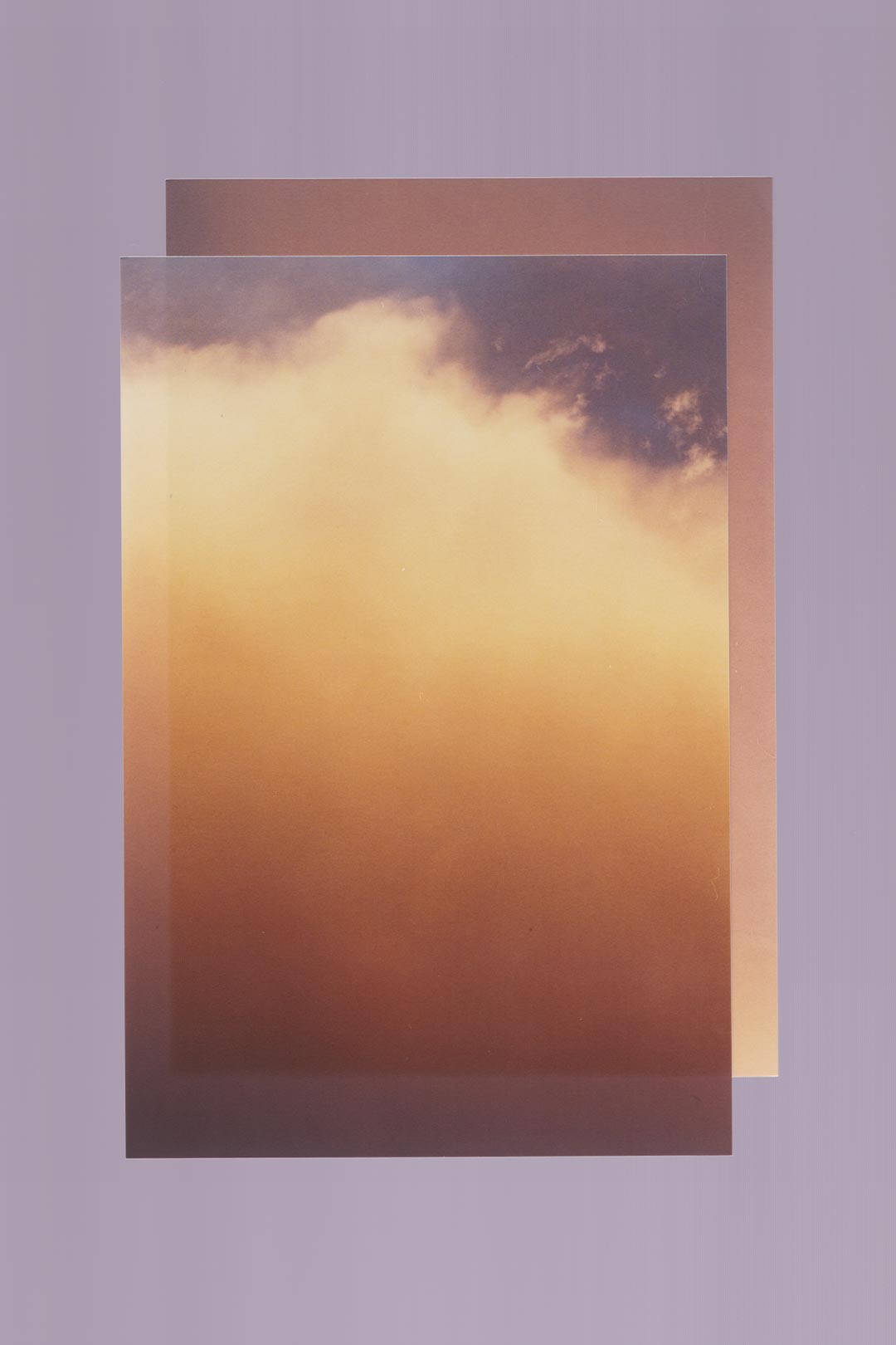
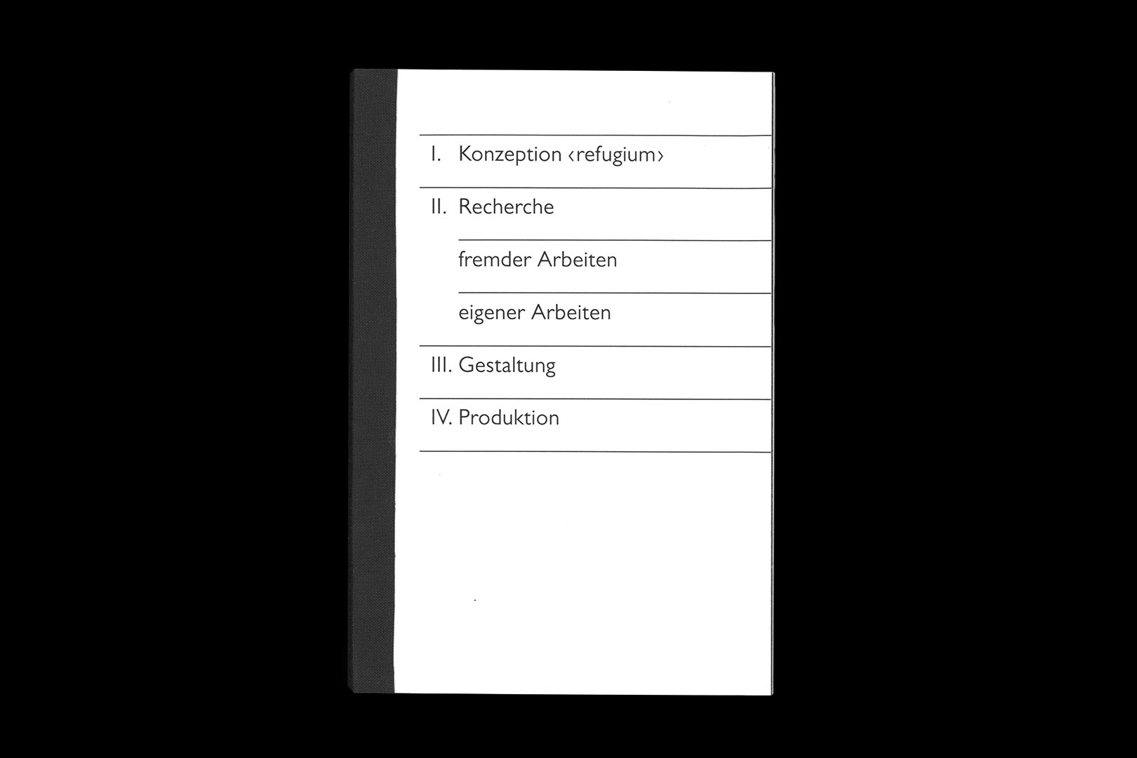
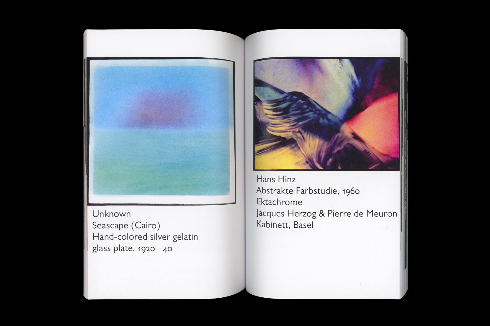
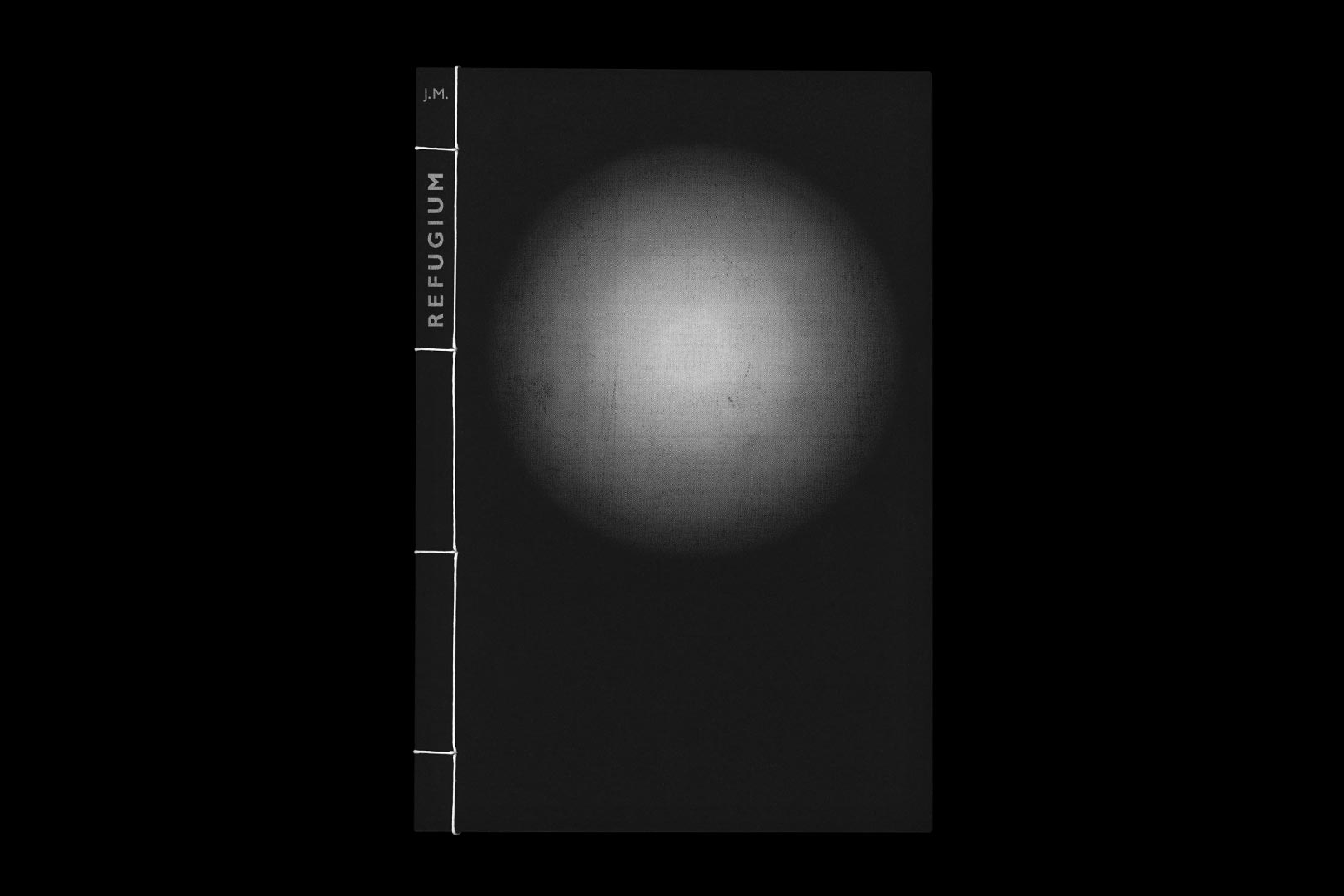
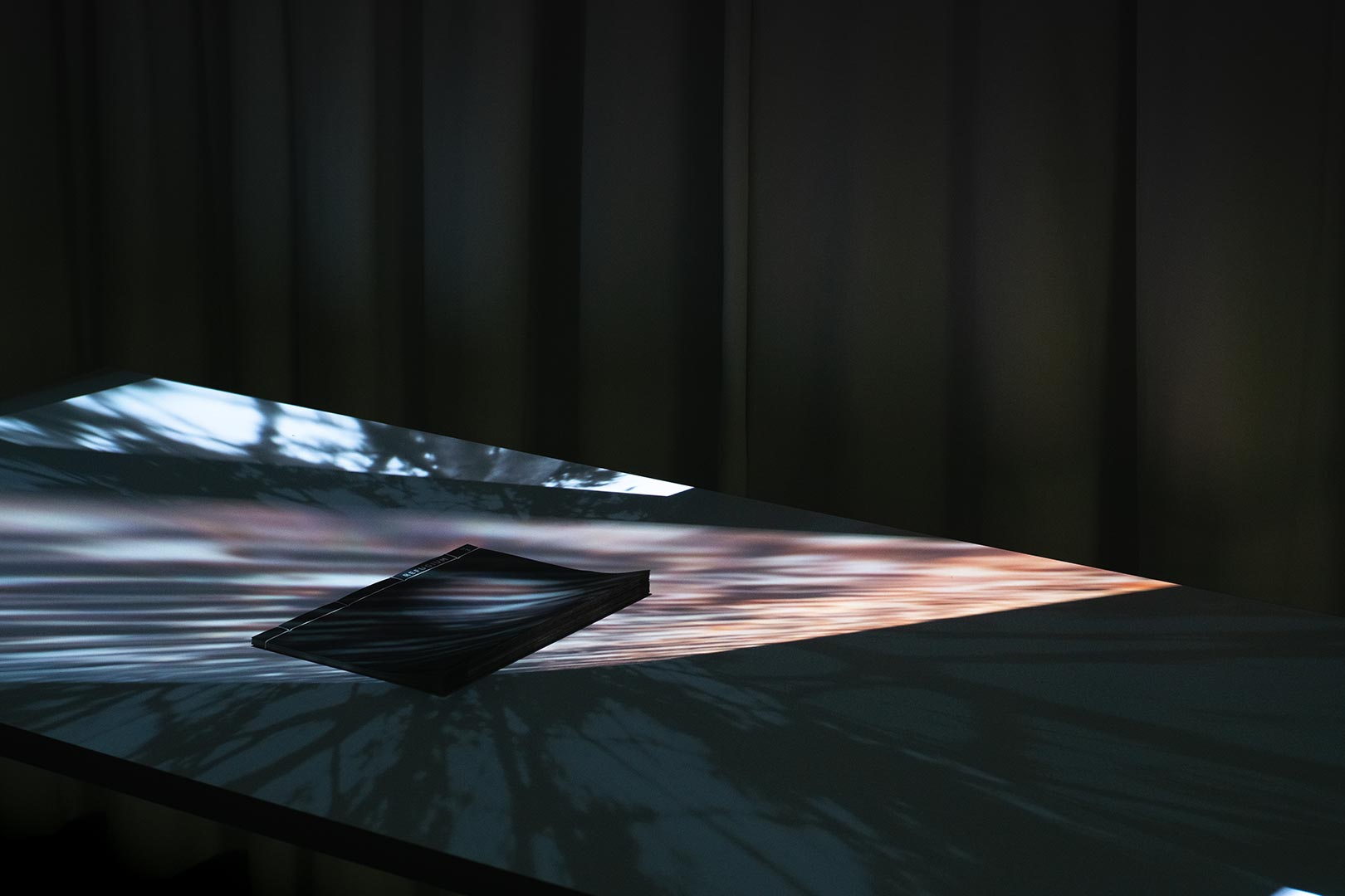
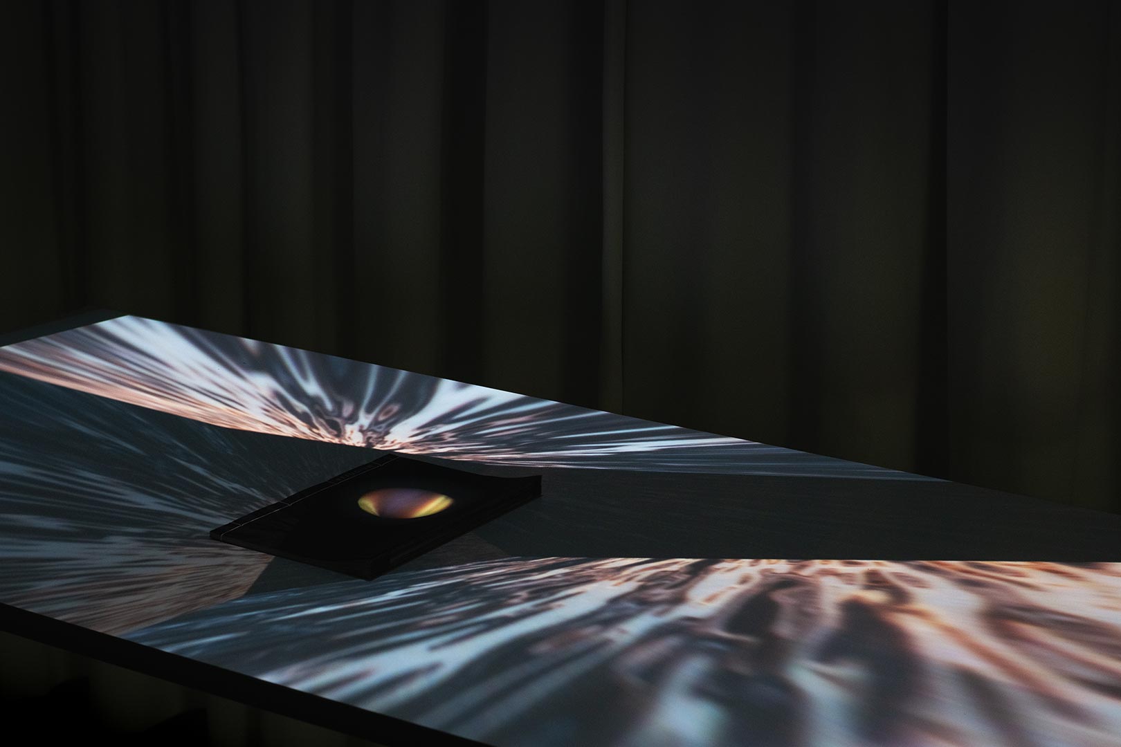
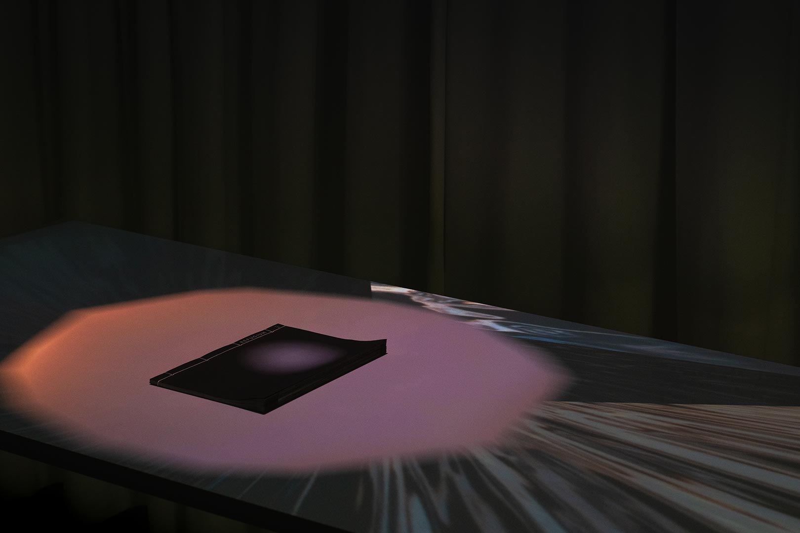
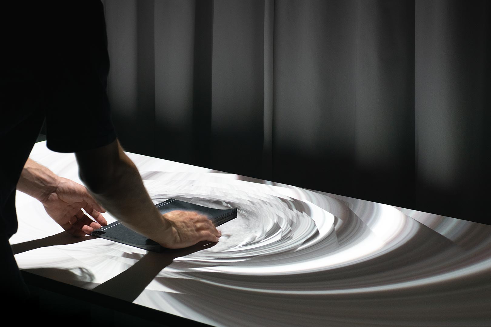
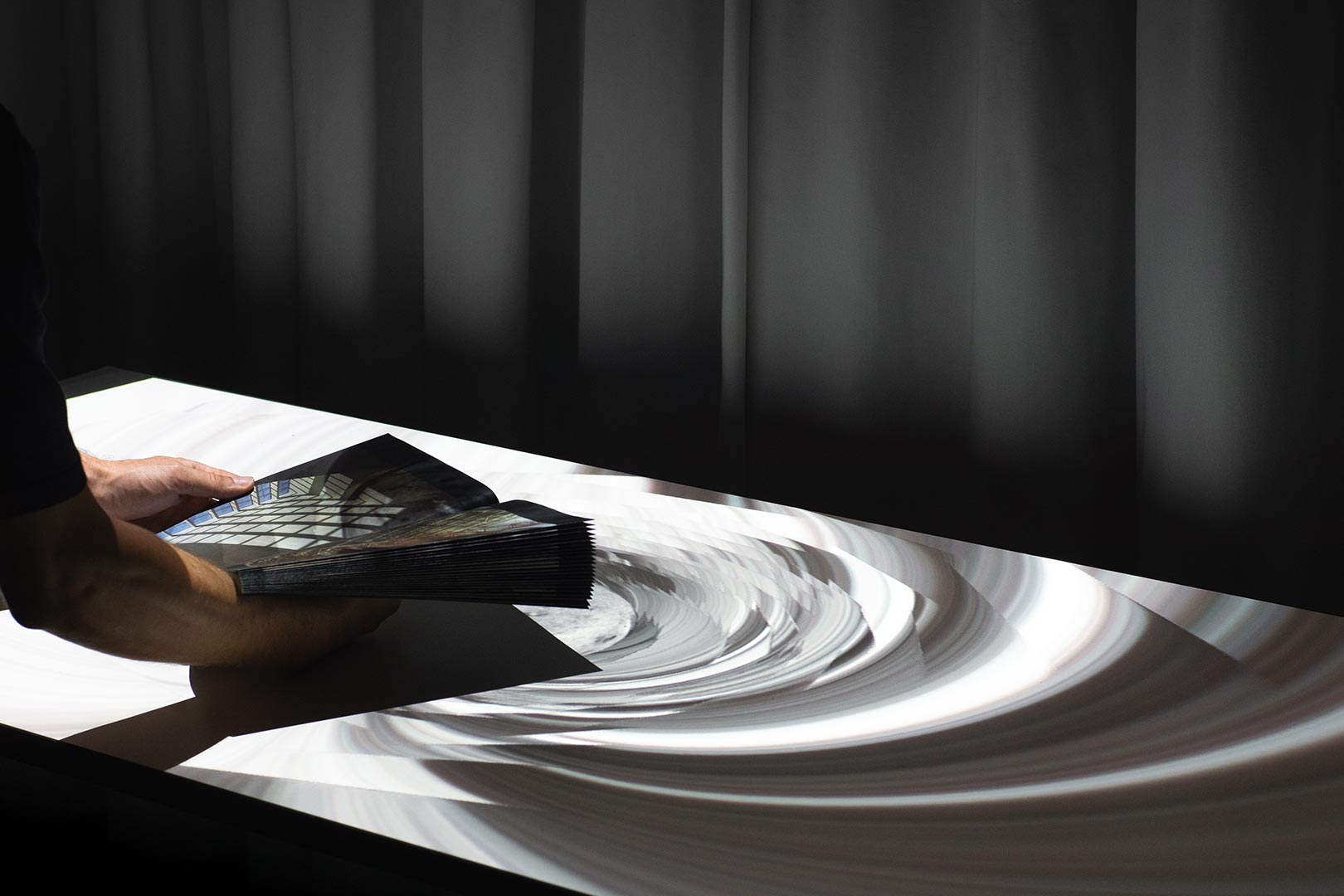
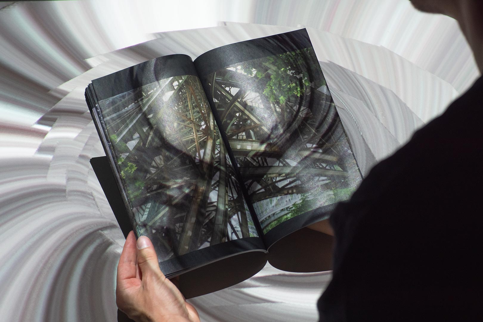
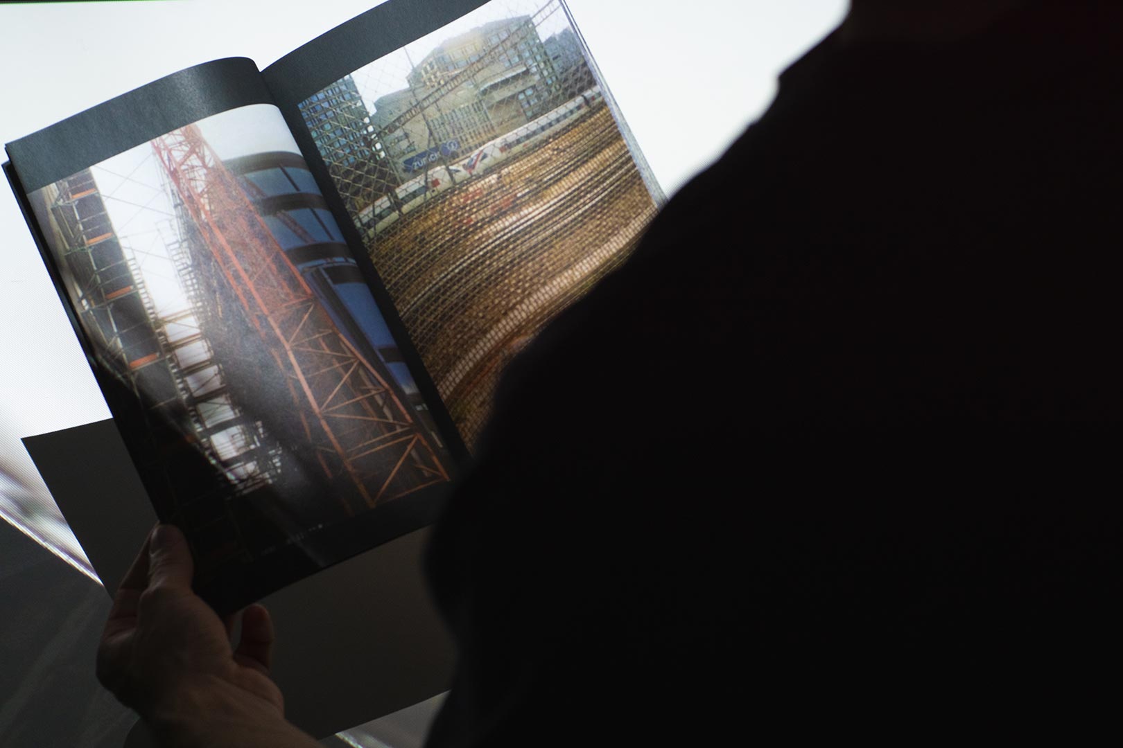
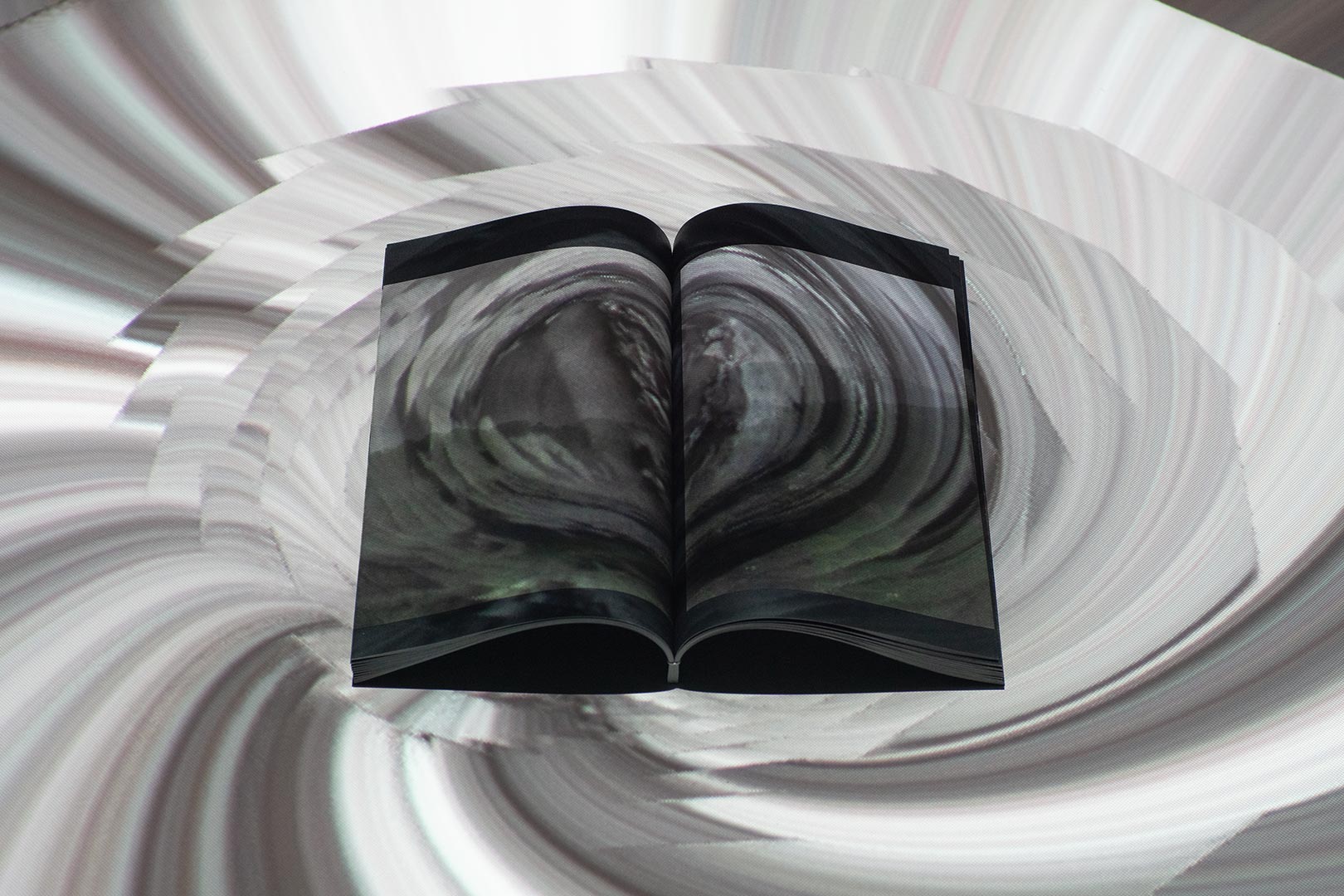
For my contribution to the summer project exhibition of the FHNW HGK in 2020 I went ahead with a photographic analysis of the Latin term ‹refugium›. I made a photobook with analog photographs, with which I wanted to show that within a shelter, space plays a very important role. However, for this project I needed to create another dimension. I therefore designed a three-dimensional photograph series that was projected directly onto the photobook. What inspired me to go for this kind of approach was a quote from Sir Edward Coke: ‹domus sua cuique est tutissimum refugium›*. This particular quote describes a house as a sanctuary. You can watch the raw material of the projection in the p5.js Editor.
*Semayne’s Case 1604 Michaelmas Term, 2 James 1 In the Court of King’s Bench. First Published in the Reports, volume 5, page 91a.
Revendo
Corporate Design
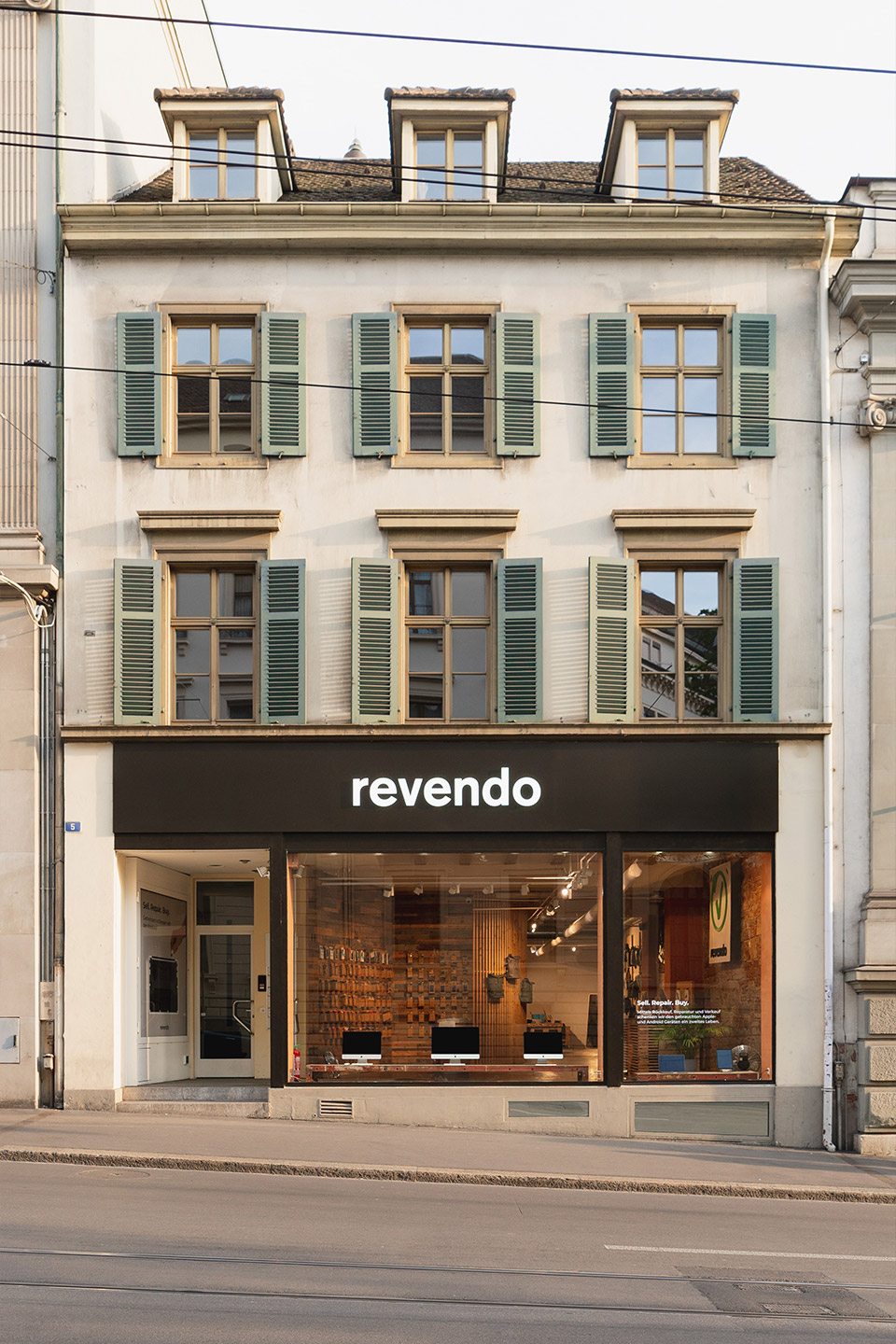
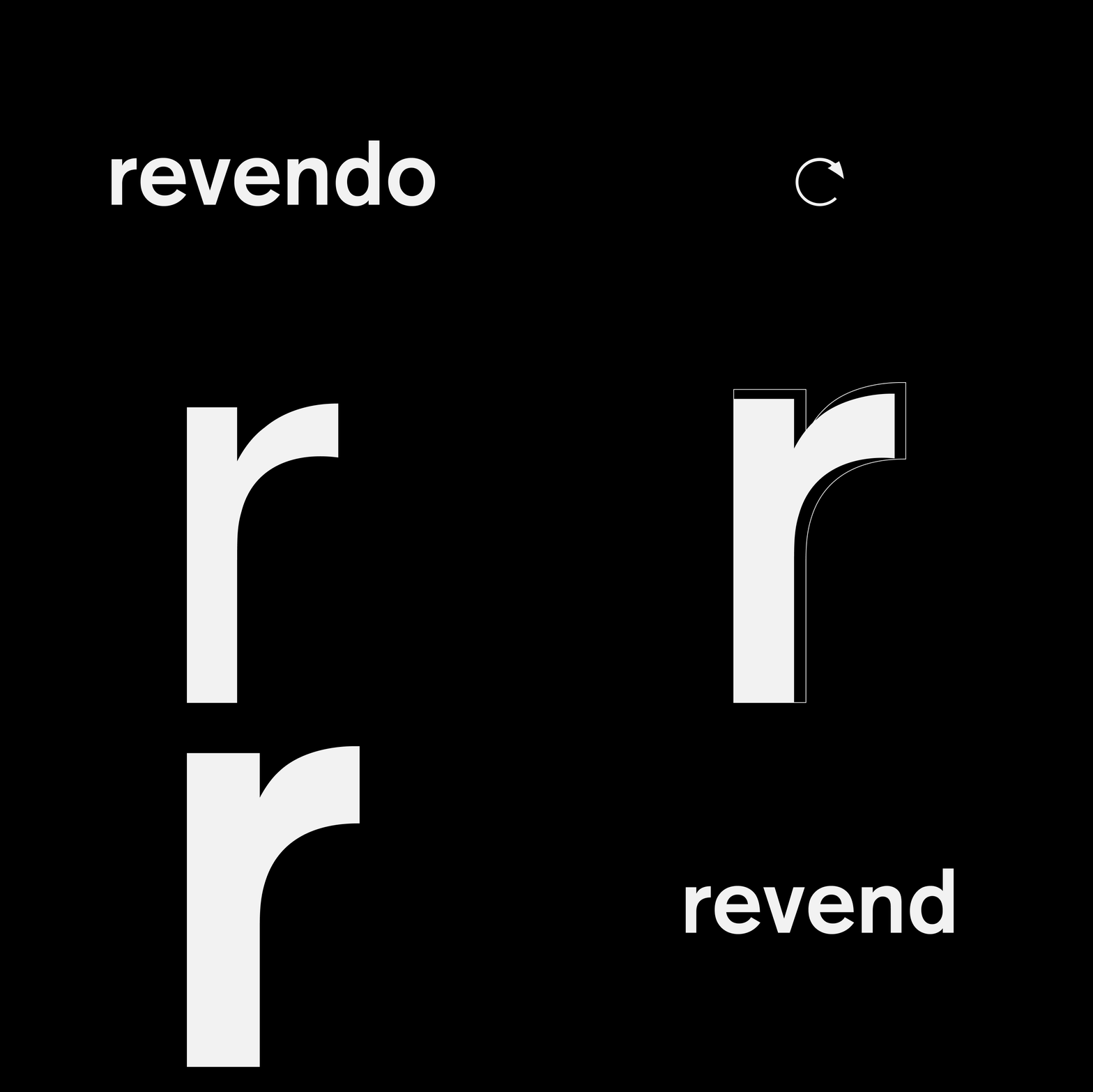
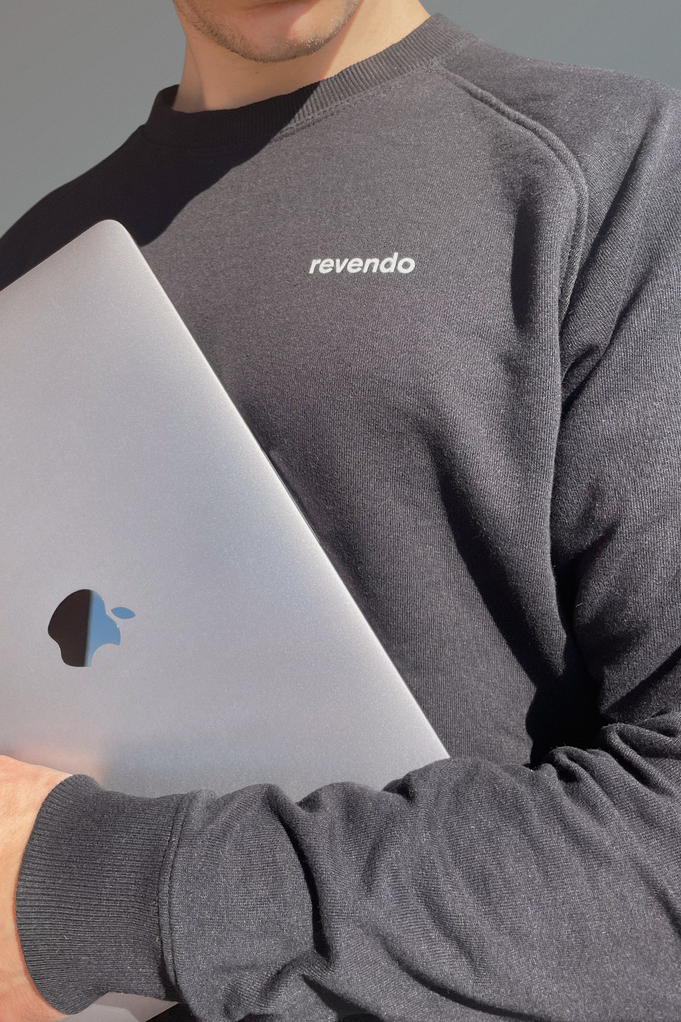
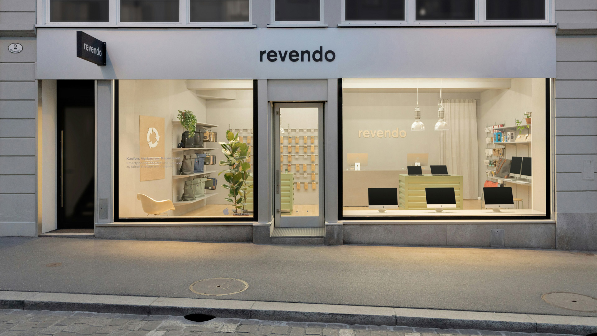
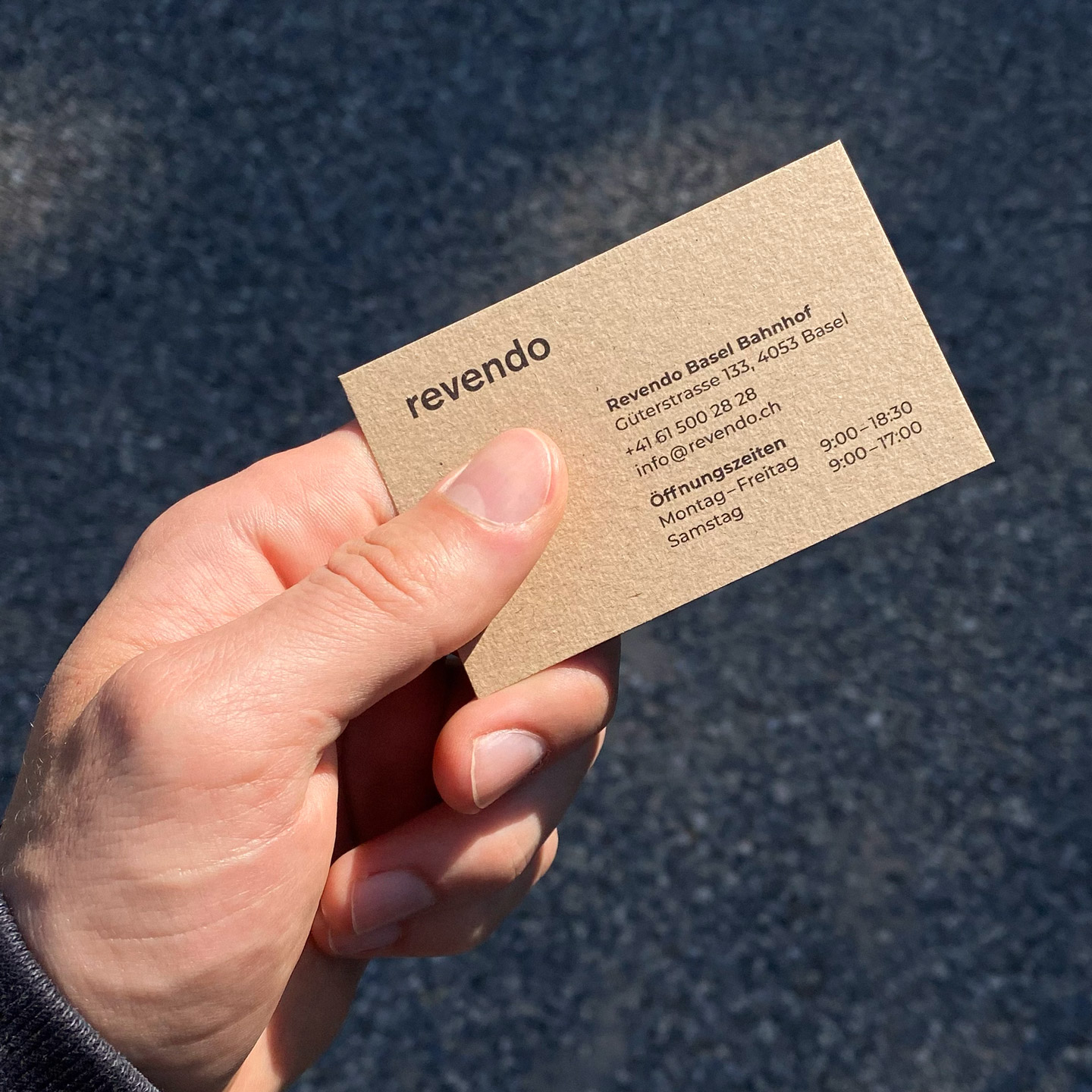
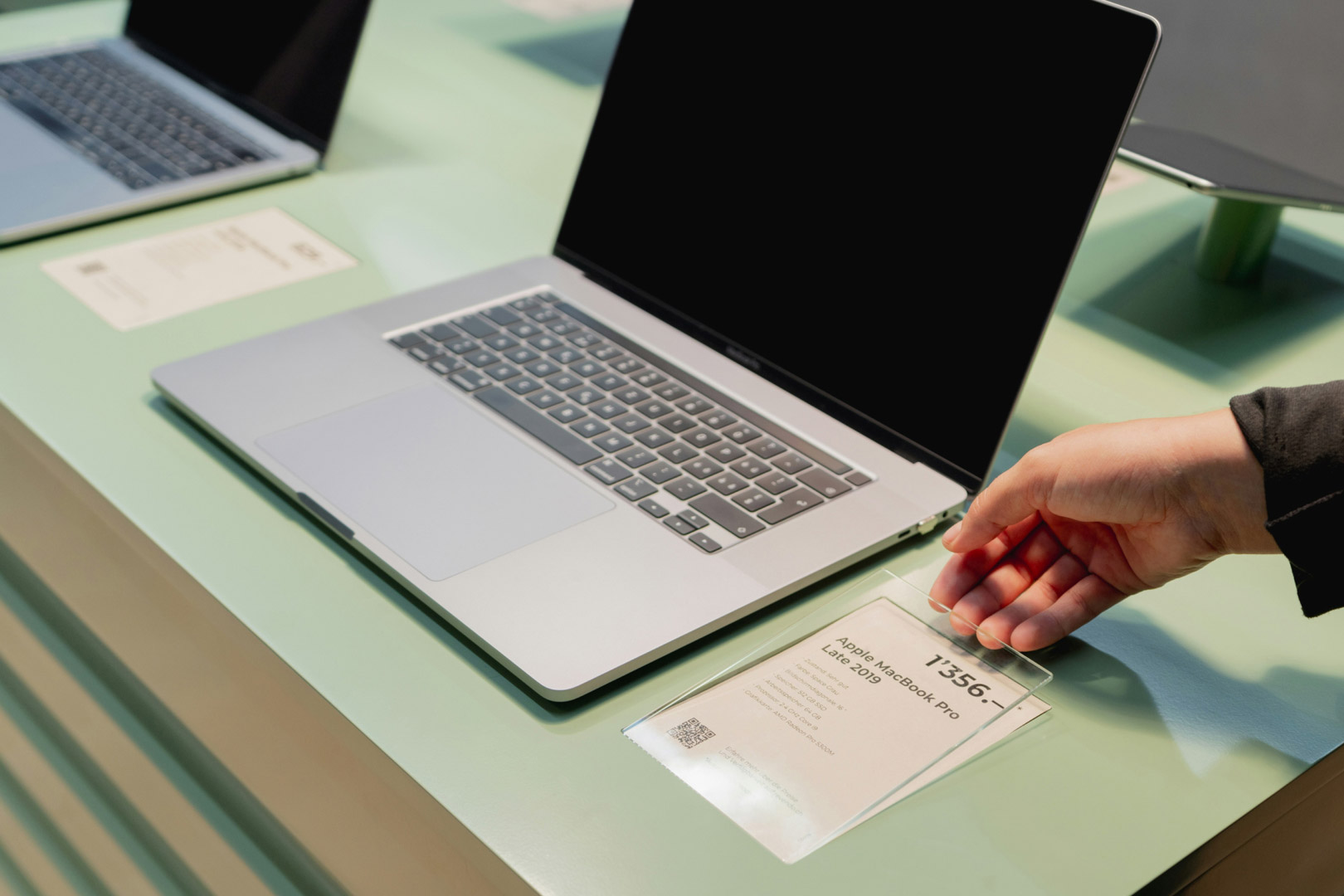
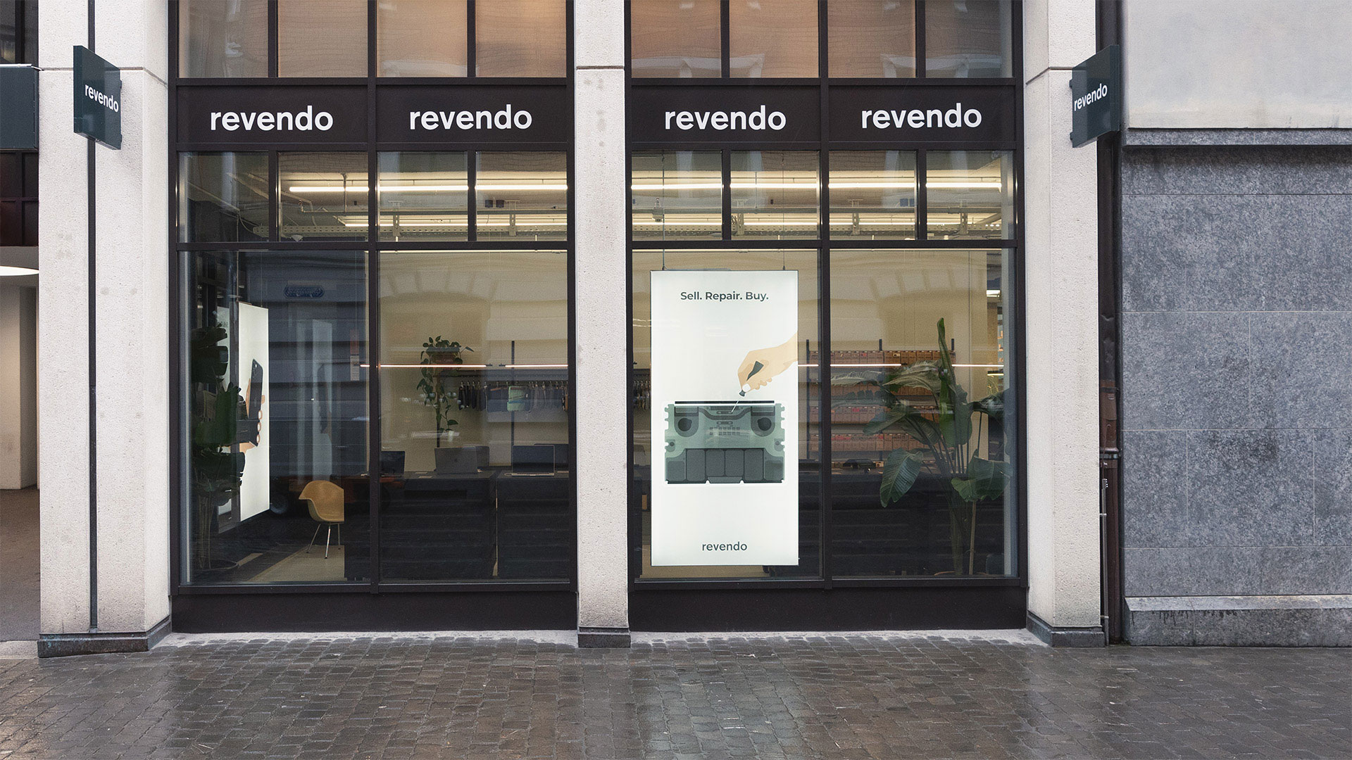
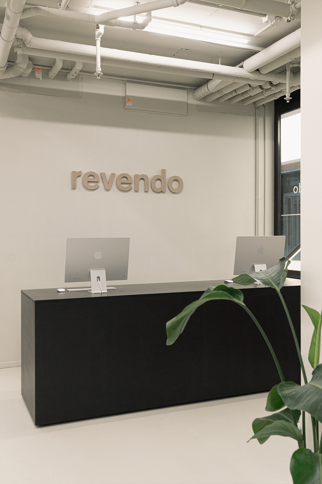
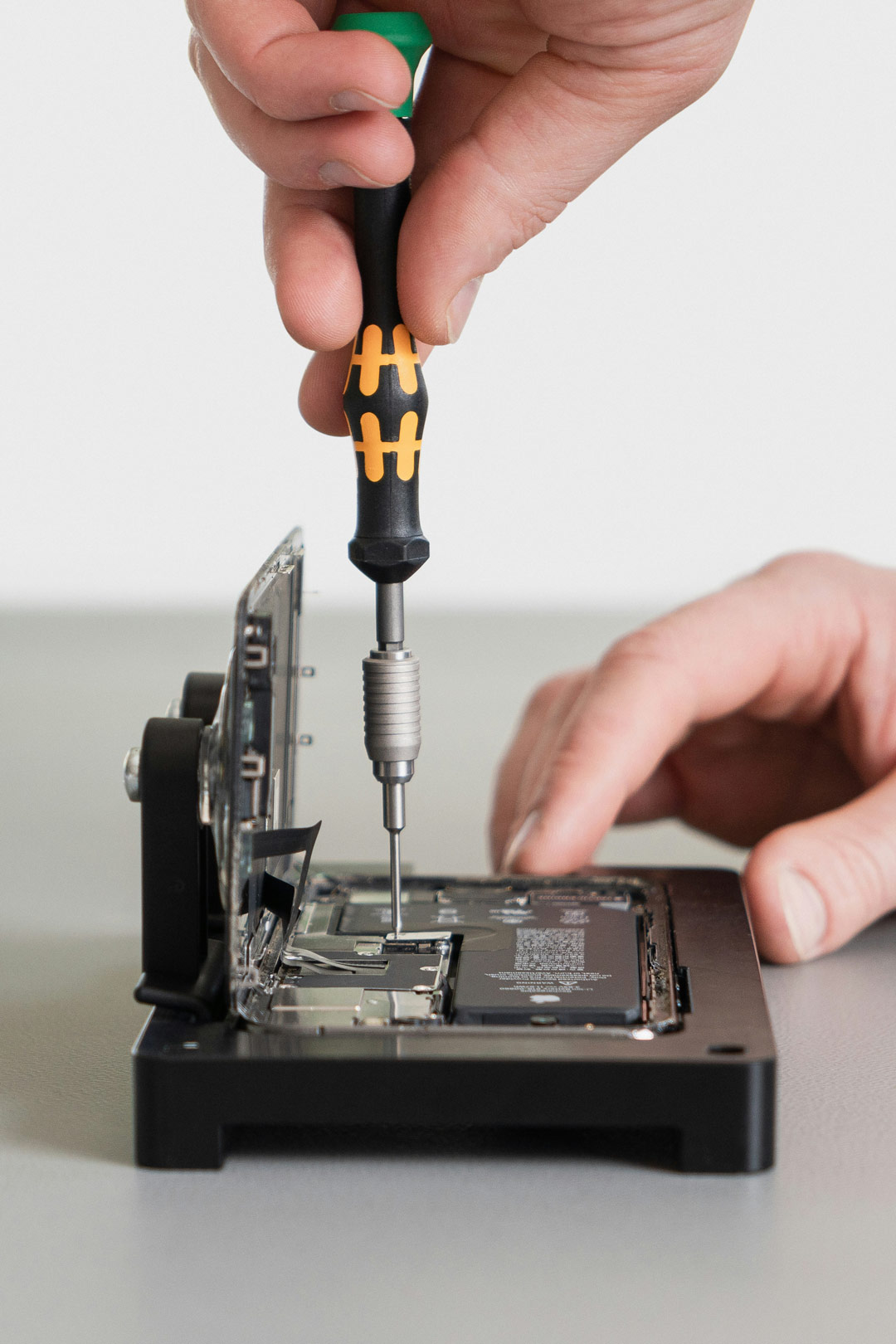
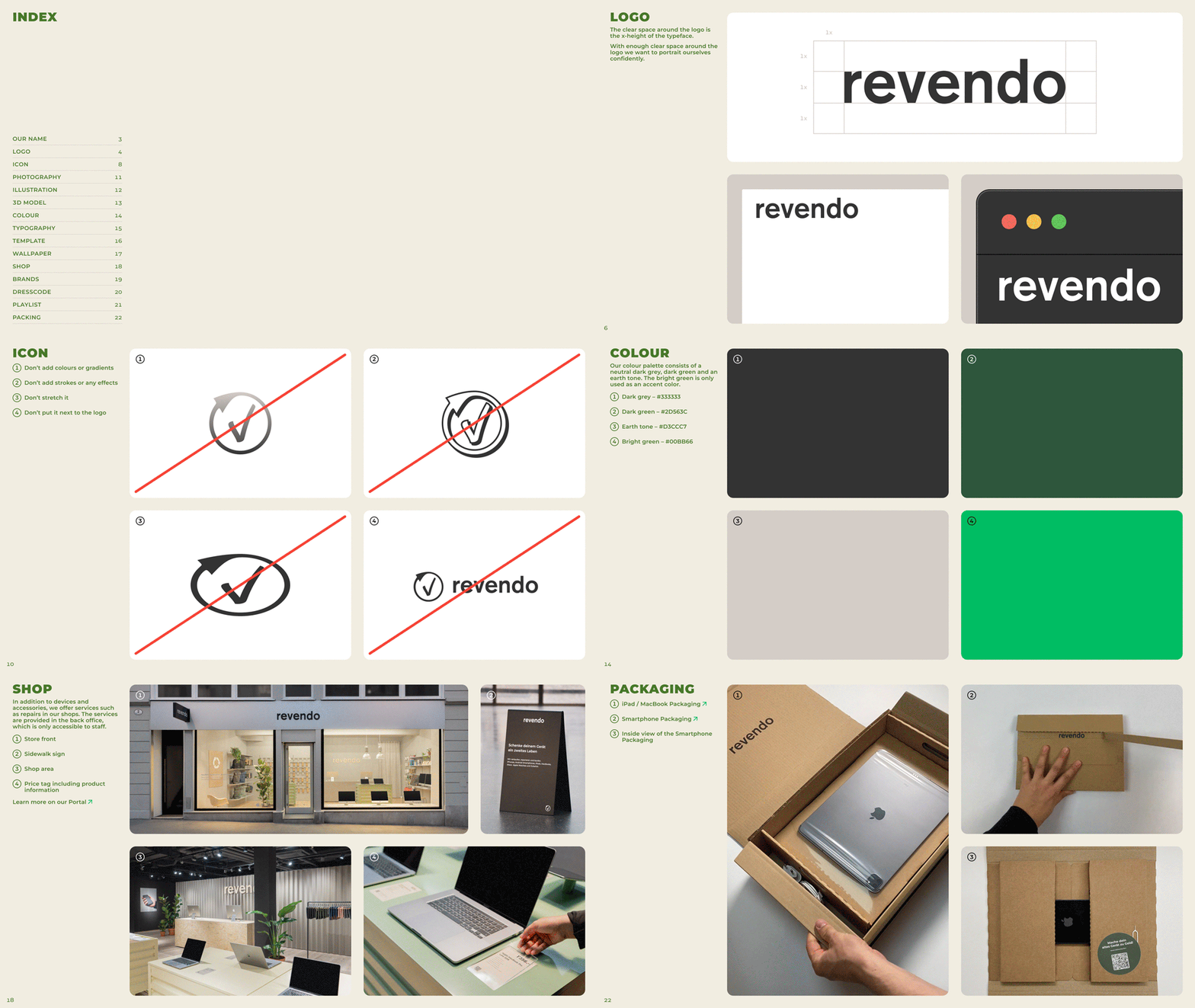
Revendo aims to enable sustainable usage and longevity of devices, by refurbishing and repairing them. Since the start-up’s founding in 2013, it has been experiencing great development in various disciplines. This also includes its tremendous growth in Switzerland and its expansion into the European Union in 2020. Revendo confidently embraces these changes and wants to carry them into the world. Therefore, and under my direction, the rebranding and development of the new corporate identity for Revendo took place. You can view the Brand Guide on Figma.



Suncar
Corporate Design
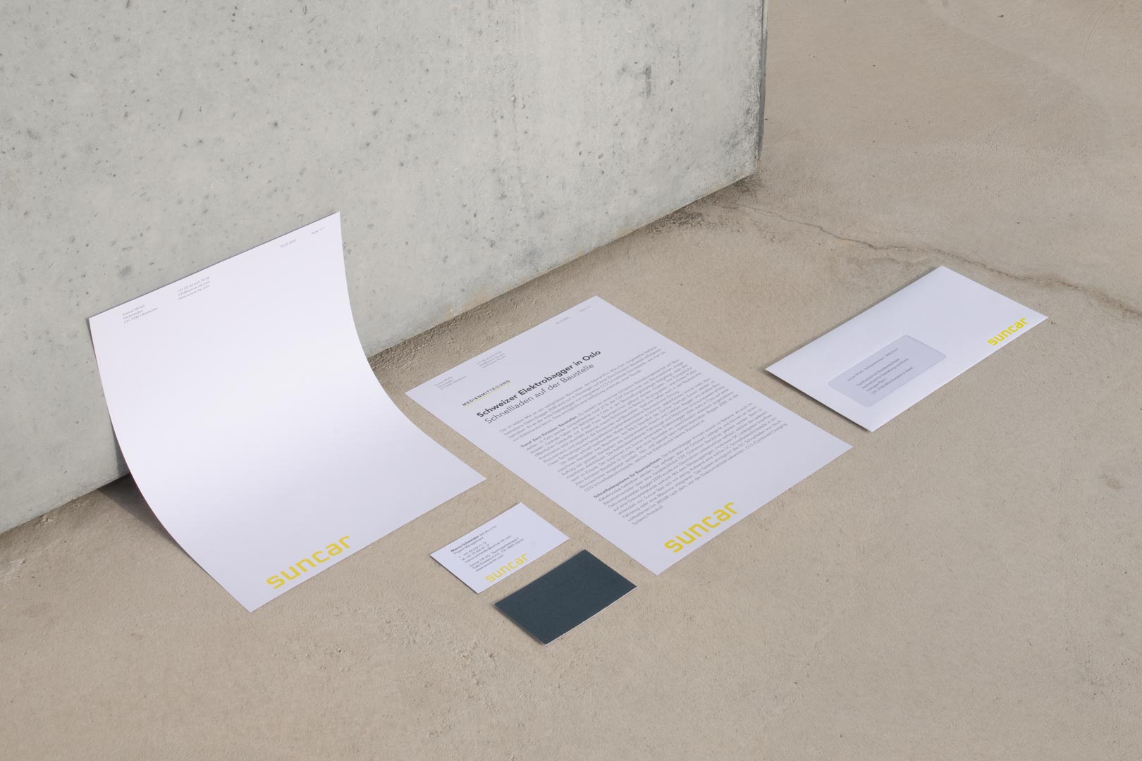
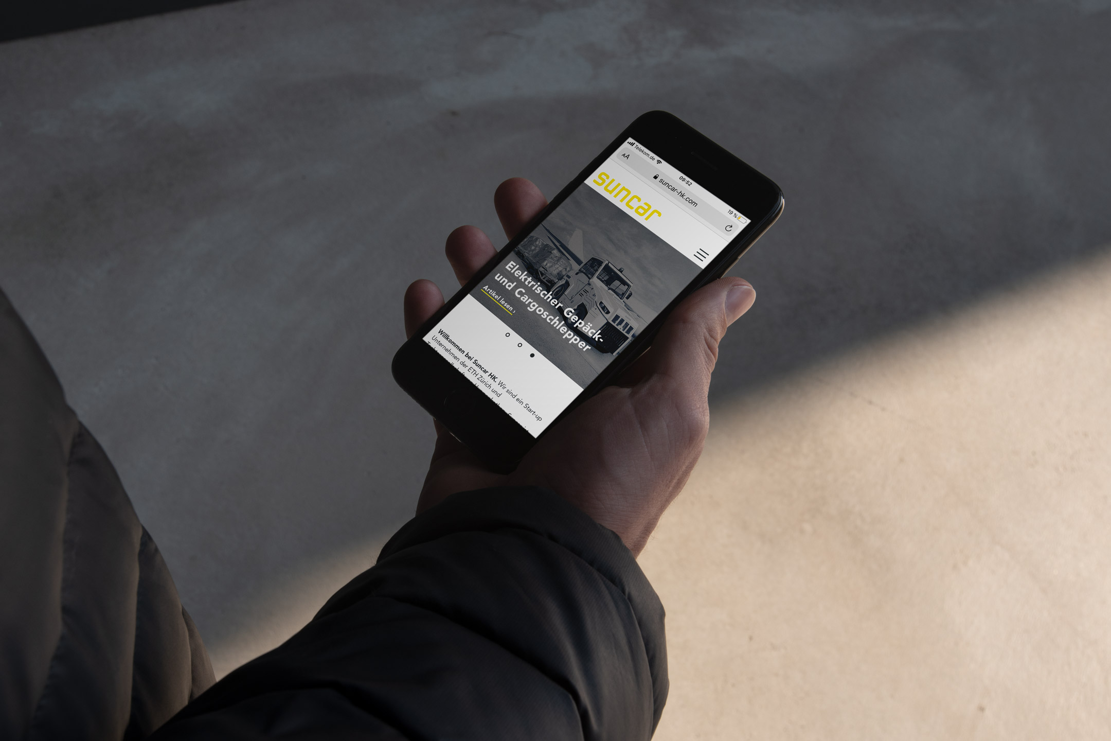
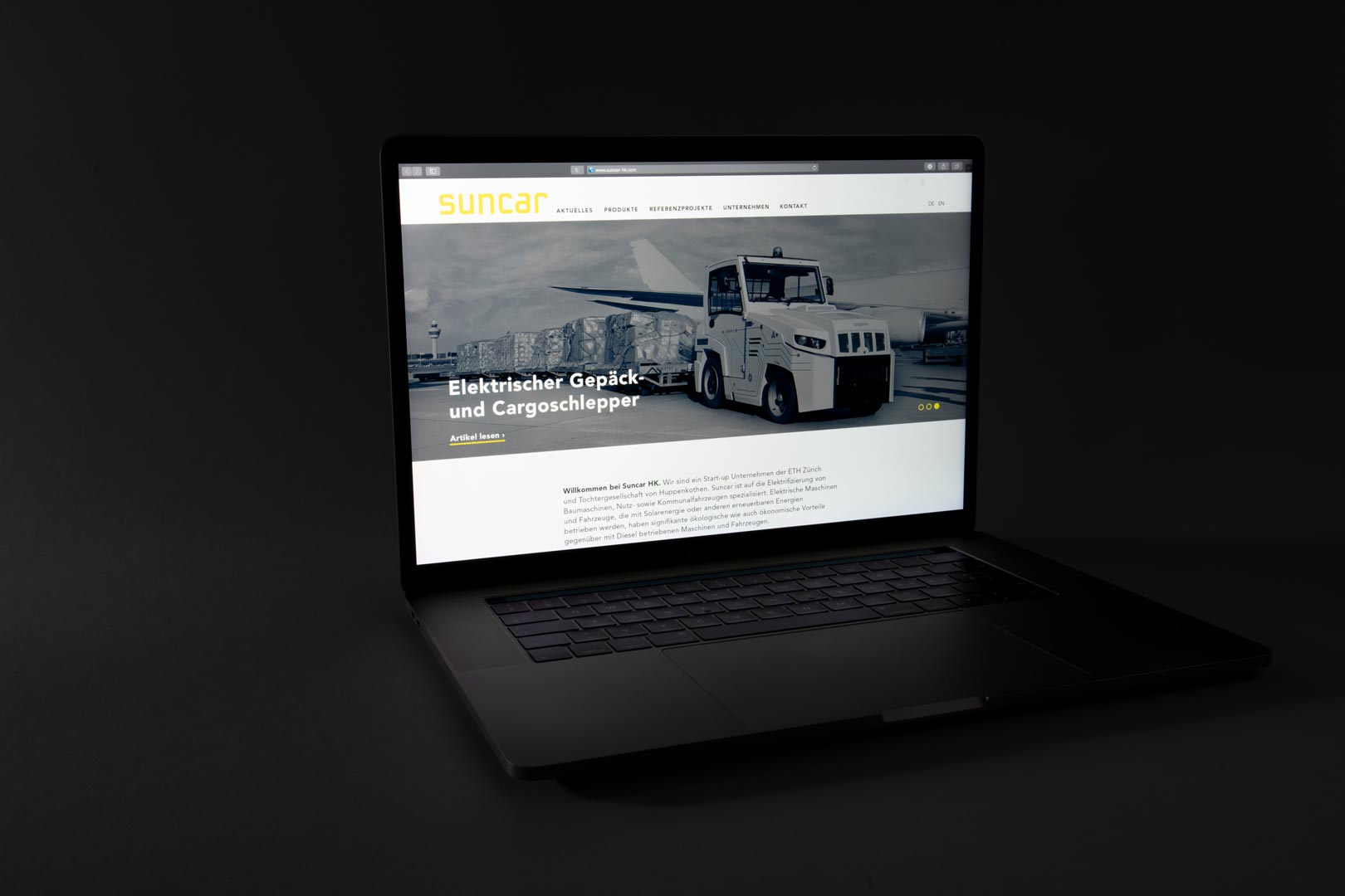
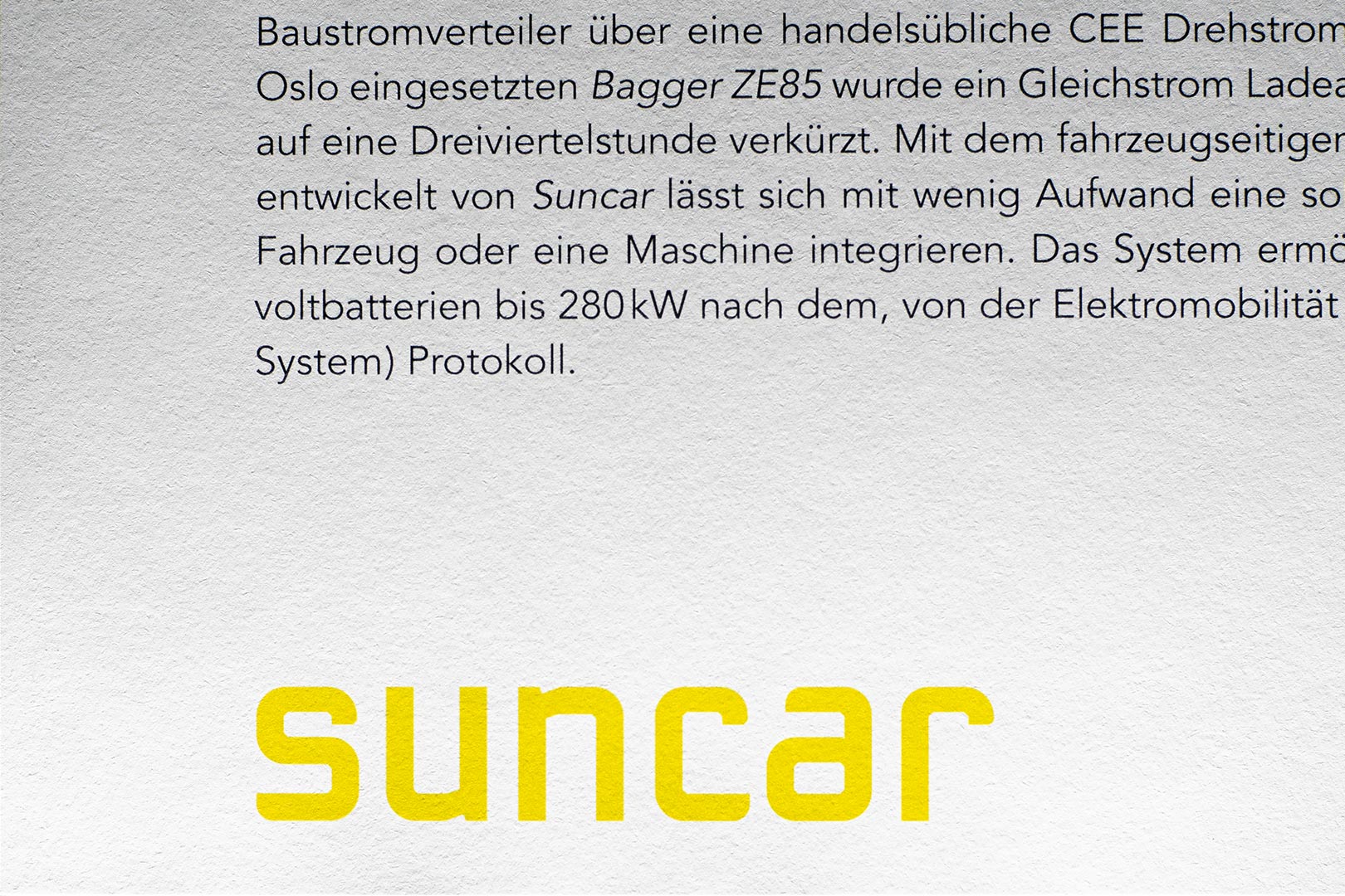
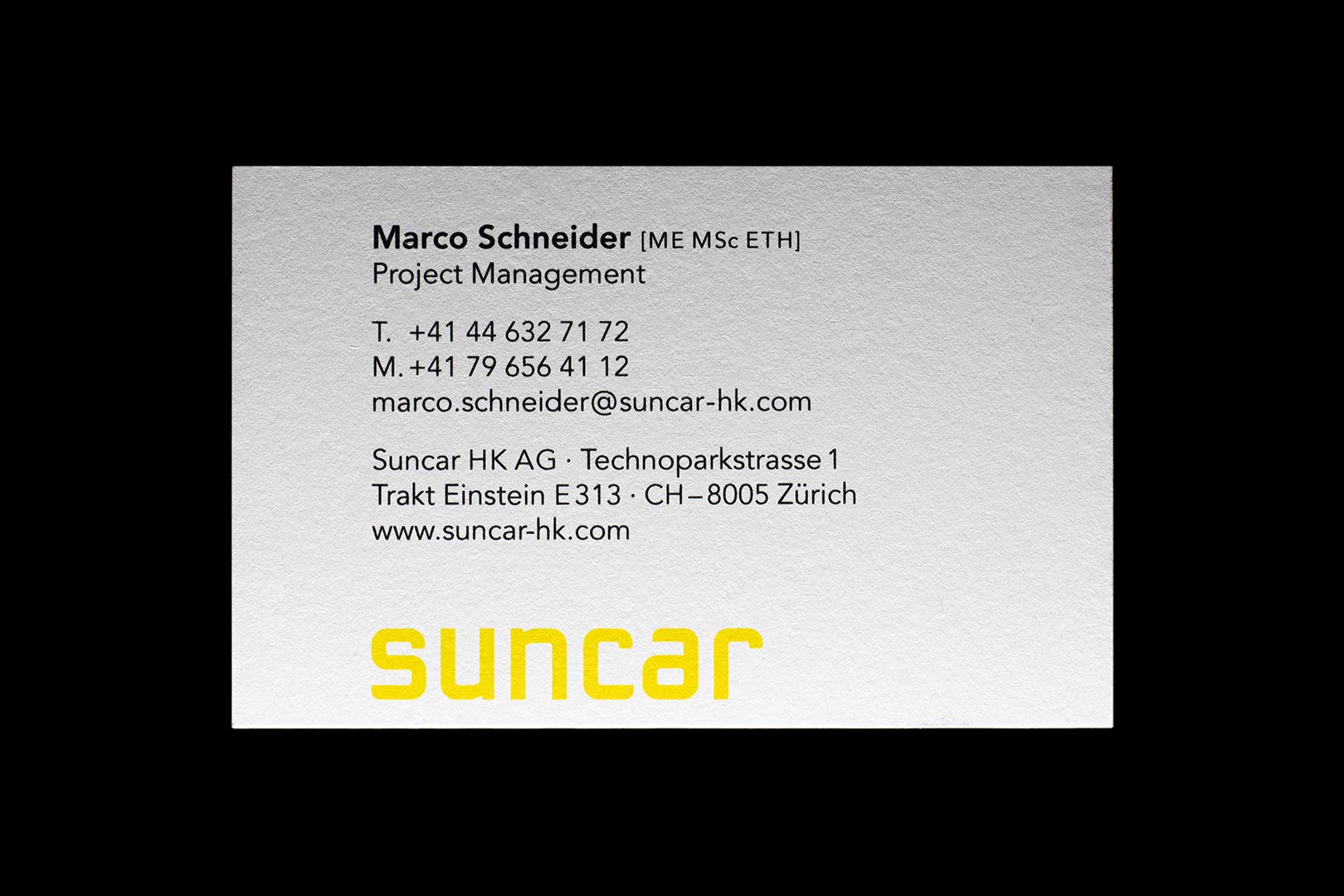
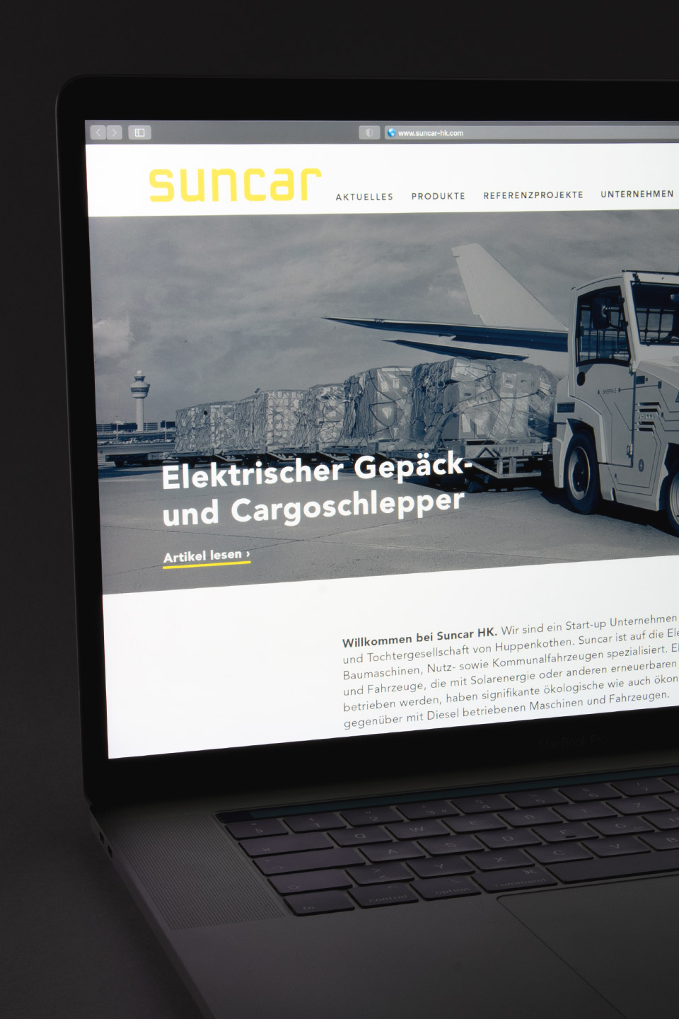
In collaboration with my fellow student Timo Reber, I was developing a proposal for a new Corporate Identity for the company Suncar HK AG. The start-up Suncar was founded from a project of the ETH in Zurich in 2015. It is focused on the electrification of construction machinery and commercial and communal vehicles. In the mutual briefing, Suncar mentioned that they wanted to be displayed as ecological, innovative and safe. These attributes helped us to derive a colour scheme and develop a word mark and pictograms. My fellow student and I then presented this collaborative approach on paper as well as online.
